By Collins Odhiambo Owino
Founder & Lead Analyst — DatalytIQs Academy
Source: Finance & Economics Dataset (2000–2025), DatalytIQs Academy Research Repository
Introduction
The Phillips Curve concept suggests an inverse relationship between unemployment and inflation (or interest rates as its proxy) — when employment rises, inflation and rates tend to increase, and vice versa.
This visualization extends that logic by color-coding observations by economic phase to highlight how the unemployment–interest rate relationship behaves throughout the business cycle.
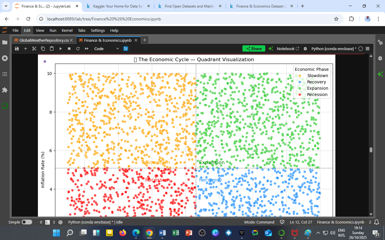
Visualization: Interest Rate vs. Unemployment by Economic Phase

Figure 1: Scatter plot showing Interest Rate (%) against Unemployment Rate (%) across all phases of the economic cycle — Expansion (green), Slowdown (yellow), Recession (red), and Recovery (blue).
Key Observations
a. Expansion (🟢 Green) — Tight Labor and Rising Rates
During expansion, most data points cluster at lower unemployment (2–6%) and higher interest rates (6–10%).
This phase reflects tight labor markets and active monetary tightening, consistent with growth peaks before inflation moderation.
b. Slowdown (🟡 Yellow) — Policy Friction Zone
In slowdown periods, unemployment begins to edge upward while rates remain elevated, indicating monetary policy lag — central banks remain cautious even as the real economy starts cooling.
c. Recession (🔴 Red) — High Unemployment and Loose Policy
Recessionary dots concentrate around 8–15% unemployment with interest rates below 5%, showing aggressive monetary easing to reignite hiring and spending.
d. Recovery (🔵 Blue) — Transitional Balance
Recoveries form a bridge between recession and expansion: rates rise gradually while unemployment declines, marking policy normalization and renewed confidence in labor markets.
Analytical Interpretation
| Economic Phase | Unemployment | Interest Rate | Policy Stance | Economic Outcome |
|---|---|---|---|---|
| 🟢 Expansion | Low | High | Tightening | Inflation control, risk of overheating |
| 🟡 Slowdown | Rising | High | Lagging | Output deceleration, cautious optimism |
| 🔴 Recession | High | Low | Easing | Stimulus injection, job market contraction |
| 🔵 Recovery | Declining | Moderate | Gradual tightening | Growth stabilization, renewed hiring |
Macroeconomic Implications
-
Policy Timing Matters:
Misalignment between labor signals and monetary response can prolong downturns or trigger premature slowdowns. -
Phillips Curve Flattening:
The wide dispersion of points indicates that the traditional inverse relationship has weakened, especially post-2008 and during 2020–2022, as structural and global forces decoupled inflation from employment. -
Data-Driven Forecasting:
Incorporating unemployment-rate–rate interactions into machine learning models enhances the prediction of phase shifts, especially in identifying early-stage recoveries.
The DatalytIQs Academy Insight
The economy breathes through jobs and money — when labor tightens, policy exhales; when jobs vanish, policy inhales.
At DatalytIQs Academy, this kind of cross-phase visualization helps learners model the dynamic tension between labor and interest rates, training them to recognize when markets are signaling the next shift in the economic cycle.
Source & Acknowledgment
Author: Collins Odhiambo Owino
Institution: DatalytIQs Academy
Dataset: Finance & Economics Dataset (2000–2025), Kaggle.
Visualization: Interest Rate vs Unemployment Rate by Economic Phase
Section: Macroeconomic Cycle Analytics — Phillips Curve Module
Key Takeaway
The Phillips Curve still breathes — but its rhythm has changed. Labor markets now respond more slowly, demanding smarter, data-driven policy timing.
Leave a Reply
You must be logged in to post a comment.