Mapping Inflation and Growth Interactions Across Business Phases
By Collins Odhiambo Owino
Founder & Lead Analyst — DatalytIQs Academy
Source: Finance & Economics Dataset (2000–2025), DatalytIQs Academy Research Repository
Introduction
Economies fluctuate through distinct phases — expansion, slowdown, recession, and recovery.
This visualization classifies data points into those four quadrants based on GDP Growth (%) and Inflation Rate (%), enabling a clear visual interpretation of macroeconomic performance cycles.
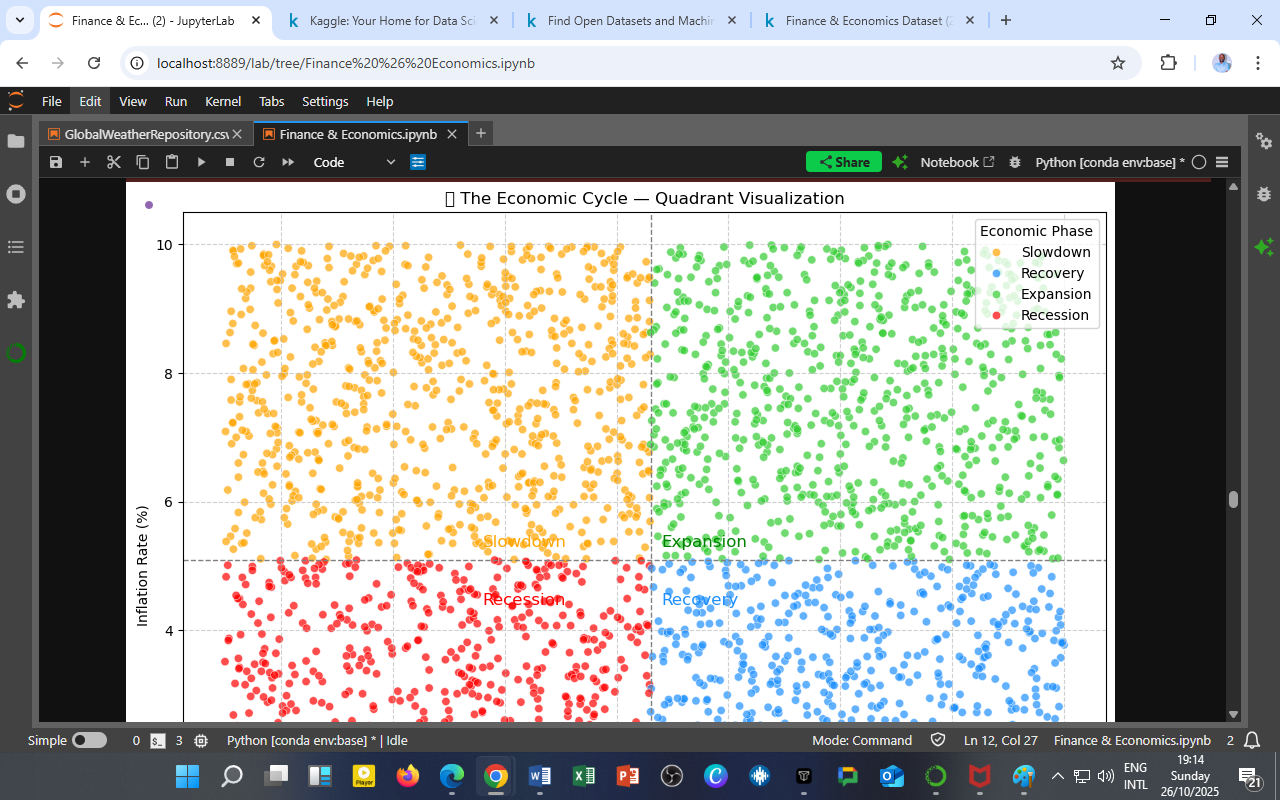
Visualization: The Four Economic Phases

Figure 1: Quadrant classification of the economy using GDP Growth (%) and Inflation Rate (%). Each point represents a historical observation between 2000 and 2025.
Quadrant Interpretation
| Quadrant | Inflation Rate | GDP Growth | Economic Phase | Description |
|---|---|---|---|---|
| 🟢 Expansion | Moderate | High | Healthy Growth | Businesses thrive, employment rises, and consumer confidence is strong. Often associated with stable inflation and productivity growth. |
| 🟡 Slowdown | High | High | Overheating Economy | Growth persists, but rising inflation pressures signal capacity constraints or speculative bubbles. |
| 🔴 Recession | Low | Low | Contraction | Economic activity contracts, unemployment rises, and prices may stagnate or fall. Typically follows policy tightening or financial shocks. |
| 🔵 Recovery | Low | Rising | Post-Recession Rebound | GDP begins to rise while inflation remains subdued, indicating reactivation of demand and investment confidence. |
Insights from the Visualization
a. Expansion and Slowdown Dominance
Most data points cluster in the right-hand quadrants (green & yellow), showing that the economy spent substantial time in growth phases — often oscillating between healthy expansion and overheating due to policy cycles or commodity shocks.
b. Recession Periods Are Sharp and Short
The lower-left (red) quadrant is visibly sparse, indicating that recessions were less frequent but steep.
This aligns with post-crisis recovery data — recessions were typically policy-induced corrections rather than structural collapses.
c. Recovery Transitions Are Stable
The blue quadrant (recovery) shows a steady buildup of GDP growth with low inflation, implying strong macroeconomic fundamentals and effective stabilization measures during recoveries.
Economic Interpretation
1. The Growth–Inflation Trade-off
The visualization reinforces the Phillips curve dynamics, where rapid growth tends to raise inflation risks — yet controlling inflation too aggressively may trigger downturns.
2. Policy Timing and Calibration
Monetary and fiscal authorities must monitor this balance:
-
Tighten policy during prolonged yellow-phase overheating.
-
Ease policy during red-phase contractions to encourage movement into blue-phase recovery.
3. Long-Term Structural View
The transition frequency between quadrants can reveal economic resilience — economies with shorter red phases and smoother green-to-blue transitions exhibit stronger structural stability.
The DatalytIQs Academy Insight
Every economy dances between heat and chill — the art of policy lies in keeping it warm enough to grow, but cool enough to last.
At DatalytIQs Academy, this quadrant analysis forms part of our Macroeconomic Visualization and Forecasting Module, teaching learners to classify real-world cycles using data-driven thresholds and dynamic dashboards.
Source & Acknowledgment
Author: Collins Odhiambo Owino
Institution: DatalytIQs Academy
Dataset: Finance & Economics Dataset (2000–2025), Kaggle.
Visualization: GDP Growth (%) vs. Inflation Rate (%)
Source: DatalytIQs Academy Research Repository — Macro-Economic Cycle Analytics Section
Key Takeaway
Understanding where the economy sits in its cycle is the cornerstone of intelligent fiscal, monetary, and investment decisions.
Leave a Reply
You must be logged in to post a comment.