Seeing the Universe Through Statistics
In our previous post, we mapped the Kepler sky distribution and explored how logistic regression identifies exoplanet types using machine learning.
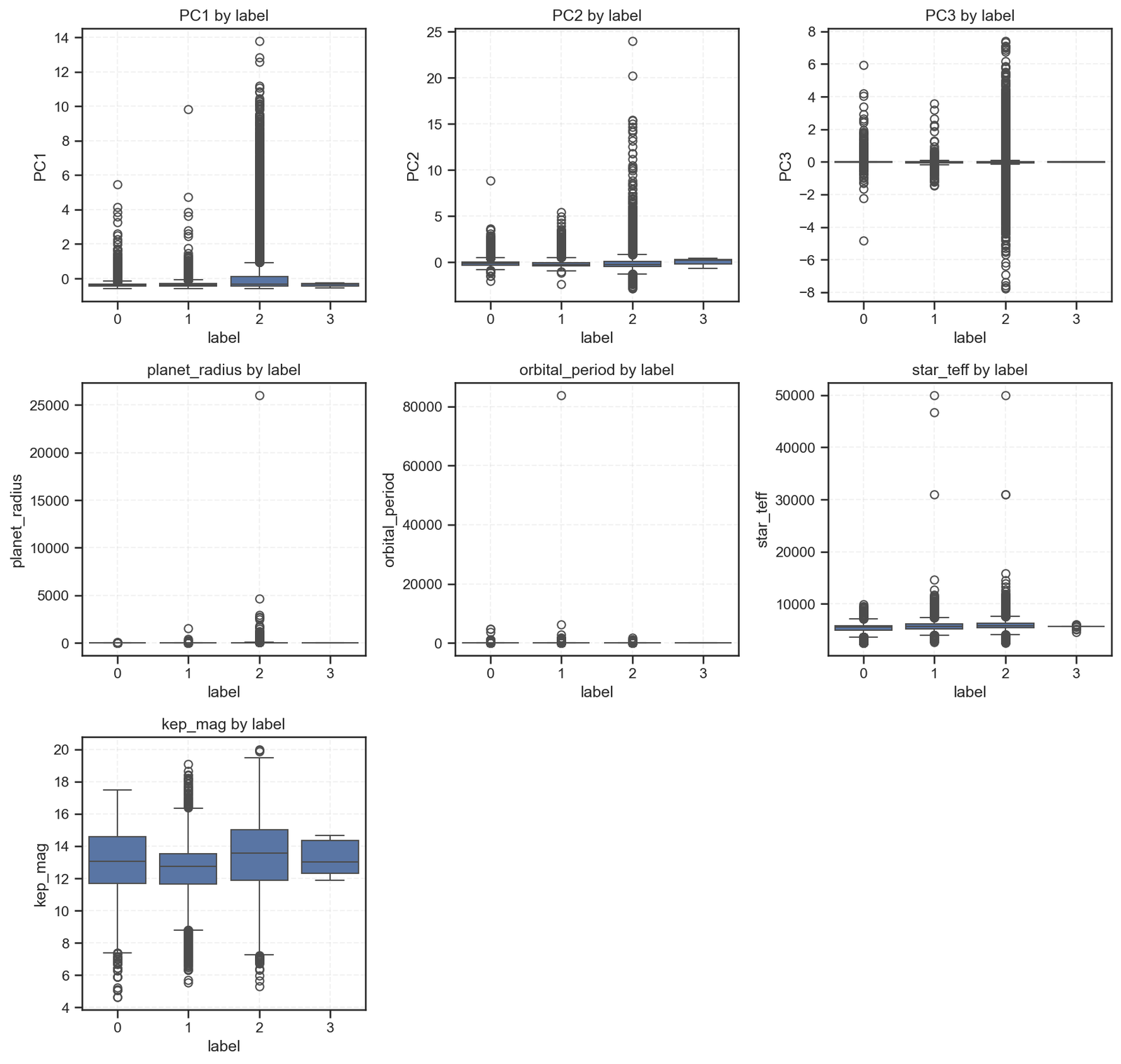
Now, we dive deeper — looking at how key numerical features differ across planetary labels using boxplots.

Each plot compares feature distributions across the four classification labels:
-
0 → Non-planetary objects
-
1 → Planet candidates
-
2 → Confirmed exoplanets
-
3 → Rare/uncertain cases
Interpreting the Patterns
1. Principal Components (PC1–PC3)
These three PCA features summarize dozens of original telescope parameters.
-
Labels 0 and 1 show a wide variation — suggesting mixed stellar properties.
-
Label 2 (confirmed planets) clusters more tightly, implying stable photometric signals.
-
Label 3 barely varies, reinforcing the data scarcity observed in our confusion matrix.
Takeaway: PCA effectively compresses light-curve patterns; confirmed exoplanets tend to occupy more consistent ranges within this reduced feature space.
2. Planet Radius
Here, the distribution stretches dramatically for label 2, showing several massive objects — likely gas giants or hot Jupiters.
Labels 0 and 1 remain near zero, aligning with non-planetary or small candidates.
Takeaway: Planet size remains one of the strongest predictors of true exoplanet classification.
3. Orbital Period
Most values cluster below 10,000 days, but label 2 includes rare long-period planets.
The outliers emphasize that Kepler was biased toward short-period detections, as they produced more transits within its mission timeframe.
Takeaway: Mission design shapes what we can observe — short orbits dominate because they are easier to confirm.
4. Stellar Temperature (star_teff)
Across all labels, most stars lie between 5,000 and 7,000 K — near solar-type.
However, slight skews for labels 0 and 1 suggest detection noise or subgiant contamination.
Takeaway: Stellar environments affect detection accuracy; hotter stars produce more variability, which complicates classification.
5. Kepler Magnitude (kep_mag)
Brightness plays a clear role: brighter stars (lower magnitudes) are more likely to yield confident detections (label 2).
Dimmer stars result in uncertain or false positives (label 1).
Takeaway: Data quality is literally measured in light. The fainter you go, the fuzzier your predictions.
Bringing It All Together
This statistical fingerprint reinforces our earlier logistic regression findings:
| Insight | Statistical Evidence |
|---|---|
| Overlapping class regions | PCA and orbital period boxplots show mixed distributions. |
| Strong feature signals | Planet radius and brightness cleanly separate label 2. |
| Underrepresented classes | Label 3 remains flat across all plots — data imbalance confirmed. |
These patterns remind us that machine learning is only as good as its inputs.
The boundaries between stars and planets are not always numerical — sometimes, they’re observational.
Policy and Research Implications
For the data science and astrophysics community:
| Policy Direction | Actionable Step |
|---|---|
| Data Equity | Increase follow-up observations for rare or faint stars to reduce bias in exoplanet classification. |
| Transparent ML Pipelines | Publish baseline models (like logistic regression) alongside deep learning alternatives. |
| Inter-Mission Collaboration | Integrate data from TESS, Gaia, and JWST to fill gaps in stellar characterization. |
| Educational Integration | Promote citizen science initiatives to classify light curves — expanding both reach and dataset balance. |
Acknowledgements
-
Data Source: NASA Kepler Exoplanet Archive (via Kaggle).
-
Analysis: Conducted by Collins Odhiambo Owino under DatalytIQs Academy – Data Science & Space Analytics Division.
-
Tools Used: Python (
seaborn,pandas,matplotlib,scikit-learn). -
Institutional Credit: DatalytIQs Academy – advancing knowledge at the intersection of Data, Economics, and the Cosmos.
Closing Reflection
“Every planet we discover expands our view of the universe —
but every dataset we analyze expands our understanding of ourselves.”
Through data, policy, and education, DatalytIQs Academy continues to connect the dots — between stars, between models, and between minds.
Leave a Reply
You must be logged in to post a comment.