The Story Before the Algorithm
Before any model can predict, data must speak.
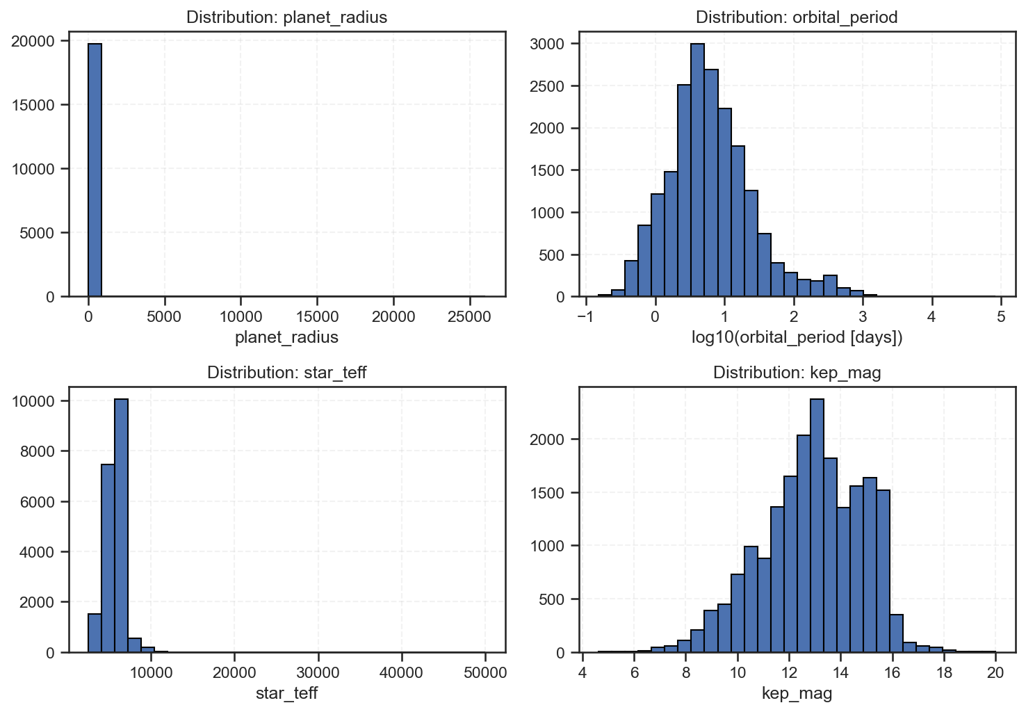
The histograms below visualize how planetary and stellar features are distributed across the Kepler dataset — the raw foundation from which our logistic regression classifier learns to distinguish stars, candidates, and exoplanets.

Understanding the Four Key Features
1. Planet Radius (top-left)
The distribution is highly right-skewed, with most values near zero and a few extreme outliers reaching enormous sizes.
This tells us that:
-
The majority of detected objects are small, Earth-to-Neptune-sized.
-
A small number of giant planets or data artifacts extend the scale dramatically.
Interpretation: Kepler’s sensitivity favored smaller, short-orbit transits, but occasional detection noise inflated radius estimates for a few outliers.
It also highlights the need for feature scaling or log transformation before feeding into machine learning models.
2. Orbital Period (top-right)
Here, we used log10(period) to compress the massive range of orbital days.
The distribution peaks around 10–100 days, tapering off beyond 1,000 days.
Interpretation: Most confirmed planets orbit close to their stars — so-called “hot Jupiters” or short-period terrestrials.
Long-period exoplanets are rare because they require longer observation time and produce fewer detectable transits.
This reveals an observational bias, not necessarily an astrophysical one.
3. Stellar Temperature (bottom-left)
Temperatures cluster tightly between 5,000–7,000 K, corresponding to Sun-like stars (G-type).
A few hotter outliers reach up to 50,000 K, representing unusual or possibly misclassified stellar objects.
Interpretation: Kepler’s mission deliberately focused on Sun-like stars for habitability research, explaining the central peak.
However, the long tail of extreme temperatures reminds us that data cleaning and astrophysical validation are crucial before interpretation.
4. Kepler Magnitude (bottom-right)
The brightness distribution (lower is brighter) spans 6–20 magnitudes, with a clear concentration around 12–15.
This aligns with the mission’s optical limits — bright enough to measure but not saturate Kepler’s sensors.
Interpretation: Brighter stars yield more reliable transit curves, explaining why confirmed planets often cluster around this magnitude range.
Data-Driven Insights
These histograms underscore the foundations of your machine learning results:
| Feature | Observed Trend | Modeling Implication |
|---|---|---|
planet_radius |
Heavily skewed | Apply log or robust scaling to stabilize variance. |
orbital_period |
Log-normal | Log transform reveals detectability patterns. |
star_teff |
Narrow range | Focus on subtler spectral effects for classification. |
kep_mag |
Moderate spread | Impacts model confidence and feature weighting. |
Together, they explain why our logistic regression achieved 0.59 accuracy and 0.75 AUC, strong for a linear baseline but constrained by data imbalance and feature spread.
Policy and Analytical Perspective
1. Mission Bias Recognition
Kepler’s design influenced which planets it could find.
Future missions (like TESS, PLATO, or JWST follow-ups) must prioritize long-period and dim-star systems to broaden discovery diversity.
2. Data Standardization Policy
Institutions managing astronomical archives should standardize units (e.g., days, solar radii, Kelvin) and document transformation procedures for reproducibility.
3. Machine Learning Readiness
Before model deployment, public datasets should include normalized and log-scaled feature variants to accelerate fair comparisons across algorithms.
4. Educational Integration
At DatalytIQs Academy, we advocate teaching data exploration as the first step of discovery — every chart reveals more than any algorithm alone.
Acknowledgements
-
Dataset: NASA Kepler Exoplanet Archive (via Kaggle Open Dataset).
-
Analysis: Collins Odhiambo Owino, Lead Data Scientist, DatalytIQs Academy.
-
Tools: Python,
matplotlib,numpy,pandas. -
Institutional Credit: DatalytIQs Academy — Integrating data, science, and policy for a smarter universe.
Closing Thought
“Before a planet is confirmed, its story is written in distributions.”
The Kepler dataset doesn’t just show us distant worlds — it shows us how data itself becomes a telescope, turning numbers into narratives and observations into insight.
Leave a Reply
You must be logged in to post a comment.