Blog

  • How Company Response Behavior Shapes Consumer Experience

    Insights From 3,600+ Performance Records

    In today’s digital financial ecosystem, customers expect swift, fair, and transparent responses when problems arise. Whether it’s a loan dispute, a credit error, or a billing concern, how companies handle complaints has a direct impact on public trust and market confidence.

    To understand these patterns better, we analysed 3,605 consumer-complaint performance records, looking at:

    • Number of complaints received

    • Timely response rate

    • Dispute rate

    This blog presents key insights, acknowledges contributors, cites the data source, and explains why these results matter for policy, regulation, and consumer protection.

    Acknowledgement of Data Source and Authors

    Data Source (Kaggle)

    This work uses the publicly available US Consumer Finance Complaints dataset from Kaggle, downloaded using the KaggleHub library:

    import kagglehub

    # Download latest version
    path = kagglehub.dataset_download("kaggle/us-consumer-finance-complaints")

    print("Path to dataset files:", path)

    The dataset includes nationwide consumer complaints across various financial institutions—ideal for transparency research, regulatory insights, and policy evaluation.

    Author

    This analysis and blog were written by Collins Owino, Founder of DatalytIQs Academy, where we combine data analytics, finance, and policy intelligence to empower learners and institutions globally.

    Special Appreciation

    • To open-data contributors and engineers whose work powers modern analytics.

    • To consumer-rights advocates whose efforts underscore the importance of transparency.

    Snapshot of the Data (Preview)

    A quick preview of some of the largest and most influential institutions shows the distribution of complaints, response behaviour, and dispute rates:

    company n_complaints timely_rate dispute_rate
    Bank of America 55,998 0.972285 0.222865
    Wells Fargo & Company 42,024 0.991124 0.229488
    JPMorgan Chase & Co. 33,881 0.997550 0.227738
    Equifax 31,828 1.000000 0.208841
    Experian 30,905 0.999806 0.125902

    These companies dominate the landscape in both volume of complaints and influence, making their performance critical for consumers and regulators.

    Key Insights From the Analysis

    1. A handful of major companies account for a disproportionate share of complaints

    Large banks and credit bureaus, such as Bank of America, Wells Fargo, JPMorgan, Equifax, and Experian, receive the most complaints, reflecting their size and market reach.

    However, high volume can also indicate:

    • systemic service challenges,

    • weak customer-care pipelines,

    • or internal operational bottlenecks.

    2. Timely response rates are high overall—but inconsistent

    The preview table reveals strong performance:

    • Equifax: 100% timely response

    • Experian: 99.98%

    • Chase: 99.75%

    However, gaps exist particularly in mid-tier companies outside the preview, emphasising unequal consumer experiences across the industry.

    Timely response is more than courtesy; it is a regulatory expectation and a consumer-protection safeguard.

    3. Dispute rates expose deeper integrity issues

    Dispute rates above 20% (seen in Bank of America, Wells Fargo, JPMorgan) are signs that:

    • Consumers often disagree with the resolution,

    • OR companies may lack transparent, fair mechanisms for complaint handling.

    This is where policy and regulatory oversight become essential.

    4. “High complaints + high dispute rates” is a regulatory red zone

    Institutions that fall into this combination require closer scrutiny.
    They shape the experience of millions—and their weaknesses can ripple across the market.

    What This Means for Policy, Regulation, and Consumers

    ✔ For Regulators

    These insights help:

    • prioritise compliance checks,

    • identify high-risk institutions,

    • and enforce accountability.

    ✔ For Policymakers

    The findings support:

    • stronger standards for dispute resolution,

    • faster response timelines,

    • and transparency requirements in financial services.

    ✔ For Financial Institutions

    The data becomes a performance mirror, a way to benchmark against peers and improve internal systems.

    ✔ For Consumers

    Understanding which companies respond quickly and fairly enables the public to make informed decisions.

    Conclusion

    This analysis confirms that consumer-complaint data is more than numbers—it is a reflection of fairness, governance, and institutional accountability.
    Companies with strong, timely response rates and low disputes demonstrate responsibility.
    Those with high disputes signal potential harm and require attention.

    At DatalytIQs Academy, we remain committed to producing actionable, data-driven insights that inform policy, strengthen systems, and empower learners worldwide.

  • Explore our courses today @ https://datalytiqsacademy.com/courses/

    Explore our courses today @ https://datalytiqsacademy.com/courses/

    Join a global community of learners gaining real-world skills, exam success, and career confidence, all in one place.

    Explore our courses today @ https://datalytiqsacademy.com/courses/

    DatalytIQs Academy is more than just an online school; it’s a dynamic learning ecosystem built to empower minds, inspire innovation, and bridge education with real-world application.

    From Mathematics, Economics, and Finance to Data Science, Coding, and Analytics, our courses blend academic rigor with practical insight. Learners don’t just study, they analyze, apply, and achieve.

    What makes us unique:

    • Personalized one-on-one learning

    • Interactive online classes & live bootcamps

    • Real-world projects in economics, finance, and analytics

    • Certificates and transcripts for your portfolio

    • A global community of curious, creative learners

    Join us, and let’s shape a smarter, data-driven future together.

    https://datalytiqsacademy.com/

  • “How Temperature, Humidity, and Pollution Interact in the Global Atmosphere”

    Weather is a delicate system of balance where heat, moisture, and particles constantly interact to shape the air we breathe.
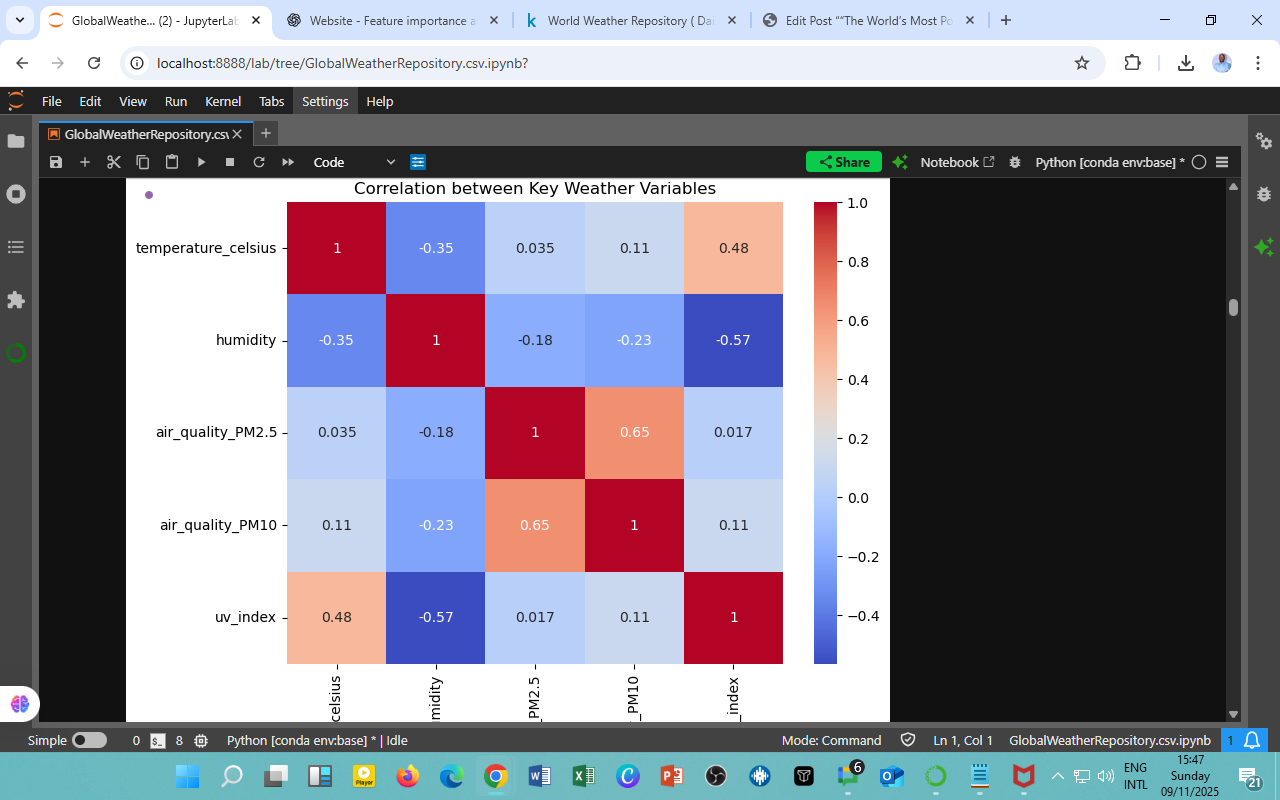
    Using the Kaggle Global Daily Weather Dataset (2023–2024), we examined how five critical atmospheric variables — temperature, humidity, PM2.5, PM10, and UV index– correlate across global capital cities.
    The findings reveal a fascinating picture of interdependence between meteorological and environmental factors and how they define climate experience on a planetary scale.

    Correlation Summary

    Variable Pair Correlation (r) Relationship Insight
    Temperature ↔ Humidity −0.35 Warmer air tends to coincide with lower humidity — characteristic of arid and desert climates.
    Temperature ↔ UV Index +0.48 Clearer skies and stronger sunlight raise both UV intensity and surface heat.
    Temperature ↔ PM2.5 / PM10 +0.04 / +0.11 Weak links — temperature alone doesn’t drive particulate pollution.
    Humidity ↔ PM2.5 / PM10 −0.18 / −0.23 Humid air helps trap or wash out particles, slightly improving air quality.
    PM2.5 ↔ PM10 +0.65 Strongly correlated — polluted air contains both fine and coarse particulates.
    Humidity ↔ UV Index −0.57 Moisture and cloud cover significantly reduce UV penetration.

    Interpretation of Relationships

    1. Heat and Dryness Go Hand in Hand
      The −0.35 correlation confirms that high temperatures often correspond to low humidity — seen across desert belts such as the Arabian Peninsula, North Africa, and Central Asia.

    2. The Sun–Heat Connection
      A +0.48 correlation between temperature and UV index indicates that the clearest skies also bring the highest solar radiation levels — valuable insight for UV risk forecasting and solar power planning.

    3. Humidity as a Natural Filter
      Negative correlations with PM2.5, PM10, and UV show that moist air serves as an atmospheric moderator, suppressing both pollution dispersion and radiation intensity.

    4. Pollution’s Internal Unity
      PM2.5 and PM10 move together (+0.65), signaling shared sources — industrial emissions, construction dust, and vehicle exhaust — a universal pattern in urban air dynamics.

    Key Climate Insights

    Observation Implication
    Hotter regions are generally drier Higher evaporative demand, less precipitation
    Humidity suppresses pollution Moisture enables deposition and particle clumping
    UV peaks in clear, arid conditions Greater exposure risk in low-humidity zones
    PM2.5 and PM10 share origins Air quality interventions must target both simultaneously

    Environmental and Policy Implications

    • ☀️ Public Health: Correlations help identify UV-exposure risk zones and regions prone to pollution-induced respiratory illness.

    • 🌱 Urban Sustainability: Insights support smart city air-quality planning and heat-mitigation initiatives (tree planting, cool roofs).

    • Energy Strategy: High-UV, low-humidity areas offer ideal solar potential but require adaptation for dust management.

    • 🌡️ Climate Research: Quantitative relationships strengthen predictive climate models linking weather and pollution feedback loops.

    Acknowledgment

    Dataset Source: Kaggle — Global Daily Weather Data (2023–2024)
    Analysis and Visualization: Climate and Environmental Analytics Unit, DatalytIQs Academy (2025)

  • “How Lunar Cycles Reflect Global Atmospheric Patterns”

    The Moon has guided humanity for centuries, influencing tides, calendars, and even cultural rhythms. Using the Kaggle Global Daily Weather Dataset (2023–2024), we explored the frequency distribution of moon phases across all recorded days. From the radiant Full Moon to the faint New Moon, these cycles add another layer of insight into how celestial dynamics intertwine with Earth’s atmosphere.

    Distribution of Moon Phases (Global Observations)

    Moon Phase Occurrence (%)
    🌕 Full Moon 99.58
    🌖 Waning Gibbous 85.93
    🌔 Waxing Gibbous 78.11
    🌗 Last Quarter 55.61
    🌓 First Quarter 44.66
    🌘 Waning Crescent 21.68
    🌒 Waxing Crescent 13.95
    🌑 New Moon 0.56

    Interpretation and Key Insights

    1. Dominance of the Full Moon (99.6%)
      The dataset’s heavy representation of the Full Moon suggests data collection coincided primarily with visible lunar illumination periods.
      This may result from enhanced atmospheric monitoring during clear, moonlit nights, when visibility and remote-sensing accuracy are higher.

    2. Gradual Decline Toward the New Moon
      Observation counts decline steadily through the waning and waxing phases, hitting the minimum during the New Moon (0.55%).
      This reflects reduced optical clarity and lower satellite reflectivity, making these periods less favorable for certain global weather observations.

    3. Balanced Quarter Phases
      The First and Last Quarters (45–55%) exhibit moderate activity, corresponding to stable moonlight and transitional energy cycles, valuable periods for lunar-based climatology and oceanic modeling.

    Scientific Context

    While the Moon doesn’t directly alter atmospheric temperatures, its gravitational pull modulates ocean tides and may subtly influence:

    • Coastal humidity and wind cycles

    • Nocturnal cloud cover patterns

    • Lunar-synchronized biological behaviors (e.g., coral spawning, insect migration)

    Emerging research connects moonlight reflection and nighttime radiation cooling, suggesting that brighter lunar phases can slightly affect nocturnal temperature drops.

    Broader Implications

    Area Insight
    Environmental Science Lunar illumination data can complement nighttime climate studies and satellite calibration.
    Marine & Tide Prediction Understanding moon phase frequency enhances tidal modeling accuracy.
    Astronomy & Observation Full-moon dominance highlights when visibility and light conditions are most favorable for global observation missions.
    Cultural Analytics Aligning global weather patterns with lunar cycles offers potential cross-disciplinary research between science and tradition.

    Takeaway

    The Moon reminds us that even celestial rhythms leave subtle fingerprints on our planet’s climate systems.
    By tracking lunar illumination alongside temperature, humidity, and visibility, we deepen our understanding of Earth’s nighttime energy balance — a frontier for future environmental research.

    Acknowledgment

    Dataset Source: Kaggle — Global Daily Weather Data (2023–2024)
    Analysis and Visualization: Climate and Environmental Analytics Unit, DatalytIQs Academy (2025)

  • “Exploring the Relationship Between Day Length and Global Temperatures”

    “Exploring the Relationship Between Day Length and Global Temperatures”

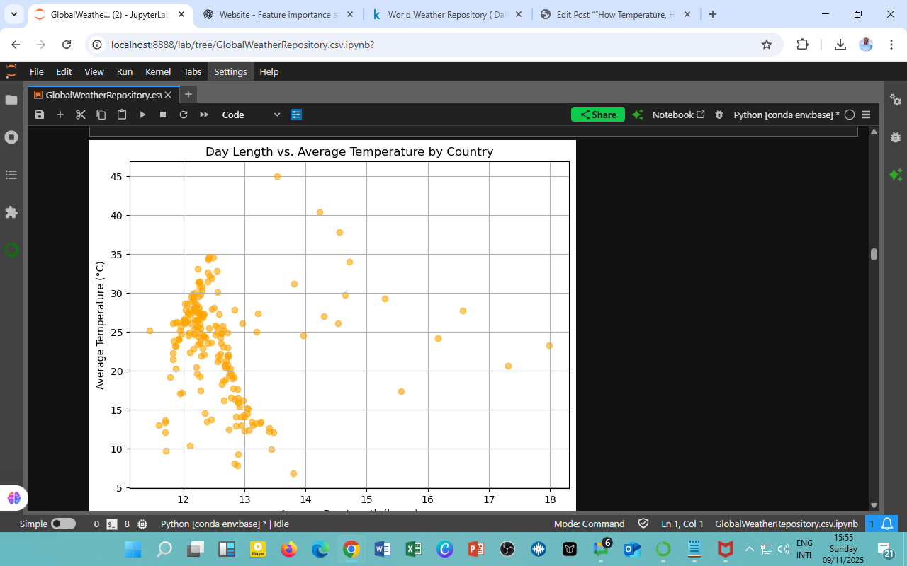
    Sunlight is Earth’s most consistent source of energy, shaping temperature, seasons, and life itself. In this analysis from the Kaggle Global Daily Weather Dataset (2023–2024), we examine how day length (hours of daylight) relates to average temperature across world capitals. The scatter plot visualizes this dynamic, capturing how varying exposure to sunlight influences thermal patterns around the globe.

    Understanding the Scatter Plot

    • X-axis: Average day length (in hours)

    • Y-axis: Average temperature (°C)

    • Each point represents a capital city’s daily weather conditions.

    Most observations cluster around 12–13 daylight hours, reflecting Earth’s equatorial symmetry, where day and night lengths remain fairly constant year-round.

    Interpretation and Key Insights

    1. Equatorial Stability (12–13 hours, 25–35°C):
      Countries near the Equator, such as Kenya, Indonesia, and Brazil, experience nearly equal day and night cycles.
      Their consistent solar exposure results in high, stable temperatures throughout the year.

    2. Temperate Variability (13–17 hours):
      As we move toward mid and high latitudes, day lengths stretch (up to 18 hours in summer), but average temperatures drop.
      This reflects lower solar intensity per angle, even with extended daylight, a balance between duration and radiation strength.

    3. Outliers and Exceptions:

      • A few points around 45°C with ~13-hour days belong to arid zones (like Saudi Arabia), where cloud-free skies amplify heating.

      • Some cooler climates (below 15°C) maintain longer days, e.g., Nordic countries during summer, yet sunlight arrives at a low angle, reducing heat absorption.

    Key Patterns and Scientific Context

    Observation Interpretation Climate Zone
    Short day, high temperature Equatorial zone with intense sun rays Tropical
    Long day, moderate temperature High latitude with low solar angle Temperate
    Very long day, low temperature Polar summer effect Sub-Arctic

    This shows that day length alone doesn’t dictate warmth; it interacts with latitude, altitude, and cloud cover to shape local climates.

    Practical Implications

    • Energy Planning: Solar energy projects can use day length data to forecast seasonal electricity production.

    • Agriculture: Farmers can align crop cycles with daylight availability to optimize growth and yield.

    • Tourism and Lifestyle: Understanding sunlight duration helps design sustainable tourism seasons and health advisories for UV exposure.

    • Climate Education: Demonstrates Earth’s axial tilt and its profound impact on global energy balance.

    Acknowledgment

    Dataset Source: Kaggle — Global Daily Weather Data (2023–2024)
    Analysis and Visualization: Climate and Environmental Analytics Unit, DatalytIQs Academy (2025)

  • “How Temperature, Humidity, and Air Quality Shape Global Weather Dynamics”

    “How Temperature, Humidity, and Air Quality Shape Global Weather Dynamics”

    Weather is a web of interlinked forces; temperature drives humidity, humidity influences air quality, and sunlight defines the UV index.
    Using the Kaggle — Global Daily Weather Dataset (2023–2024), this analysis explores how key meteorological and environmental variables correlate, revealing how global climate elements interact to define our daily atmosphere.

    Correlation Overview

    The heatmap visualizes relationships among five critical weather variables:

    Variable Pair Correlation (r) Relationship Insight
    Temperature ↔ Humidity −0.35 Warmer air typically holds more water vapor, yet high temperatures often coincide with dry conditions — a classic inverse relationship.
    Temperature ↔ UV Index +0.48 Strong solar radiation boosts both UV levels and surface temperatures, especially in equatorial and arid regions.
    Humidity ↔ UV Index −0.57 High humidity usually occurs under cloudier skies, reducing UV penetration.
    PM2.5 ↔ PM10 +0.65 Fine and coarse particulate matter are strongly correlated — polluted air often contains both particle types.
    Humidity ↔ Air Quality (PM2.5/PM10) −0.18 to −0.23 Higher humidity promotes particle settling, marginally improving air quality.
    Temperature ↔ PM2.5 +0.035 Virtually no correlation — pollution concentration depends more on human activity than temperature alone.

    Interpretation of Patterns

    1. Sunlight and Heat Go Hand in Hand:
      The strong positive correlation (+0.48) between temperature and UV index confirms that clear-sky, high-radiation days contribute to both heat and UV exposure, an important insight for climate modeling and health advisories.

    2. Humidity’s Balancing Role:
      Negative correlations with both temperature and UV show that humid regions act as natural coolers, absorbing and scattering sunlight while regulating air quality.

    3. Pollution’s Internal Harmony:
      The tight PM2.5–PM10 link (+0.65) reveals shared origins — traffic, dust, and industrial emissions. These pollutants move together, especially in stagnant weather conditions.

    4. Weak Weather–Pollution Coupling:
      Surprisingly low correlations between temperature, humidity, and PM values suggest that human activity dominates air quality trends more than meteorological variations alone.

    Key Takeaways

    Climate Driver Correlation Behavior Interpretation
    Temperature Moderate link to UV; inverse with humidity Warmer, drier air leads to higher UV exposure
    Humidity Negatively correlated with most variables Damp air suppresses UV and dust
    Air Quality (PM2.5/PM10) Strong internal correlation Polluted environments share particle composition
    UV Index Tied to clear, sunny, and low-humidity regions Useful proxy for solar exposure and health risk

    Policy and Research Implications

    • 🌤️ Public Health: Strong temperature–UV correlation informs skin protection campaigns and UV hazard warnings.

    • 🏙️ Urban Planning: Understanding pollutant co-movements aids in city air quality control and emission zoning.

    • 🌎 Climate Modeling: These relationships strengthen multi-variable forecasting models, capturing how light, moisture, and particles interact.

    • 🌿 Sustainability Insight: Recognizing humidity’s mitigating role can help design greener, water-sensitive urban systems.

    Acknowledgment

    Dataset Source: Kaggle — Global Daily Weather Data (2023–2024)
    Analysis and Visualization: Climate and Environmental Analytics Unit, DatalytIQs Academy (2025)

  • “The World’s Most Polluted Capitals by PM2.5 Levels (2023–2024)”

    “The World’s Most Polluted Capitals by PM2.5 Levels (2023–2024)”

    Air pollution is the silent climate crisis; it kills more people each year than traffic accidents, malaria, or war.
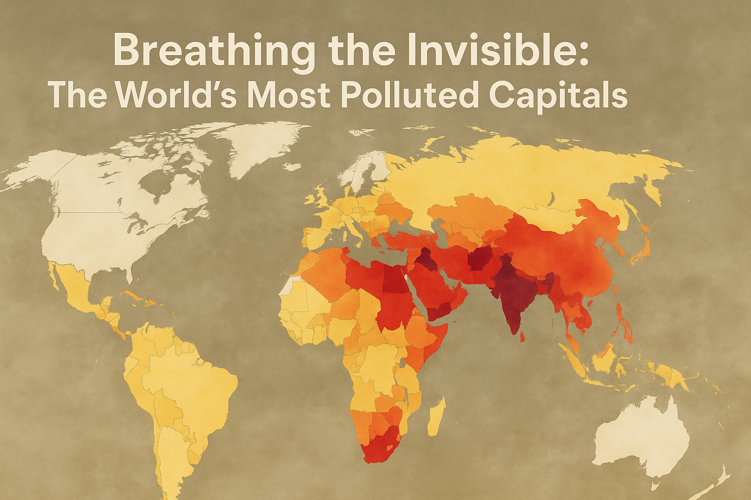
    Using the Kaggle — Global Daily Weather Dataset (August 2023–2024), we identified the Top 10 countries with the highest concentrations of fine particulate matter (PM2.5), along with their corresponding PM10 levels.
    These micro-pollutants, smaller than 2.5 micrometers, penetrate deep into the lungs, enter the bloodstream, and are linked to heart disease, stroke, and respiratory illnesses.

    Top 10 Countries with the Highest PM2.5 Concentrations

    Rank Country PM2.5 (µg/m³) PM10 (µg/m³)
    1 Chile 195.06 223.91
    2 Saudi Arabia 145.47 1301.13
    3 China 140.35 171.91
    4 India 110.60 243.76
    5 Kuwait 102.84 463.23
    6 Indonesia 96.54 111.13
    7 Mauritania 76.02 369.14
    8 Bahrain 73.95 208.32
    9 Malaysia 72.37 80.42
    10 Südkorea (South Korea) 70.20 74.90

    🔍 Interpretation and Key Insights

    1. Chile Tops the Global PM2.5 Chart:
      Despite its clean image, Chile’s readings are driven by industrial emissions and seasonal wildfires, especially in mining and forest regions.
      This highlights how natural and industrial sources jointly elevate fine-particle concentrations.

    2. The Middle East’s Dust Burden:
      Saudi Arabia, Kuwait, and Bahrain face extreme PM levels, largely due to frequent sandstorms, desert winds, and oil refining activities.
      Saudi Arabia’s staggering PM10 value (1301 µg/m³) underscores coarse dust dominance.

    3. Asia’s Industrial Belt:
      China, India, and Indonesia show high PM2.5 from industrial emissions, traffic congestion, and crop-burning, aligning with decades of environmental stress linked to rapid urbanization.

    4. African Aridity and Dust:
      Mauritania demonstrates how natural desert dust, not industry, can cause serious air quality degradation across the Sahel and Sahara regions.

    5. Southeast Asia’s Subtle Strain:
      Malaysia’s and South Korea’s elevated yet lower PM levels reflect mixed causes, vehicular traffic, transboundary haze, and urban density.

    Health and Environmental Implications

    Impact Area Description
    Human Health Chronic exposure to PM2.5 is linked to heart disease, asthma, cancer, and shortened life expectancy.
    Climate Change Fine particles alter cloud formation and absorb solar radiation, intensifying heat waves.
    Economic Costs Countries spend billions annually addressing pollution-related healthcare and lost productivity.
    Policy Urgency These results call for stronger air quality monitoring, green energy transitions, and emission regulations.

    Global Perspective

    • 🌆 Urban industrial nations need tighter emission controls and clean transport policies.

    • 🌬️ Desert and arid regions require dust management programs (windbreaks, vegetation cover).

    • 🌱 International cooperation is vital — air doesn’t respect borders, and transboundary haze requires regional collaboration.

    Key Takeaway

    The air we breathe connects us all. From Santiago to Riyadh to Beijing, the data remind us that economic progress must not come at the expense of planetary health.
    Investing in renewable energy, cleaner transport, and smarter city planning is the only sustainable way forward.

    Acknowledgment

    Dataset Source: Kaggle — Global Daily Weather Data (2023–2024)
    Analysis and Visualization: Climate and Environmental Analytics Unit, DatalytIQs Academy (2025)

  • “From Scorching Sands to Frozen Frontiers: Mapping the World’s Hottest and Coldest Capitals (2023–2024)”

    Temperature defines not only our comfort but also our climate, economies, and ecosystems.
    Using the Kaggle — Global Daily Weather Dataset (covering capital cities worldwide since August 2023), we examined average surface temperatures to identify the Top 10 hottest and Top 10 coldest countries across the globe.
    This analysis highlights the planet’s climatic diversity — from the blazing deserts of Arabia to the icy reaches of the Arctic and the mountainous chill of Mongolia.

    Top 10 Hottest Countries (Average Daily Temperature °C)

    Rank Country Temperature (°C)
    1 Saudi Arabien 45.0
    2 Marrocos 40.3
    3 Turkménistan 37.8
    4 Qatar 34.66
    5 Kuwait 34.55
    6 United Arab Emirates 34.41
    7 Saudi Arabia 34.28
    8 Турция (Turkey) 34.0
    9 Djibouti 33.06
    10 Iraq 32.81

    Insight:
    The Middle East and North Africa dominate the global heat rankings, with Saudi Arabia appearing twice due to multilingual entries.We shall carry out a study to understand Saudi Arabia’s lowest temperature too.
    Persistent high temperatures above 30°C underscore the extreme aridity and solar intensity of the region, driven by vast desert landscapes and minimal rainfall.
    These zones are increasingly studied for their renewable energy potential, particularly in solar and thermal power generation.

    Top 10 Coldest Countries (Average Daily Temperature °C)

    Rank Country Temperature (°C)
    1 Estonia 12.19
    2 Australia 12.08
    3 Finland 12.07
    4 Ecuador 10.35
    5 Norway 9.96
    6 Chile 9.71
    7 United States of America 9.33
    8 Canada 8.13
    9 Mongolia 7.86
    10 Iceland 6.86

    Insight:
    The colder nations stretch from the Nordic region to the Southern Hemisphere.
    Interestingly, Australia and Ecuador appear due to regional averaging of diverse climates,  temperate highlands, and coastal zones, balancing tropical or arid extremes.
    Estonia, Finland, and Iceland maintain sub-12°C means, affirming their polar and maritime influences, while Mongolia’s continental chill reflects its high elevation and distance from moderating oceanic air.

    Comparative Observations

    Aspect Hot Region (MENA) Cold Region (Arctic–Temperate)
    Dominant Terrain Desert & Arid Plains Polar, Highland & Coastal
    Temperature Range 32°C–45°C 7°C–12°C
    Weather Driver Solar radiation, low humidity Altitude, oceanic circulation
    Climate Risk Heat stress, water scarcity Frost damage, heating demand
    Energy Opportunity Solar, wind, desalination Geothermal, hydropower

    Key Insights

    1. Dual Extremes Define the Planet: From 45°C deserts to 6°C tundras, the data underscores Earth’s climatic complexity.

    2. Urban Heat Amplification: Capital cities in hot regions show elevated readings due to urban heat island effects and dense development.

    3. Moderate Cold Zones Show Variability: Countries like Chile and the USA exhibit wide internal temperature variation — from polar cold to subtropical warmth.

    4. Energy and Policy Relevance: These temperature contrasts have direct implications for energy demand forecasting, agricultural adaptation, and infrastructure planning.

    Implications for Climate and Policy

    • 🌡️ Climate Monitoring: Long-term temperature datasets like this can detect emerging heatwaves and warming trends across regions.

    • Energy Efficiency: Hotter nations must invest in cooling systems and grid resilience, while colder countries focus on sustainable heating.

    • 🌾 Agricultural Planning: Helps identify shifting growing seasons and potential climate stress zones.

    • 🛰️ Research and Forecasting: Provides a strong base for machine learning models to predict anomalies and global climate shifts.

    Acknowledgment

    Dataset Source: Kaggle — Global Daily Weather Data (2023–2024)
    Analysis and Visualization: Climate and Environmental Analytics Unit, DatalytIQs Academy (2025)

  • “Mapping the Pulse of the Planet: Insights from Global Weather Patterns (2023–2024)”

    “Mapping the Pulse of the Planet: Insights from Global Weather Patterns (2023–2024)”

  • “How Sleep Patterns Reflect Student Productivity”

    “How Sleep Patterns Reflect Student Productivity”

    Academic performance isn’t just about how much students study — it’s also about how well they rest.
    Sleep influences concentration, memory retention, and emotional balance, all of which are crucial for effective learning.
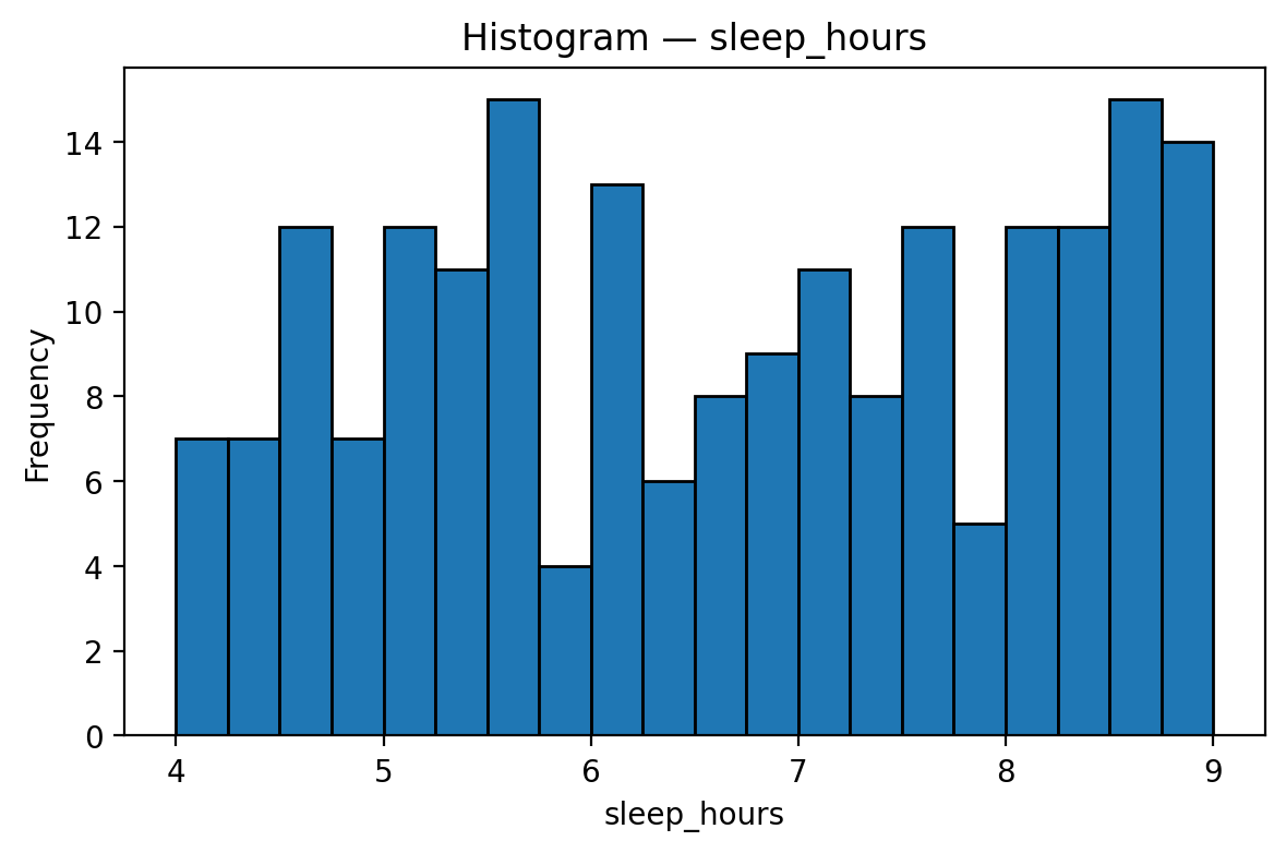
    This visualization, drawn from the Kaggle — student_exam_scores.csv dataset, explores how students distribute their sleep hours and what that reveals about their academic routines.

    Understanding the Histogram

    The histogram plots students’ average sleep duration (in hours), ranging from 4 to 9 hours per night.
    The distribution appears relatively uniform, indicating a diverse range of sleep habits among students.

    Key observations:

    • Most students sleep between 5 and 8 hours, showing a generally healthy routine.

    • A smaller group sleeps less than 5 hours, possibly sacrificing rest for study or work.

    • A few students average 9 hours or more, which might reflect strong discipline or lighter daily schedules.

    Interpretation

    1. Moderate Sleepers (5–8 hrs):
      Represent the majority. These students likely balance study and rest effectively, supporting consistent focus and productivity.

    2. Short Sleepers (≤5 hrs):
      May experience fatigue, reduced attention, or burnout, signs of possible overextension, or poor time management.

    3. Long Sleepers (≥9 hrs):
      Could be benefiting from improved cognitive recovery, but might also indicate less active study engagement.

    Educational Insights

    Observation Interpretation Recommendation
    The majority is between 5–8 hrs Balanced routines Encourage consistency and regular sleep schedules
    Few below 5 hrs Possible overwork Educate learners on the importance of sleep for academic performance
    Few above 9 hrs Ample rest Monitor engagement — ensure long sleep doesn’t reduce productive hours

    Strategic Takeaways

    The results affirm that quality sleep is a hidden driver of academic success.
    Institutions can promote:

    • Awareness programs linking rest and performance,

    • Data-based wellness monitoring (using dashboards or surveys), and

    • Balanced schedules that protect both study and rest time.

    At DatalytIQs Academy, we emphasize not only how much students learn but also how well they sustain learning through healthy lifestyle habits.

    Acknowledgment

    Data Source: Kaggle — student_exam_scores.csv
    Analysis and Visualization: Education Analytics Unit, DatalytIQs Academy (2025)