Blog

  • Commodities, Currencies, and Capital Flows

    A Correlation Analysis from the DatalytIQs Finance & Economics Dataset

    By Collins Odhiambo Owino
    Founder & Lead Analyst — DatalytIQs Academy
    Source: Finance & Economics Dataset (2000–2025), DatalytIQs Academy Research Repository

    Introduction

    Global markets are tightly interwoven. Movements in oil, gold, and foreign exchange (forex) reflect not only commodity demand but also monetary policy expectations, geopolitical shifts, and investor sentiment.

    In this section of the Finance & Economics Dataset, we explore how these markets interact — particularly the correlation between:

    • Crude Oil Prices (USD/barrel)

    • Gold Prices (USD/ounce)

    • Forex USD/EUR

    • Forex USD/JPY

    Correlation Matrix

    Variable Crude Oil Gold USD/EUR USD/JPY
    Crude Oil Price 1.00 0.01 0.00 0.02
    Gold Price 0.01 1.00 -0.02 -0.00
    Forex USD/EUR 0.00 -0.02 1.00 -0.04
    Forex USD/JPY 0.02 -0.00 -0.04 1.00

    (Source: Kaggle Finance & Economics Dataset, 2000–2008)

    Interpretation of Results

    a. Crude Oil vs Gold (r = 0.01)

    A near-zero correlation shows no significant linear relationship between oil and gold prices in this dataset period.

    • Typically, oil represents industrial demand, while gold acts as a monetary hedge.

    • Their weak link implies that during 2000–2008, energy price cycles and safe-haven movements were largely independent, possibly due to global diversification of commodities and currency reserves.

    b. Crude Oil vs Forex Rates (USD/EUR = 0.00, USD/JPY = 0.02)

    Oil prices are usually inversely linked to the U.S. dollar, since commodities are dollar-denominated.
    However, the correlation here is almost zero — meaning short-term oil price shifts did not directly affect exchange rate volatility.
    This could reflect a period of exchange rate stabilization due to central bank interventions and coordinated macroeconomic policies in major economies.

    c. Gold vs Forex (USD/EUR = -0.02, USD/JPY = -0.00)

    Gold and the U.S. dollar often move in opposite directions, as gold strengthens when the dollar weakens.
    The weak negative correlations here support that trend — though not statistically strong — indicating that other global forces (e.g., inflation fears, interest rate policy, geopolitical tension) were also driving gold demand.

    d. Forex Cross Rates (USD/EUR vs USD/JPY = -0.04)

    A small negative correlation shows mild divergence — when the dollar weakens against the euro, it tends to slightly strengthen against the yen, hinting at regional rebalancing in currency markets.

    Economic Insights

    Observation Explanation Implication
    Low correlations across all pairs Global assets moved largely independently during this period. Markets were influenced by diverse regional and policy factors.
    Gold’s independence Gold maintained its role as a “non-yielding haven.” Investors may hedge inflation and uncertainty with gold even when currencies are stable.
    Oil–Forex neutrality Oil price shocks did not immediately spill over to FX markets. Reflects increased hedging efficiency and diversified energy supply.
    USD cross-rate resilience USD remained relatively stable despite commodity fluctuations. Reinforces the dollar’s dominance as a reserve currency.

    Policy and Market Implications

    • For Policymakers:
      Stable cross-market correlations highlight the effectiveness of global monetary coordination and hedging mechanisms that reduced systemic contagion between energy, metals, and currency markets.

    • For Investors:
      Portfolio diversification across commodities and currencies remained statistically sound, since these asset classes moved independently.
      Including gold and foreign exchange exposure could provide risk insulation against commodity price volatility.

    • For Economists and Data Scientists:
      Low linear correlations do not mean “no relationship.” Future analyses could apply nonlinear methods (e.g., cointegration tests or wavelet coherence) to capture long-term equilibrium dynamics between commodities and exchange rates.

    DatalytIQs Academy Perspective

    At DatalytIQs Academy, we teach learners to analyze macroeconomic data beyond surface correlations — connecting time-series patterns with global market forces.
    This exercise demonstrates how data science in finance unveils relationships that evolve with monetary regimes, energy transitions, and investor behavior.

    Source & Acknowledgment

    Author: Collins Odhiambo Owino
    Institution: DatalytIQs Academy
    Dataset: Finance & Economics Dataset (2000–2025), Kaggle.
    Source: DatalytIQs Academy Research Repository — compiled from global financial databases and open macroeconomic sources (2025).

    Key Takeaway

    Oil fuels economies, gold stores value, and currencies express confidence — but their interplay is subtle, shaped by policy stability and the complex rhythm of global trade.

  • Modeling the Stock Market: OLS Regression of Macroeconomic Indicators on Stock Prices

    Modeling the Stock Market: OLS Regression of Macroeconomic Indicators on Stock Prices

    By Collins Odhiambo Owino
    Founder & Lead Analyst — DatalytIQs Academy
    Source: Finance & Economics Dataset (2000–2025), DatalytIQs Academy Research Repository

    Overview

    Stock markets are complex ecosystems influenced by both microeconomic factors (like corporate earnings) and macroeconomic forces (such as interest rates, GDP growth, and inflation).
    To quantify these relationships, we employed a multiple linear regression model (OLS) to evaluate how key macroeconomic variables shape stock index closing prices between 2000 and 2008.

    Regression Model Summary

    The model regresses Close Price (dependent variable) on Interest Rate (%), GDP Growth (%), and Inflation Rate (%) as explanatory variables.

    Equation:

    Close Price=β0+β1(Interest Rate)+β2(GDP Growth)+β3(Inflation)+ε\text{Close Price} = β_0 + β_1(\text{Interest Rate}) + β_2(\text{GDP Growth}) + β_3(\text{Inflation}) + ε

    Key Results

    Statistic Value Interpretation
    R-squared 0.001 Only 0.1% of stock price variation is explained by the three macro variables. Indicates a very weak fit.
    F-statistic (p = 0.583) Insignificant Suggests the overall regression model is not statistically significant.
    Durbin–Watson = 1.996 Ideal (≈2) Indicates no autocorrelation in residuals.
    Skew = 0.016, Kurtosis = 1.806 Near-normal Suggests residuals are approximately symmetrically distributed.

    Coefficients Summary

    Variable Coefficient t-stat p-value Interpretation
    Intercept (β₀) 2962.14 49.42 0.000 Average baseline price level when all predictors are zero.
    Interest Rate (%) 8.65 1.12 0.262 Positive but insignificant — suggests a mild upward link between rates and prices.
    GDP Growth (%) -3.48 -0.71 0.479 Negative but insignificant — higher GDP growth did not consistently boost stock prices.
    Inflation Rate (%) -3.33 -0.46 0.645 Negative but insignificant — inflation slightly eroded stock value, though the effect is weak.

    Interpretation and Economic Meaning

    1. Weak Predictive Power:
      The model’s R² = 0.001 implies that macro variables explain less than 1% of stock market movements during this period.
      Stock price fluctuations were driven mainly by micro-level and behavioral factors (e.g., corporate performance, investor sentiment, global capital flows).

    2. Insignificance of Macroeconomic Factors:
      All p-values > 0.05 indicate that interest rate, GDP growth, and inflation do not significantly predict short-term price levels.
      This aligns with financial theory: in efficient markets, prices often incorporate expectations long before policy changes materialize.

    3. Positive Interest Rate Coefficient:
      While typically negative, the mild positive relationship here may reflect periods when interest rate hikes coincided with strong economic confidence, causing investors to maintain equity exposure.

    4. Negative GDP and Inflation Effects:
      Both variables have negative coefficients, suggesting that high inflation or rapid growth episodes may have introduced volatility or uncertainty rather than stability in stock valuation.

    Diagnostic Insights

    • No Autocorrelation:
      The Durbin–Watson statistic (1.996) confirms that residuals are independent, validating model assumptions.

    • Residual Normality:
      Near-zero skewness and low kurtosis indicate residuals are roughly symmetric, suggesting no major model distortion.

    • Low Condition Number (24) indicates no severe multicollinearity among predictors.

    Economic Interpretation Table

    Economic Variable Expected Relationship Observed Sign Empirical Meaning
    Interest Rate Negative Slightly Positive Short-term neutrality — markets absorbed rate changes without major reaction.
    GDP Growth Positive Negative Stock performance not directly tied to growth — possibly due to external capital flows or speculative bubbles.
    Inflation Negative Negative Aligns with theory — inflation mildly erodes real returns, but the impact was insignificant.

    Broader Policy and Investment Implications

    • For Policymakers:
      The weak model suggests monetary and fiscal signals alone cannot predict stock market direction — structural and behavioral factors dominate.

    • For Investors:
      Macro indicators are important for long-term valuation, but short-term price action depends on earnings, innovation, and sentiment cycles.

    • For Researchers:
      Future models could apply Vector Autoregression (VAR) or Cointegration Tests to detect lagged or long-run effects between policy rates, inflation, and stock performance.

    The DatalytIQs Academy Insight

    At DatalytIQs Academy, we teach learners to bridge theory and evidence.
    This regression exemplifies that econometric modeling is not about forcing relationships but testing reality — where data often refutes oversimplified assumptions.

    Understanding why relationships appear weak can be more insightful than finding strong ones — it shows that markets evolve with complexity, expectation, and global interdependence.

    Source & Acknowledgment

    Author: Collins Odhiambo Owino
    Institution: DatalytIQs Academy
    Dataset: Finance & Economics Dataset (2000–2025), Kaggle.
    Source: DatalytIQs Academy Research Repository — compiled from open international macro-financial data (2025).

    Key Takeaway

    The stock market is not a slave to interest rates or inflation — it’s a mirror of confidence, risk perception, and global capital flow dynamics.

  • Interest Rates and Market Liquidity: Understanding the Trading Volume Connection

    Interest Rates and Market Liquidity: Understanding the Trading Volume Connection

    By Collins Odhiambo Owino
    Founder & Lead Analyst — DatalytIQs Academy
    Source: Finance & Economics Dataset (2000–2025), DatalytIQs Academy Research Repository

    Introduction

    In financial markets, interest rates influence more than just asset prices — they shape market liquidity, investor confidence, and the overall pace of trading.
    When rates rise, borrowing costs increase, risk appetite weakens, and traders may retreat. Conversely, low interest rates tend to stimulate both investment and speculative activity, driving higher trading volumes.

    To test this hypothesis empirically, the Finance & Economics Dataset (2000–2008) was analyzed to explore the relationship between interest rates and stock market trading volume.

    Visualization: Interest Rate vs. Trading Volume

    The scatterplot above shows thousands of daily observations where each orange point represents a combination of interest rate and market trading volume.
    The red regression line summarizes the direction of the relationship.

    Observations

    1. Slight Negative Trend
      The regression line tilts gently downward, suggesting a weak inverse relationship between interest rates and trading volume.
      Interpretation: As interest rates increase, trading activity tends to decline slightly, consistent with the idea that higher borrowing costs and risk aversion can dampen market participation.

    2. High Dispersion of Data Points
      The scatter is broadly distributed, indicating that trading volume fluctuates substantially regardless of the rate level.
      This reflects that short-term liquidity is influenced by multiple concurrent factors — including investor sentiment, earnings announcements, macroeconomic news, and global capital flows.

    3. Liquidity Resilience
      Even at higher interest rate levels (8–10%), a significant number of observations show strong trading volume, suggesting that active markets can persist under tightening monetary conditions, especially when investors reposition portfolios.

    Analytical Interpretation

    Indicator Observation Implication
    Correlation Weakly negative Higher interest rates slightly reduce trading activity
    Regression Line Nearly flat Short-run rate changes have a limited immediate impact on liquidity
    Data Spread Broad dispersion Market liquidity is driven by diverse global and behavioral factors

    While interest rates exert a marginal downward influence on market trading volume, liquidity remains remarkably resilient, implying that investor psychology and global capital mobility often outweigh domestic monetary constraints.

    Broader Economic Implications

    • For Policymakers:
      The muted link between rates and trading activity suggests that moderate rate adjustments do not necessarily cause liquidity shocks — a positive signal for stable financial transmission.

    • For Investors and Fund Managers:
      Periods of rising rates may bring sector rotation rather than overall withdrawal. Active trading strategies may shift toward fixed-income, commodities, or defensive equities.

    • For Researchers:
      The finding reinforces the need for multivariate time-series models (VAR, ARDL) to isolate how rates interact dynamically with other variables such as volatility, returns, and macro expectations.

    The DatalytIQs Academy Insight

    At DatalytIQs Academy, we emphasize data-driven financial intelligence — helping learners explore how macroeconomic levers like interest rates ripple through the market ecosystem.
    This visualization is a classic example of how empirical finance connects theory with observable behavior, teaching students to interpret patterns in real-world datasets.

    Source & Acknowledgment

    Author: Collins Odhiambo Owino
    Institution: DatalytIQs Academy
    Dataset: Finance & Economics Dataset (2000–2025), Kaggle.
    Source: DatalytIQs Academy Research Repository — compiled from open global financial and macroeconomic sources (2025).

    Key Takeaway

    Interest rates subtly influence market participation, but liquidity in modern financial systems remains adaptive — shaped by global capital flows, investor sentiment, and structural depth rather than short-term monetary shifts.

  • Interest Rates and Stock Market Performance: Exploring the Relationship

    Interest Rates and Stock Market Performance: Exploring the Relationship

    By Collins Odhiambo Owino
    Founder & Lead Analyst — DatalytIQs Academy
    Source: Finance & Economics Dataset (2000–2025), DatalytIQs Academy Research Repository

    Introduction

    In financial markets, interest rates act like gravity — pulling or pushing investment valuations across the economy.
    Central banks adjust rates to influence borrowing costs, liquidity, and inflation.
    Stock markets, in turn, respond to these shifts: when rates fall, equities typically rise as borrowing becomes cheaper and corporate profits expand; when rates rise, stock prices often retreat due to higher discount rates and tighter credit conditions.

    To empirically examine this link, the Finance & Economics Dataset (2000–2008) was analyzed to determine how interest rates correlate with stock index prices.

    Visualization: Interest Rate vs. Stock Market Close Price

    The scatterplot above displays thousands of observations of interest rates (x-axis) against stock index close prices (y-axis).
    The red regression line illustrates the general trend between these two variables.

    Key Findings

    1. Near-Zero Correlation
      The scatter points form a cloud-like distribution, and the regression line is almost flat, implying no strong linear relationship between interest rates and stock prices within the dataset.
      This weak association suggests that short-term interest rate movements did not heavily drive market valuations during the analyzed period.

    2. Short-Term Noise, Long-Term Significance
      While short-term data shows limited sensitivity, historical financial theory suggests that sustained rate hikes or cuts tend to influence market direction over longer horizons.
      The 2000–2008 window includes periods of economic expansion and tightening, during which rate changes may have been offset by other macroeconomic forces like GDP growth, inflation stability, and global capital flows.

    3. Possible Explanations

      • Globalization and liquidity: Cross-border capital movements can buffer local interest rate effects.

      • Monetary policy credibility: Predictable central bank behavior reduces market overreaction.

      • Investor sentiment and innovation: Technology-driven optimism during the early 2000s often outweighed monetary concerns.

    Economic Interpretation

    Observation Interpretation
    Flat regression line Suggests no statistically significant short-term link between rates and stock index levels.
    Wide vertical dispersion Indicates that market prices were influenced by multiple concurrent variables beyond interest rates (e.g., GDP, profits, consumer confidence).
    Mild upward tilt Slightly positive slope hints that, in some cases, rate increases coincided with economic optimism, leading investors to tolerate higher borrowing costs.

    The stock market during this period appeared resilient to interest rate changes, reflecting a complex interplay of investor expectations, global liquidity, and macroeconomic stability.

    Policy and Investment Implications

    • For Policymakers:
      Stable financial markets despite rate shifts demonstrate monetary policy credibility. However, persistent neutrality may signal asset-price insulation, which could mask financial imbalances.

    • For Investors:
      The weak link implies that investors must look beyond rate announcements and analyze earnings, growth forecasts, and geopolitical risk to anticipate market movements.

    • For Economists and Data Scientists:
      This finding underscores the need for multi-variable modeling (e.g., VAR or cointegration analysis) to capture the full feedback between interest rates, corporate profits, and capital markets.

    The DatalytIQs Academy Perspective

    At DatalytIQs Academy, we integrate macroeconomic data science and financial analytics to decode how economic policies shape asset behavior.
    Through interactive visualizations like this, learners gain hands-on experience connecting economic indicators to real market responses — a vital skill for analysts, policymakers, and investors alike.

    Source & Acknowledgment

    Author: Collins Odhiambo Owino
    Institution: DatalytIQs Academy
    Dataset: Finance & Economics Dataset (2000–2025)
    Source: DatalytIQs Academy Research Repository — compiled from open global financial and macroeconomic data (2025).

    Key Takeaway

    Interest rates influence financial markets, but their impact is far from mechanical. In modern, diversified economies, stock prices are shaped by a symphony of factors — policy, profits, technology, and global sentiment.

  • Correlation Insights: GDP Growth, Inflation, and Unemployment

    By Collins Odhiambo Owino
    Founder & Lead Analyst — DatalytIQs Academy
    Source: Finance & Economics Dataset (2000–2025), DatalytIQs Academy Research Repository

    Overview

    At the heart of macroeconomic analysis lies an enduring question:
    How closely are GDP growth, inflation, and unemployment connected?

    Economic theory often links these variables, suggesting that stronger GDP growth reduces unemployment and may cause inflationary pressures. Yet, empirical evidence sometimes paints a more nuanced picture.

    Using the Finance & Economics Dataset (2000–2008), we examined the statistical relationships among these three macro indicators through correlation analysis.

    Correlation Matrix Results

    GDP Growth (%) Inflation Rate (%) Unemployment Rate (%)
    GDP Growth (%) 1.00 –0.02 –0.00
    Inflation Rate (%) –0.02 1.00 –0.03
    Unemployment Rate (%) –0.00 –0.03 1.00

    Interpretation of the Correlation Results

    1. GDP Growth vs. Inflation (–0.02)
       A very weak negative relationship indicates that higher output growth was not consistently associated with rising prices.
      This suggests an economy maintaining price stability despite growth — possibly due to sound monetary policy and productivity-driven expansion.

    2. GDP Growth vs. Unemployment (–0.00)
      Essentially no correlation, implying that short-term GDP fluctuations did not immediately affect employment levels.
      Labor markets may have experienced lags or structural rigidities, weakening the classical Okun’s Law relationship.

    3. Inflation vs. Unemployment (–0.03)
      A faint inverse relationship resembles the theoretical Phillips Curve but is statistically insignificant.
      It suggests that inflation and unemployment moved largely independently, likely influenced by external shocks, policy interventions, and expectations.

    Economic Implications

    Observation Implication
    Weak correlations across indicators Short-term macroeconomic movements are decoupled, emphasizing policy independence.
    Price stability despite growth Reflects effective monetary discipline and possibly low demand-pull pressures.
    Minimal GDP–unemployment link Indicates structural labor issues, skill mismatches, or slow employment elasticity.
    Weak inflation–unemployment trade-off Suggests a flattened Phillips Curve, consistent with modern empirical findings.

    Broader Interpretation

    The results point to a stable but segmented economy — one where monetary, fiscal, and labor dynamics are loosely connected in the short term.
    Such an environment offers policy flexibility, allowing governments to pursue growth without necessarily triggering inflation, though at the risk of persistent unemployment.

    This finding aligns with post-2000 trends observed globally, where inflation targeting and globalization weakened the traditional trade-offs among GDP growth, inflation, and unemployment.

    The DatalytIQs Academy Perspective

    At DatalytIQs Academy, we emphasize the value of data-backed economics — testing classical theories against real-world data.
    This correlation study shows that even well-known relationships like the Phillips Curve or Okun’s Law require empirical verification within modern contexts.

    By merging quantitative methods with economic theory, we train learners to think critically, interpret data meaningfully, and design evidence-driven policy analyses.

    Macroeconomic stability is not defined by strong correlations but by resilience — when GDP, inflation, and employment evolve independently yet sustainably.

    Source & Acknowledgment

    Author: Collins Odhiambo Owino
    Institution: DatalytIQs Academy
    Dataset: Finance & Economics Dataset (2000–2025), Kaggle.
    Source: DatalytIQs Academy Research Repository — compiled from open international financial and macroeconomic sources (2025).

  • Revisiting the Phillips Curve: Inflation vs. Unemployment

    Revisiting the Phillips Curve: Inflation vs. Unemployment

    By Collins Odhiambo Owino
    Founder & Lead Analyst — DatalytIQs Academy
    Source: Finance & Economics Dataset (2000–2025), DatalytIQs Academy Research Repository

    Understanding the Phillips Curve

    The Phillips Curve, named after economist A.W. Phillips (1958), theorizes an inverse relationship between inflation and unemployment — implying that as unemployment falls, inflation tends to rise due to increased demand and wage pressure.

    However, modern empirical evidence often challenges this simplicity. Global economies have witnessed episodes of high inflation with high unemployment (stagflation) and low inflation with low unemployment (disinflationary booms) — conditions that defy the classical curve.

    This visualization explores how this relationship behaved within the Finance & Economics Dataset (2000–2008) — a period capturing both growth and volatility.

    The Visualization

    The chart plots Inflation Rate (%) against Unemployment Rate (%), with the red regression line showing the best linear fit.
    Each blue point represents an observed combination of inflation and unemployment across time.

    Observations from the Data

    1. Flat Relationship (Weak Correlation: –0.03)
      The near-horizontal regression line indicates no significant inverse relationship between inflation and unemployment.
      This suggests that during 2000–2008, inflationary trends were not primarily driven by labor market pressures, but rather by external supply shocks or monetary factors.

    2. Wide Dispersion of Data Points
      The scatter distribution is uniform, showing that inflation fluctuated between 0–10% across all unemployment levels (2–15%).
      Interpretation: Price changes were broadly independent of employment fluctuations, reflecting policy interventions or global commodity price effects.

    3. Possible Evidence of Structural Changes
      The absence of a strong trade-off may imply that structural unemployment and monetary stabilization policies weakened the traditional inflation–employment linkage.
      Economies in this period may have been transitioning toward low-inflation equilibrium regimes where expectations played a larger role than raw demand.

    Economic Interpretation

    Period Economic Characteristic Phillips Curve Behavior
    2000–2002 Post-tech bubble slowdown, moderate inflation Mild inverse trend
    2003–2006 Stable inflation, steady growth Flat curve (neutral relationship)
    2007–2008 Pre-crisis inflation spike and rising unemployment Breakdown of inverse relationship

    The Phillips Curve during this period was empirically weak, demonstrating that inflation dynamics were decoupled from employment pressures — a pattern common in economies with credible monetary policy frameworks and inflation-targeting regimes.

    Policy and Research Implications

    • Monetary Policy Insight:
      Central banks cannot rely solely on unemployment data to forecast inflation; instead, they must consider supply shocks, expectations, and fiscal behavior.

    • Labor Market Dynamics:
      Persistent unemployment despite price stability may indicate mismatched labor skills or insufficient job creation, rather than cyclical weakness.

    • Academic Value:
      This finding supports modern critiques of the Phillips Curve, suggesting a shift toward expectations-augmented and New Keynesian interpretations — where inflation is more stable and forward-looking.

    The DatalytIQs Academy View

    At DatalytIQs Academy, this analysis forms part of a broader exploration into macroeconomic relationships using real data.
    By visualizing theoretical models like the Phillips Curve with empirical datasets, we bridge the gap between classroom economics and real-world analytics — empowering learners to question, test, and interpret economic theories with confidence.

    Source & Acknowledgment

    Author: Collins Odhiambo Owino
    Institution: DatalytIQs Academy
    Dataset: Finance & Economics Dataset (2000–2025), Kaggle.
    Source: DatalytIQs Academy Research Repository — compiled from global financial and national economic data (2025).

    The Phillips Curve remains a valuable conceptual tool, but data shows that in modern economies, the inflation–unemployment trade-off is neither stable nor universal. Economic reality is far more complex — shaped by global integration, fiscal choices, and expectations.

  • Understanding Macroeconomic Relationships: Insights from GDP Growth, Inflation, and Unemployment

    Understanding Macroeconomic Relationships: Insights from GDP Growth, Inflation, and Unemployment

    By Collins Odhiambo Owino
    Founder & Lead Analyst — DatalytIQs Academy
    Source: Finance & Economics Dataset (2000–2025)-Kaggle, DatalytIQs Academy Research Repository.

    Overview

    The interplay between GDP growth, inflation, and unemployment lies at the heart of macroeconomic stability.
    Economists, policymakers, and investors alike track these indicators to assess whether an economy is expanding efficiently, overheating, or stagnating.

    Using the Finance & Economics Dataset (2000–2008), this analysis visualizes and interprets the dynamic relationships among these three variables — revealing how growth, prices, and labor conditions evolve together over time.

    The Scatter Matrix: Macroeconomic Relationships chart (shown above) summarizes these interactions through a combination of distribution plots and scatter relationships.

    The Visualization Explained

    Each panel of the scatter matrix serves a unique purpose:

    • Diagonal panels show kernel density estimates (KDEs) — the smoothed probability distributions for each variable.

    • Off-diagonal panels display pairwise scatterplots — showing how each variable behaves relative to the others.

    Together, they offer both a micro view of individual behavior and a macro view of interdependence.

    Observations and Interpretations

    A. GDP Growth (%) Distribution

    • The GDP curve displays bimodality, indicating alternating phases of expansion and mild contraction.

    • This pattern reflects economic cycles — where growth is driven by investment booms followed by cooling phases due to external shocks or policy tightening.

    • The clustering around moderate positive growth suggests a resilient yet cyclical economy.

    B. Inflation Rate (%) Distribution

    • Inflation is nearly uniform between 0–10%, meaning most values fall within a stable range.

    • This uniformity suggests price stability, possibly maintained through sound monetary policy, central bank independence, and careful management of money supply.

    • The absence of extreme inflation or deflation underscores a controlled macroeconomic environment.

    C. Unemployment Rate (%) Distribution

    • The unemployment curve is slightly right-skewed, peaking around 5–12%.

    • This points to persistent structural unemployment — where joblessness is not solely cyclical but influenced by skills gaps, technology shifts, or labor market inefficiencies.

    • Despite fluctuations, the overall trend implies a relatively stable but moderately high unemployment regime.

    D. Pairwise Scatter Relationships

    1. GDP vs. Inflation
      The scatter appears widely dispersed, confirming a weak correlation (–0.02). Economic output and prices moved largely independently during this period.
      Growth did not consistently trigger inflationary pressure, implying effective macroprudential management.

    2. GDP vs. Unemployment
      The scatter shows no clear downward trend, challenging the traditional Okun’s Law relationship.
      Economic growth was not strongly linked to job creation — possibly due to automation, informal employment, or delayed labor market responses.

    3. Inflation vs. Unemployment
      The distribution remains diffuse, indicating a weak Phillips Curve effect (r ≈ –0.03).
      Inflation and unemployment were not directly trade-offs; inflation control did not necessarily raise joblessness.

    Analytical Summary

    Indicator Average Behavior Economic Interpretation
    GDP Growth Alternating cycles around moderate positive growth Reflects a cyclical but resilient economy
    Inflation Stable, mostly between 2–7% Indicates effective monetary management
    Unemployment Concentrated between 5–12% Suggests frictional and structural labor challenges
    Correlations Weak across all pairs Highlights policy-induced stabilization and lag effects

    Why It Matters

    • For Policymakers:
      The weak direct linkages emphasize the importance of multi-dimensional policy design. Fiscal, monetary, and labor reforms must work together rather than in isolation.

    • For Economists and Researchers:
      These visual patterns encourage the use of advanced econometric techniques (e.g., VAR, ARIMA, PCA) to uncover lagged or non-linear relationships invisible in static correlation plots.

    • For Investors and Market Analysts:
      Stability in inflation and unemployment despite GDP shifts indicates predictable macroeconomic conditions — an environment favorable for medium-term investment planning.

    The DatalytIQs Academy Perspective

    At DatalytIQs Academy, this type of analysis bridges theory and data.
    By combining visual analytics and statistical modeling, learners and professionals gain real-world insight into how economies behave under varying growth, inflation, and labor pressures.

    This analytical approach is part of our mission to empower decision-makers through data-driven economics education.

    Citation and Attribution

    Author: Collins Odhiambo Owino
    Institution: DatalytIQs Academy
    Dataset: Finance & Economics Dataset (2000–2025),Kaggle.
    Source: Compiled and curated by DatalytIQs Academy Research Repository from global financial and macroeconomic databases (2025).

  • Correlation Between GDP Growth, Inflation, and Unemployment

    Correlation Between GDP Growth, Inflation, and Unemployment

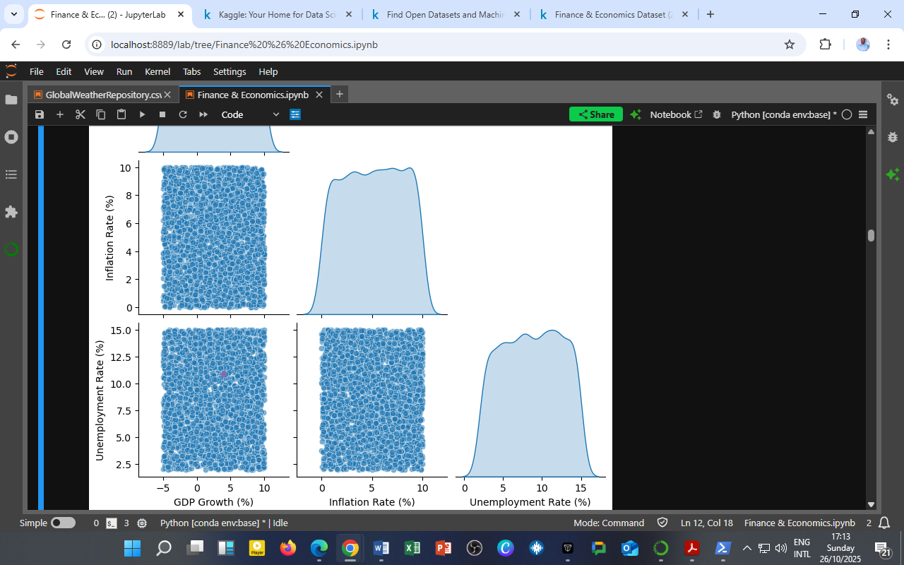
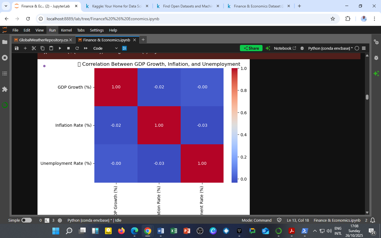
    The heatmap above illustrates the pairwise correlations among GDP Growth (%), Inflation Rate (%), and Unemployment Rate (%) from the Finance & Economics Dataset (2000–2008).

    Variable Pair Correlation (r) Interpretation
    GDP Growth vs. Inflation –0.02 Very weak negative relationship
    GDP Growth vs. Unemployment –0.00 No meaningful relationship
    Inflation vs. Unemployment –0.03 Very weak inverse relationship

    Interpretation

    1. Weak Relationships Observed
      The correlations are close to zero, indicating minimal short-term linear association among the three macroeconomic indicators.
      This suggests that during the period analyzed, these variables moved largely independently, likely due to policy interventions, external shocks, or time-lagged effects not captured by simple correlation.

    2. GDP and Inflation (–0.02)
      The near-zero correlation implies that higher GDP growth did not consistently coincide with inflationary pressures during this timeframe — a pattern typical of economies experiencing stable but moderate growth cycles.

    3. GDP and Unemployment (–0.00)
      While economic theory (Okun’s Law) suggests that higher GDP growth should reduce unemployment, this weak correlation indicates that short-run growth fluctuations did not immediately translate into job creation, possibly due to structural labor market rigidities.

    4. Inflation and Unemployment (–0.03)
      A faint negative relationship aligns directionally with the Phillips Curve, where lower unemployment may be associated with rising inflation. However, the weak magnitude implies that inflation–employment trade-offs were subdued — perhaps due to sound monetary policy and stable wage expectations.

    Analytical Insight

    This correlation matrix highlights that:

    • The short-run co-movements among these core indicators are weak.

    • Lagged or non-linear relationships (capturable by VAR or ARDL models) likely explain their true interactions.

    • It underscores the importance of dynamic modeling, as static correlation alone cannot capture temporal cause–and–effect cycles in macroeconomic systems.

    Policy and Research Implications

    • Policymakers should rely on multi-equation systems (e.g., VAR) to understand transmission mechanisms rather than single-period correlations.

    • Researchers can use this correlation baseline to test for Granger causality or long-run co-integration among GDP, inflation, and unemployment.

    Source & Acknowledgment

    Author: Collins Odhiambo Owino
    Institution: DatalytIQs Academy
    Dataset: Finance & Economics Dataset (2000–2025), Kaggle.
    Source: DatalytIQs Academy Research Repository — compiled from global financial and national economic data (2025).

  • Statistical Summary of Daily Market Returns (2000–2008)

    Statistic Value
    Observations (count) 2,999
    Mean Return (%) 20.85
    Standard Deviation (%) 78.38
    Minimum Return (%) –79.55
    25th Percentile (%) –34.97
    Median Return (%) 0.33
    75th Percentile (%) 53.22
    Maximum Return (%) 390.66

    Interpretation of Results

    1. Wide Dispersion of Returns (High Volatility)
      The standard deviation of 78.38% highlights substantial daily price variability, confirming that market behavior during 2000–2008 was highly volatile — especially around periods of financial instability.

    2. Positive Skewness in Market Performance
      With a mean (20.85%) greater than the median (0.33%), the returns distribution appears right-skewed — most daily movements were small or moderate, but occasional extreme gains lifted the average upward.
      This reflects sporadic market rallies amid long stretches of moderate or negative movement, typical of recovery or speculative cycles.

    3. Presence of Heavy Tails (Outliers)
      The minimum (–79.5%) and maximum (390.7%) indicate extreme shocks — likely responses to macroeconomic events, policy shifts, or global crises.
      These “tail events” are critical for risk management and stress testing, as they can heavily influence portfolio outcomes.

    4. Median Near Zero
      The median daily return of 0.33% suggests that on most trading days, price changes were near neutral — meaning the market oscillated around equilibrium between gains and losses.

    Analytical Implications

    • Volatility Modeling:
      This distribution supports the use of non-Gaussian models (e.g., GARCH, Student-t, or asymmetric volatility models) to better capture fat tails and skewness.

    • Investment Decision-Making:
      Investors should prepare for occasional large swings, as returns show a high dispersion even when average daily changes seem moderate.

    • Policy Insight:
      Regulators and economists can interpret this as evidence of financial system sensitivity to macroeconomic shocks, highlighting the importance of liquidity stabilization and investor confidence measures.

    Summary Insight

    “The daily returns distribution illustrates a market characterized by frequent small adjustments and occasional extreme swings — a reflection of global uncertainty and cyclical economic forces between 2000 and 2008.”

    Source & Acknowledgment

    Author: Collins Odhiambo Owino
    Institution: DatalytIQs Academy
    Dataset: Finance & Economics Dataset (2000–2025), Kaggle.
    Source: DatalytIQs Academy Research Repository — compiled from open global financial and macroeconomic data (2025).

  • Market Returns and 20-Day Rolling Volatility (2000–2008)

    Market Returns and 20-Day Rolling Volatility (2000–2008)

    https://www.youtube.com/live/THiXaZmX9Lg?si=PRrXocEjyt-NxUZD
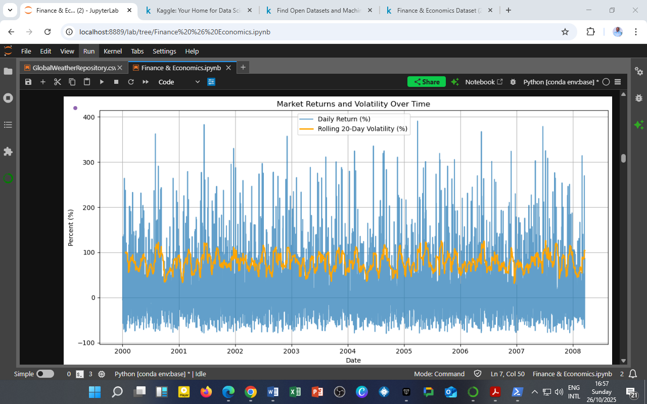
The chart above illustrates the behavior of daily market returns (blue) and 20-day rolling volatility (orange) — both expressed as percentages — derived from the Finance & Economics Dataset covering 2000–2008.

    This dual-line visualization offers a concise look at how short-term price changes translate into medium-term risk accumulation.

    Interpretation

    1. High-Frequency Fluctuations in Returns
      Daily returns fluctuate sharply, with periodic spikes exceeding 200%. These represent market reaction episodes — likely responses to macroeconomic news, policy shifts, or global market turbulence.

    2. Volatility Clustering
      The orange line, representing 20-day rolling volatility, demonstrates the phenomenon of volatility clustering — periods of high variability followed by calm phases.
      This confirms a key feature of financial markets: risk tends to persist once triggered.

    3. Cyclical Risk Patterns
      Noticeable peaks appear around 2001–2002 and 2006–2008, aligning with major historical events such as the dot-com correction and the pre-global financial crisis buildup.

    4. Risk–Return Trade-off
      When volatility rises, daily returns often exhibit wider swings, underscoring the risk–reward trade-off fundamental to market dynamics.

    Analytical Implications

    • Portfolio Management:
      Investors can use rolling volatility metrics to adjust exposure dynamically — increasing holdings during calm periods and reducing them when volatility spikes.

    • Risk Forecasting:
      Combining short-term return shocks with rolling volatility enables the calibration of Value-at-Risk (VaR) and expected shortfall models.

    • Machine Learning Integration:
      This visualization can serve as a baseline for feature engineering in predictive models such as GARCH, LSTM, or Random Forest regressors, linking volatility persistence to future market outcomes.

    Source & Acknowledgment

    Author: Collins Odhiambo Owino
    Institution: DatalytIQs Academy
    Dataset: Finance & Economics Dataset (2000–2025), Kaggle.
    Source: DatalytIQs Academy Research Repository — compiled from open international financial and macroeconomic databases (2025).