Blog

  • “What Drives Academic Success? A Correlation Map of Study Habits and Performance”

    “What Drives Academic Success? A Correlation Map of Study Habits and Performance”

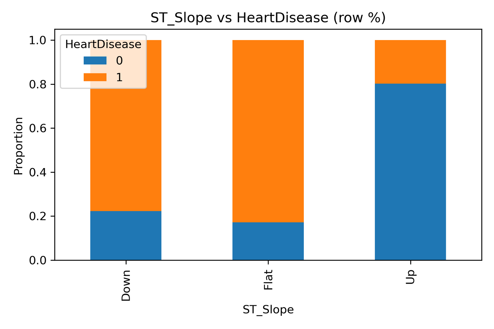
    Learning outcomes are rarely random; they emerge from a combination of habits, consistency, and personal effort.
    To understand what shapes student performance, we analyzed the Kaggle — student_exam_scores.csv dataset and used Spearman correlation to explore how variables such as hours studied, sleep hours, attendance percentage, and previous scores relate to final exam results.

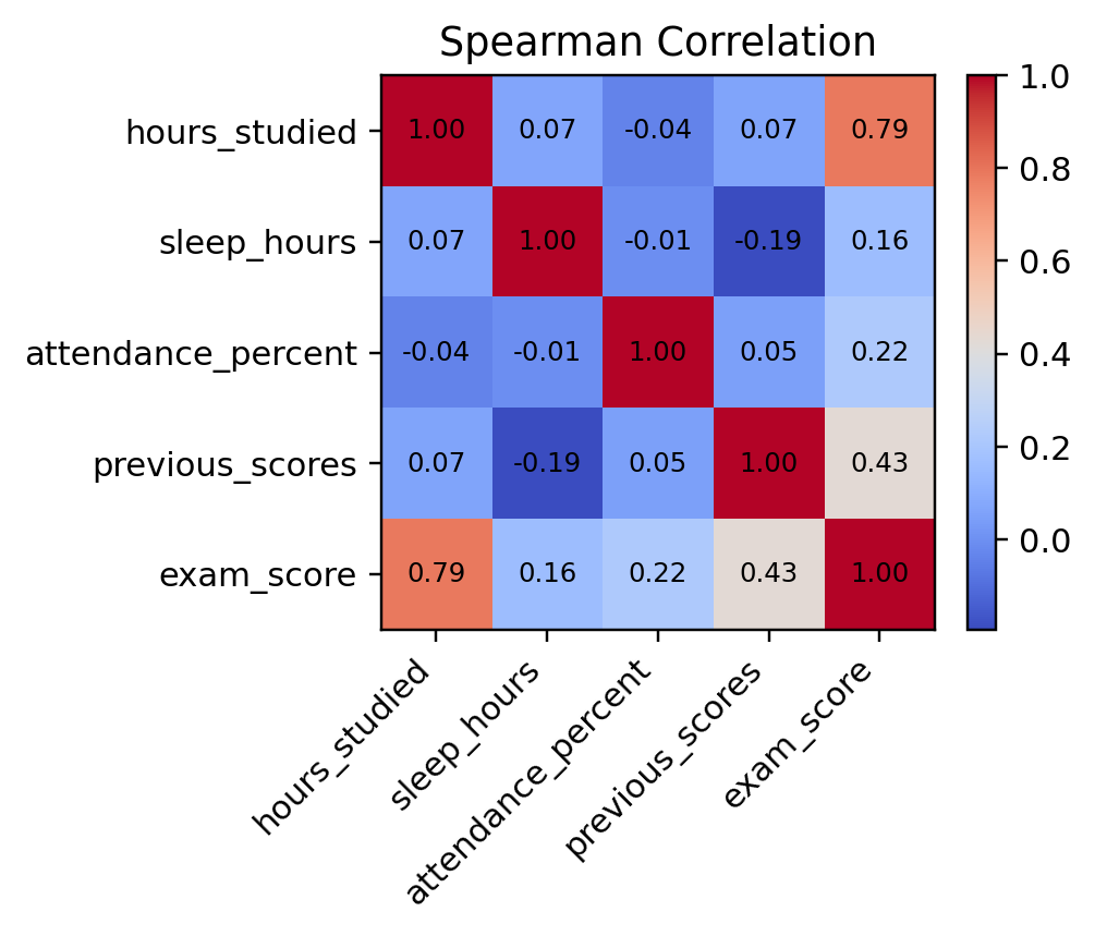
    Understanding the Correlation Map

    The heatmap displays the strength and direction of associations between key variables.
    Spearman correlation is particularly suited for this analysis because it measures monotonic relationships, how one variable moves relative to another, not just linearly.

    The scale ranges from -1 (perfect negative correlation) to +1 (perfect positive correlation).

    Key Insights from the Heatmap

    1. Hours Studied vs Exam Score (ρ = 0.79):
      This strong positive correlation shows that increased study time is directly associated with better exam performance. Students who dedicate more hours to study tend to achieve higher scores, reinforcing the timeless principle: effort drives results.

    2. Previous Scores vs Exam Score (ρ = 0.43):
      Moderate correlation indicates that students who performed well before are likely to maintain consistency. It highlights the importance of academic continuity, and learning builds on past achievements.

    3. Attendance vs Exam Score (ρ = 0.22):
      A weak but positive relationship suggests that attending classes contributes modestly to exam performance, possibly due to differences in how students utilize classroom time or self-study methods.

    4. Sleep Hours (ρ = 0.16 with Exam Score):
      Surprisingly low correlation implies that while sleep is crucial for health, its direct measurable effect on performance may vary across individuals.

    5. Other Interactions:

      • A slight negative link between previous scores and sleep hours (-0.19) could indicate that high-performing students may be studying longer, sometimes at the cost of sleep.

      • Attendance shows minimal correlation with other variables, implying it’s an independent behavioral factor.

    Educational Implications

    Factor Strength of Influence on Exam Scores Takeaway
    Hours Studied Strong (ρ = 0.79) Reinforce study planning and consistency
    Previous Scores Moderate (ρ = 0.43) Track progress over time to maintain momentum
    Attendance Weak (ρ = 0.22) Attendance alone is not enough — engagement matters
    Sleep Hours Weak (ρ = 0.16) Encourage balanced routines for focus and memory

    Strategic Takeaways

    These correlations highlight that academic performance is multi-dimensional, shaped by persistence, preparation, and prior learning.
    For educators and students alike:

    • Data-driven study planning can help identify which habits contribute most to outcomes.

    • Schools can integrate these analytics into performance dashboards to guide personalized tutoring and motivation systems.

    • Students can self-assess their habits and make informed improvements toward balanced productivity.

    Acknowledgment

    Data Source: Kaggle — student_exam_scores.csv
    Analysis and Visualization: Education Analytics Unit, DatalytIQs Academy (2025)

  • “What Study Hours Reveal About Learning Discipline”

    “What Study Hours Reveal About Learning Discipline”

    Effort is the invisible force behind every academic outcome. While intelligence and environment matter, the number of hours a student spends studying remains one of the strongest predictors of success.
    This visualization, based on the Kaggle — student_exam_scores.csv dataset, explores how students distribute their study hours and what this means for learning discipline and performance outcomes.

    Understanding the Histogram

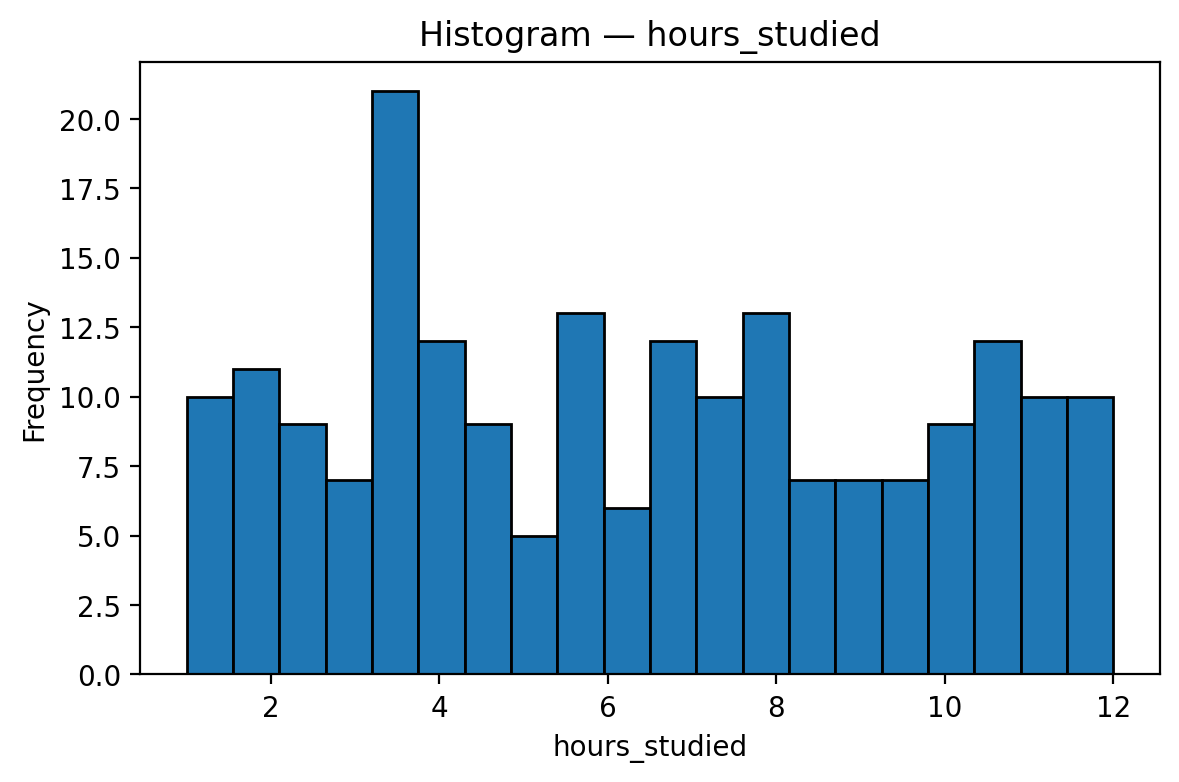
    The histogram presents the frequency of students according to their hours studied per day, ranging roughly from 1 to 12 hours.

    Unlike attendance or exam scores, the distribution here is uneven and scattered; some students study for long periods, while others commit only a few hours.

    Key takeaways:

    • Most students fall between 3–8 hours, representing moderate study engagement.

    • A small but significant group studies 10 hours or more, showing exceptional dedication.

    • A few learners spend less than 2 hours, which could affect their mastery of the course material.

    Interpretation

    1. Midrange Cluster (3–8 hrs):
      The majority of students fall into this category, indicating steady but varied learning habits.

    2. Low Study Hours (≤2 hrs):
      These learners may be underprepared, struggling with time management, or balancing other commitments.

    3. High Study Hours (≥10 hrs):
      Intense study patterns may reflect strong motivation — but could also hint at exam pressure or inefficient study techniques.

    Educational Insights

    Observation Implication Recommendation
    Moderate range (3–8 hrs) dominates Healthy study rhythm Reinforce through balanced coursework and scheduled breaks
    Few below 2 hrs Risk of poor performance Offer time-management and study-skills coaching
    Few above 10 hrs High motivation, possible burnout Encourage smart studying and rest routines

    Strategic Takeaways

    Effective studying is not about duration alone; it’s about consistency and focus.
    Institutions can use this kind of analysis to:

    • Identify students who may need study-planning support,

    • Encourage evidence-based learning strategies, and

    • Promote the principle of “study smarter, not longer.”

    Acknowledgment

    Data Source: Kaggle — student_exam_scores.csv
    Analysis and Visualization: Education Analytics Unit, DatalytIQs Academy (2025)

  • “What Exam Scores Reveal About Student Learning Patterns”

    “What Exam Scores Reveal About Student Learning Patterns”

    Grades are not just outcomes; they are indicators of understanding, effort, and consistency.
    At DatalytIQs Academy, we analyze learning data to identify what shapes academic results. Using the Kaggle student_exam_scores.csv dataset, this post examines how exam scores are distributed among students and what the shape of that distribution reveals about classroom learning dynamics.

    Understanding the Histogram

    The histogram represents the distribution of student exam scores ranging from about 18 to 50 marks.
    The curve shows a near-normal pattern, with most students clustered around 30–36 marks, suggesting that the majority are performing at an average level while fewer students occupy the lower and upper extremes.

    Interpretation

    1. Central Tendency:
      The peak frequency appears near 33 marks; this is where most students’ scores fall. It represents a balance point between lower and higher achievers.

    2. Symmetry and Spread:
      The histogram is fairly symmetric, indicating that performance levels are evenly distributed on both sides of the mean.

    3. Upper and Lower Extremes:
      A small group scores above 45 (high achievers), while another group falls below 25 (students needing academic support).

    Educational Insights

    Observation Interpretation Recommended Action
    Scores cluster around 30–36 Consistent average performance Continue the current curriculum, but enrich learning resources
    Few high achievers (≥45) Exceptional comprehension Introduce peer-tutoring or advanced modules
    Few low performers (≤25) Learning gaps present Implement targeted remedial support and mentorship

    Strategic Implications

    A near-normal distribution of exam scores reflects a well-balanced teaching approach where most learners benefit from classroom instruction.
    However, the presence of tails on both sides underscores the need for differentiated learning interventions:

    • Low performers may benefit from more guided practice and individualized attention.

    • Top performers should be provided with enrichment programs that sustain motivation and prevent stagnation.

    Such insights help educators and institutions design data-driven learning improvement strategies, the kind that elevate entire cohorts rather than individual successes alone.

    Acknowledgment

    Data Source: Kaggle — student_exam_scores.csv
    Analysis and Visualization: Education Analytics Unit, DatalytIQs Academy (2025)

  • “Why Showing Up Still Shapes Success”

    “Why Showing Up Still Shapes Success”

    Attendance is more than a statistic; it’s a reflection of discipline, motivation, and commitment to learning.
    Using data from the Kaggle — student_exam_scores.csv dataset, this analysis visualizes student attendance rates to understand classroom participation patterns and their possible link to academic outcomes.

    Understanding the Distribution

    The histogram illustrates the distribution of student attendance between 50% and 100%.
    Unlike exam scores, attendance data appears fairly uniform, meaning that students are spread across various attendance levels with no single dominant peak.

    Key observations include:

    • Most students attend classes regularly, with many recording attendance rates between 70% and 95%.

    • A few students fall below 60%, signaling potential disengagement or barriers to consistent attendance.

    • High attendance rates(above 90%) are evident among a significant number of learners, a positive indicator of academic reliability.

    Interpretation

    1. Balanced Participation:
      The roughly uniform distribution suggests that while attendance varies, most students maintain reasonable consistency.

    2. At-Risk Group:
      Those below 60% attendance might struggle academically or face external challenges affecting participation.

    3. Exemplary Attendance:
      Learners with attendance above 90% likely exhibit strong time management and study discipline — attributes that often translate into higher exam performance.

    Educational Insights

    Observation Implication Recommendation
    The attendance spread is wide Students differ in engagement levels Implement follow-up systems for low attenders
    Majority above 70% Good classroom commitment Reinforce attendance policies to maintain the trend
    Few below 60% Risk of academic decline Provide mentorship, counseling, or support programs

    Implications for Schools and Policymakers

    Consistent attendance remains a core predictor of academic success.
    Educational institutions can use attendance analytics to:

    • Detect early signs of academic risk,

    • Design reward systems for consistency, and

    • Align attendance tracking with performance monitoring systems.

    When attendance data is combined with exam results, educators can develop more personalized interventions that turn data into action, ensuring no student is left behind.

    Acknowledgment

    Data Source: Kaggle — student_exam_scores.csv
    Analysis and Visualization: Education Analytics Unit, DatalytIQs Academy (2025)

  • “What a Histogram Tells Us About Student Performance”

    “What a Histogram Tells Us About Student Performance”

    In education, numbers don’t just measure performance; they tell stories.
    At DatalytIQs Academy, we believe that every dataset is a mirror of learning behavior. The histogram below, based on the Kaggle student_exam_scores.csv dataset, explores how students perform under similar conditions and what their score patterns reveal about study habits, understanding, and classroom effectiveness.

    Exam Score Distribution

    The histogram illustrates the distribution of exam scores across the student population.
    Most students scored between 30 and 36, forming a central cluster that represents moderate performance. A smaller number of students achieved above 45, while a few scored below 25, creating the tails of the distribution.

    This pattern suggests that while teaching has been broadly effective, variability in performance still exists; some students excel, while others need additional support.

    Interpretation

    1. Central Concentration:
      The scores peak around 33–35, reflecting a balanced level of achievement across most learners.

    2. Lower Tail:
      A minority of students scoring below 25 may indicate learning challenges, poor attendance, or difficulties with studying.

    3. Upper Tail:
      The few who score above 45 demonstrate strong comprehension and consistent study habits.

    Educational Insights

    Observation Interpretation Recommended Action
    The majority is near the average Consistent teaching outcomes Reinforce current curriculum delivery and maintain engagement
    Low-performing group present Signs of learning gaps Introduce remedial lessons, mentorship, or personalized coaching
    A few high achievers Advanced understanding Offer enrichment or peer-tutoring programs to stretch potential

    Implications for Educators and Policy

    Data-driven analysis like this empowers educators to visualize learning outcomes, identify performance clusters, and design interventions based on real evidence.
    Repeating such studies over multiple terms can help track improvements and measure the impact of curriculum changes or study strategies.

    Acknowledgment

    Data Source: Kaggle — student_exam_scores.csv
    Analysis and Visualization: Education Analytics Unit, DatalytIQs Academy (2025)

  • Correlation Analysis of Heart Disease Predictors: Decoding the Data Behind Cardiac Risk

    Correlation Analysis of Heart Disease Predictors: Decoding the Data Behind Cardiac Risk

    Heart disease is a multifactorial condition, influenced by physiological, behavioral, and metabolic variables. Understanding how these variables interact helps clinicians and policymakers prioritize preventive measures and refine diagnostic models.

    This correlation heatmap provides a quantitative overview of relationships among key variables, including Age, Blood Pressure, Cholesterol, Max Heart Rate (MaxHR), Oldpeak, Fasting Blood Sugar (FastingBS), and Heart Disease.

    2. Understanding the Visualization

    The heatmap titled “Correlation (numeric)” uses a color-coded scale to represent the strength and direction of linear relationships between numerical variables.

    • Dark purple or blue areas represent negative correlations, where an increase in one variable corresponds to a decrease in another.

    • Yellow areas represent positive correlations, where both variables tend to increase together.

    • Values range from –1 (perfect negative) to +1 (perfect positive) correlation.

    3. Key Insights

    1. Max Heart Rate (MaxHR) has a strong negative correlation (-0.40) with Heart Disease, implying that patients with lower maximum heart rates are more likely to suffer from cardiac issues, a finding consistent with reduced exercise tolerance in heart patients.

    2. Oldpeak (0.40) shows a moderate positive correlation with Heart Disease, reflecting the diagnostic importance of ST depression as a marker for ischemia.

    3. Age (0.28) also correlates positively, confirming that heart disease risk increases with age.

    4. Fasting Blood Sugar (0.27) shows a weak-to-moderate positive relationship with Heart Disease, aligning with the known comorbidity between diabetes and cardiovascular risk.

    5. Cholesterol (-0.23) exhibits a weak negative correlation, suggesting that total cholesterol alone may not always be a strong standalone predictor, highlighting the value of multidimensional modeling.

    4. Clinical and Policy Implications

    For clinicians:

    • These correlations underscore the value of integrated patient profiling rather than isolated variable assessment.

    • MaxHR and Oldpeak emerge as reliable indicators for risk stratification and stress test evaluation.

    For policymakers:

    • Data-driven evidence like this supports targeted national screening programs focusing on high-risk groups, older adults, and individuals with elevated Oldpeak or abnormal heart rate responses.

    • Digital health systems that capture and monitor ECG-derived features could drastically improve early detection and case management.

    For data scientists:

    • The modest correlation coefficients suggest that multivariate models (e.g., logistic regression, random forests) are essential for capturing complex nonlinear patterns in heart disease prediction.

    5. Analytical Approach

    The dataset originates from Kaggle’s open cardiovascular records, analyzed using Python libraries pandas, numpy, and matplotlib.
    The correlation coefficients were computed using Pearson’s method, focusing on numeric predictors to assess linear dependencies.

    6. Acknowledgement

    This work forms part of the DatalytIQs Academy Health Analytics Series, dedicated to transforming open medical data into actionable knowledge for research, education, and policy design.
    Author: Collins Odhiambo Owino
    Institution: DatalytIQs Academy — Bridging Data, Mathematics, Economics, and Health.

    7. Policy Reflection

    By visualizing variable relationships, this analysis underscores that no single factor predicts heart disease in isolation.
    Effective health policy must integrate data analytics, preventive education, and equitable healthcare access to reduce the global cardiovascular burden.

    At DatalytIQs Academy, we continue to advocate for data-driven policy transformation, where every dataset is a tool for better public health.

  • Oldpeak and Heart Disease: Understanding the Link Between ST Depression and Cardiac Risk

    Oldpeak and Heart Disease: Understanding the Link Between ST Depression and Cardiac Risk

    The Oldpeak parameter, also known as ST depression, measures the difference between the resting and peak exercise ST segments in an electrocardiogram (ECG).
    It’s a vital clinical marker for evaluating myocardial ischemia, a condition in which the heart muscle receives insufficient oxygen during stress or exertion.

    This visualization examines how Oldpeak values differ between individuals with and without heart disease, offering key diagnostic insights for clinicians and data analysts alike.

    2. Understanding the Visualization

    The box plot titled “Oldpeak by HeartDisease” compares two patient groups:

    • No Disease (0) – Individuals without heart disease

    • Disease (1) – Individuals diagnosed with heart disease

    Each box displays the median (orange line), interquartile range (box height), and outliers (circles).
    The green triangles represent the mean Oldpeak values in each group.

    3. Key Insights

    1. Higher Oldpeak values are strongly associated with heart disease.
      Patients diagnosed with heart disease exhibit higher median and mean ST depression, indicating reduced oxygen supply during exertion.

    2. Healthy individuals generally cluster around low or near-zero Oldpeak levels, reflecting normal ECG recovery after exercise.

    3. The presence of outliers in both groups suggests variability in individual responses, emphasizing the need for multi-variable assessment rather than relying on a single metric.

    4. The overlap between the two boxes indicates that Oldpeak should be used alongside other predictors like Exercise Angina and ST Slope for accurate diagnosis.

    4. Clinical and Policy Implications

    From a clinical perspective:

    • Elevated Oldpeak values signal potential myocardial stress and ischemic heart disease risk, warranting further evaluation via stress tests or imaging.

    • Physicians can use this measure to prioritize high-risk patients for lifestyle modification or medication.

    From a public health and policy perspective:

    • Ministries of Health should promote accessible ECG-based screening programs, especially in rural or low-income settings.

    • Health insurance schemes can incentivize preventive diagnostics to reduce late-stage cardiac care costs.

    • Integration of Oldpeak analytics into digital health dashboards can enhance data-driven policy design and epidemiological tracking.

    5. Analytical Notes

    The analysis is based on Kaggle’s open cardiovascular dataset, processed using Python (pandas, matplotlib, seaborn).
    This boxplot highlights the importance of quantitative ECG features in understanding the prevalence of heart disease and supporting precision medicine.

    6. Acknowledgement

    This post is part of the DatalytIQs Academy Health Analytics Series, which applies data science to decode clinical insights for education, policy, and research.
    Author: Collins Odhiambo Owino
    Institution: DatalytIQs Academy — Bridging Data, Mathematics, Economics, and Health.

    7. Policy Reflection

    This visualization illustrates how a single ECG feature can provide powerful insights into national health challenges.
    By embedding such analytics into public health infrastructure, we can transition from reactive care to predictive prevention, aligning data analytics with Sustainable Development Goal 3 (Good Health and Well-being).

  • Understanding Cholesterol Distribution: Insights into Heart Health Risks

    Understanding Cholesterol Distribution: Insights into Heart Health Risks

    Cholesterol plays a crucial role in cardiovascular health. While it is essential for hormone production and cell function, excessive levels increase the risk of artery blockage and heart disease.
    This visualization examines the distribution of cholesterol levels among patients in a heart disease dataset, helping to reveal population health patterns and potential diagnostic red flags.

    2. The Visualization Explained

    The histogram titled “Distribution: Cholesterol” displays how cholesterol levels are distributed across the study population.

    • The x-axis represents cholesterol levels (mg/dL).

    • The y-axis represents the number of individuals (frequency) within each cholesterol range.

    3. Key Insights

    1. A cluster of cases around 200–250 mg/dL indicates that most patients fall within or slightly above the borderline high cholesterol range, consistent with real-world health data.

    2. The peak frequency near 220 mg/dL suggests that mild hypercholesterolemia is common, warranting lifestyle or medical intervention.

    3. The long right tail (values above 300 mg/dL) highlights a smaller subset of patients with severe hypercholesterolemia, at high risk for atherosclerosis and coronary complications.

    4. The spike at zero likely represents missing or unrecorded data, emphasizing the importance of robust data collection in clinical studies.

    4. Public Health and Policy Implications

    This distribution underscores the need for population-level cholesterol screening and targeted prevention programs.
    Policy implications include:

    • Implementing routine cholesterol testing in adults over 30 years old.

    • Promoting dietary interventions (low saturated fats, high fiber, plant sterols).

    • Integrating cholesterol control targets into national non-communicable disease (NCD) strategies.

    • Leveraging data analytics to identify high-risk clusters for early intervention.

    5. Analytical Notes

    This analysis used data sourced from Kaggle’s open cardiovascular dataset, processed in Python with pandas and matplotlib.
    The distribution helps detect both data anomalies (e.g., missing values at zero) and real-world trends (e.g., the prevalence of high cholesterol levels).

    6. Acknowledgement

    This post is part of the DatalytIQs Academy Health Analytics Series, dedicated to transforming open data into actionable insights for better policy and preventive healthcare.
    Author: Collins Odhiambo Owino
    Institution: DatalytIQs Academy — Bridging Data, Mathematics, Economics, and Health Analytics.

    7. Policy Reflection

    Cholesterol management is both a clinical and societal priority.
    By using analytics to understand population patterns, we can guide national efforts in health education, early detection, and data-driven intervention planning.
    At DatalytIQs Academy, we champion the belief that data saves lives when interpreted with purpose.

  • ST Segment Slope and Heart Disease: Interpreting the Hidden Signals of the Heart

    ST Segment Slope and Heart Disease: Interpreting the Hidden Signals of the Heart

    In cardiovascular diagnostics, subtle patterns in the ST segment of an electrocardiogram (ECG) can reveal profound insights about heart function.
    The ST segment slope (ST_Slope) — whether it trends upward, flat, or downward– reflects how the heart’s electrical activity responds after contraction, a critical window for detecting ischemia and other heart conditions.

    This visualization examines the relationship between different ST-segment slopes and the presence of heart disease, offering valuable guidance for clinicians, researchers, and health policymakers.

    2. Understanding the Visualization

    The chart titled “ST_Slope vs HeartDisease (row %)” compares the proportion of individuals with and without heart disease across three ST segment slope categories:

    • Up: Upward slope — often linked to healthy cardiac recovery.

    • Flat: Flat slope — may indicate limited oxygen recovery or ischemic stress.

    • Down: Downward slope — typically associated with severe ischemia or cardiac dysfunction.

    The blue portion of each bar represents patients without heart disease (0), while the orange portion indicates those diagnosed with heart disease (1).

    3. Key Insights

    1. Flat and Down slopes show the highest proportions of heart disease, suggesting compromised cardiac recovery and possible myocardial ischemia.

    2. Up slopes correspond to the lowest prevalence of heart disease, reinforcing their association with healthier heart responses during and after stress.

    3. The sharp contrast between Flat/Down vs Up underscores the diagnostic value of ECG slope analysis in early heart disease detection.

    4. Implications for Clinical Practice and Policy

    This evidence underscores that the ST segment slope is not just a technical ECG parameter; it’s a predictive marker of cardiovascular health.

    For clinical practice:

    • Routine ECG analysis should emphasize slope interpretation alongside other indicators such as Resting ECG and Exercise Angina.

    • Early detection of Flat or Down slopes can prompt timely interventions, reducing the risk of severe cardiac events.

    For policymakers:

    • National heart screening programs should invest in ECG data digitization and AI-based interpretation systems to improve diagnostic precision.

    • Training primary healthcare workers in ECG pattern recognition can significantly expand preventive care in low-resource regions.

    5. Analytical Context

    The dataset analyzed originates from Kaggle’s open cardiovascular data, processed using Python’s pandas, matplotlib, and seaborn libraries.
    The results are presented as row percentages, allowing proportional comparison of heart disease prevalence within each ST slope category.

    6. Acknowledgement

    This post is part of the DatalytIQs Academy Health Analytics Series, translating real-world data into actionable insights.
    Author: Collins Odhiambo Owino
    Institution: DatalytIQs Academy — Advancing Analytics in Mathematics, Economics, and Health.

    7. Policy Reflection

    Data like this bridge the gap between medical science and public policy. By identifying risk profiles from ECG features, health authorities can target preventive care, resource allocation, and public education campaigns more effectively.
    At DatalytIQs Academy, we believe that data-driven insight is the first step toward healthier societies.

  • Gender Differences in Heart Disease: What the Data Reveals

    Gender Differences in Heart Disease: What the Data Reveals

    Cardiovascular disease affects both men and women, but not equally. Biological, hormonal, and behavioral differences shape the way each sex experiences and responds to heart conditions.
    This post examines the relationship between Sex and Heart Disease, using data-driven visualization to highlight disparities in prevalence and risk.

    2. Understanding the Visualization

    The chart titled “Sex vs Heart Disease (row %)” compares the proportion of individuals diagnosed with heart disease (HeartDisease = 1) and those without it (HeartDisease = 0) across two groups:

    • F (Female)

    • M (Male)

    The blue bars represent individuals without heart disease, while the orange bars represent those with the condition. Each bar’s height is proportional within its sex category.

    3. Key Insights

    1. Men (M) show a higher prevalence of heart disease compared to women, with over 60% of male respondents in the affected category.

    2. Women (F) display a lower occurrence of heart disease, likely influenced by hormonal protection (estrogen) and differences in lifestyle factors.

    3. However, when women develop heart disease, their symptoms tend to be less typical, such as fatigue or nausea instead of classic chest pain, leading to potential underdiagnosis or delayed treatment.

    4. The visualization highlights that sex-specific diagnostic and preventive strategies are crucial to equitable healthcare.

    4. Policy and Public Health Implications

    The gender gap revealed here has far-reaching implications:

    • Health ministries should implement gender-responsive cardiovascular programs, emphasizing awareness and screening tailored to women’s symptom patterns.

    • Workplace wellness programs should address men’s higher risk by promoting regular health checkups and stress management.

    • National data systems must disaggregate health records by sex to guide evidence-based resource allocation and policy formulation.

    In summary, this analysis confirms that gender is not just a demographic variable; it’s a determinant of heart health outcomes.

    5. Analytical Context

    This visualization was generated from Kaggle’s open cardiovascular dataset, analyzed with Python libraries (pandas, matplotlib, and seaborn).
    Each proportion represents normalized row percentages, offering a clear comparison between female and male patterns in heart disease prevalence.

    6. About DatalytIQs Academy

    DatalytIQs Academy integrates analytical insights across Mathematics, Economics, and Finance, expanding into Health Analytics to empower evidence-based decision-making.
    Through our visual analytics series, we demonstrate how data reveals hidden patterns that can shape policy, practice, and prevention.

    7. Author’s Note

    Written by Collins Odhiambo Owino, founder of DatalytIQs Academy, dedicated to advancing analytics education and translating data into action for sustainable health and development outcomes.