Blog

  • The Diurnal Meteorological Cycle: Understanding Daily Rhythms of Temperature, Humidity, and Wind Speed

    The Diurnal Meteorological Cycle: Understanding Daily Rhythms of Temperature, Humidity, and Wind Speed

    The Diurnal Meteorological Cycle: Understanding Daily Rhythms of Temperature, Humidity, and Wind Speed

    By Collins Odhiambo | DatalytIQs Academy

    1. Introduction: A Day in the Life of the Atmosphere

    Every 24 hours, the atmosphere performs a silent symphony.
    As the sun rises and sets, temperature, humidity, and wind speed rise and fall in a rhythmic cycle — shaping weather, comfort, and even air quality.

    This post visualizes the diurnal meteorological cycle, using real environmental data processed in Python (JupyterLab).

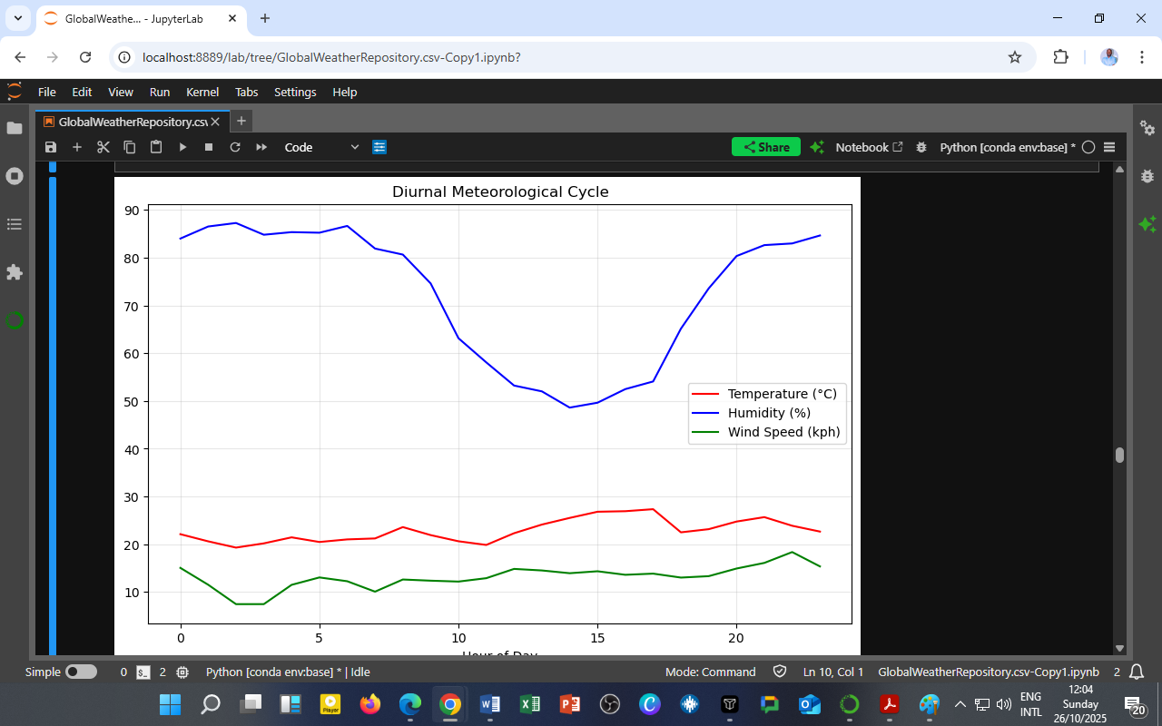
    📊 Chart: Diurnal Meteorological Cycle
    🟥 Temperature (°C) — red line
    🟦 Humidity (%) — blue line
    🟩 Wind Speed (kph) — green line

    2. Temperature: The Solar Pulse of the Day

    Morning (0–6 hours)

    • Cooler temperatures dominate the early hours before sunrise.

    • Limited solar radiation results in radiative cooling of the surface.

    Midday (10–16 hours)

    • Temperature rises gradually, reaching its peak in the afternoon, around 14:00–16:00.

    • This corresponds to the maximum solar intensity and minimum relative humidity.

    Evening (18–23 hours)

    • As the sun sets, the surface cools, and temperature decreases again — completing the daily loop.

    The diurnal temperature pattern follows the balance between incoming solar radiation and outgoing longwave radiation, influencing all other meteorological variables.

    3. Humidity: The Inverse Mirror of Temperature

    High at Night, Low by Day

    • Humidity is highest during the night and early morning (00:00–06:00) — reaching up to 85–90%.

    • As the temperature rises through the morning, humidity drops sharply, hitting its lowest point around noon.

    • In the evening, as the air cools, moisture condenses, and humidity rises again.

    Explanation:
    Humidity is inversely related to temperature because warm air holds more water vapor, but relative humidity measures how saturated the air is.
    When the air warms, its capacity increases faster than the moisture input, reducing relative humidity.

    4. Wind Speed: The Daytime Mixer

    Pattern Overview

    • Wind speeds are lowest at night (below 10 kph) when surface air layers are stable and calm.

    • After sunrise, as the surface warms, convection strengthens, mixing the air and increasing wind speeds (10–15 kph) by mid-afternoon.

    • In the evening, cooling stabilizes the atmosphere again, and winds weaken.

    Wind speed follows thermal convection cycles — higher turbulence during the day, lower at night.
    These variations control pollutant dispersion, heat distribution, and evaporation rates.

    5. Atmospheric Interactions: The Diurnal Triangle

    Variable Morning Midday Evening Key Relationship
    🌡️ Temperature Rising Peak Falling Drives humidity and wind changes
    💧 Humidity High Low Rising Inversely tied to temperature
    🌬️ Wind Speed Calm Moderate Calm Controlled by thermal mixing

    The triangle of temperature, humidity, and wind defines the daily stability or instability of the atmosphere.
    This determines how heat, moisture, and pollutants are distributed near the surface — vital for both weather forecasting and air-quality management.

    6. Implications for Environment and Policy

    1. Air Quality Forecasting

    • Morning calm and high humidity can trap pollutants near the ground (e.g., PM₂.₅, NO₂).

    • Afternoon wind and heat disperse them — hence, daily exposure risk varies by hour.

    2. Urban Planning and Cooling Design

    • Knowledge of peak heat hours supports better building ventilation, shade design, and green infrastructure planning.

    3. Renewable Energy and Efficiency

    • Wind and solar energy output depend on these daily cycles.

    • Predicting diurnal variations helps in energy scheduling and grid optimization.

    4. Public Health and Comfort

    • High daytime temperatures with low humidity increase heat stress.

    • Nighttime humidity affects sleep quality and respiratory conditions.

    7. Educational Takeaway for DatalytIQs Learners

    This diurnal cycle graph provides a perfect case study in meteorology and environmental analytics, showing:

    • How solar radiation drives atmospheric processes,

    • Why meteorological data visualization matters, and

    • How Python-based analytics can reveal insights hidden in raw datasets.

    Through consistent data practice, learners can analyze similar cycles to explore:

    • Pollution dispersion,

    • Microclimate variations, and

    • Renewable energy optimization.

    8. Conclusion: The Breath of a Day

    The diurnal meteorological cycle is nature’s 24-hour heartbeat.
    Each sunrise ignites a chain reaction — warming air, drying moisture, and stirring wind.
    By understanding these daily rhythms, we gain the power to predict, plan, and protect our environment more intelligently.

    Author

    Written by Collins Odhiambo
    Educator & Data Analyst
    DatalytIQs AcademyWhere Data Meets Discovery.

    Data: Global Weather Repository.

  • Temperature and Air Pollution: The Seasonal Tug of War Between Heat and PM₂.₅

    Temperature and Air Pollution: The Seasonal Tug of War Between Heat and PM₂.₅

    Temperature and Air Pollution: The Seasonal Tug of War Between Heat and PM₂.₅

    By Collins Odhiambo | DatalytIQs Academy

    1. Introduction: When Weather Meets Air Quality

    Every season tells a story — not just through changing skies, but through the air we breathe.
    This month’s DatalytIQs Academy analysis explores how temperature and fine particulate matter (PM₂.₅) vary across months, revealing a fascinating dance between climate and pollution.

    The figure below, generated in Python (JupyterLab), visualizes this dynamic interaction:

    Chart Title: Monthly Variation: Temperature vs PM₂.₅
    Temperature (°C) — red line (left axis)
    PM₂.₅ (µg/m³) — blue line (right axis)

    2. Interpreting the Trends

    Temperature Pattern

    • Rises steadily from mid-year (June–August), peaking around September–October.

    • Drops sharply during the cool season (December–March), reaching a minimum around February–March.

    • Gradually rebounds into the next warm cycle (April–June).

    This cyclical pattern reflects the seasonal energy balance — with solar radiation and atmospheric circulation shaping thermal conditions.

    PM₂.₅ Pattern

    • Inverse to temperature: high concentrations during cooler months (Nov–March) and low levels during warmer months (July–October).

    • Peaks correspond to stable atmospheric conditions, low wind speeds, and reduced vertical mixing, which trap pollutants near the surface.

    3. The Inverse Relationship Explained

    The anti-correlation between temperature and PM₂.₅ suggests that meteorological factors significantly control pollution dispersion.

    Temperature Phase PM₂.₅ Response Mechanism
    Warm months (high T°) Low PM₂.₅ Enhanced mixing, stronger convection, better pollutant dispersion
    Cool months (low T°) High PM₂.₅ Inversions, weak winds, poor dispersion, and increased emissions from heating or biomass burning

    Scientific Insight:
    As air warms, it expands and rises — improving air circulation and diluting pollutants.
    When air cools, it becomes dense and traps emissions, worsening air quality.

    4. Implications for Air Quality and Health

    Morning & Evening Exposure

    Cooler temperatures, often linked with temperature inversions, can increase surface-level PM₂.₅ exposure, especially for pedestrians and cyclists.

    Urban Vulnerability

    Cities with dense traffic, industrial zones, or biomass energy use experience amplified winter pollution, leading to respiratory and cardiovascular health risks.

    Seasonal Monitoring Importance

    Continuous data tracking ensures pollution mitigation strategies align with meteorological cycles — not just annual averages.

    5. Policy and Planning Insights

    1. Time-Specific Emission Control

    • Winter months (Nov–Mar): Enforce stricter emission controls, promote clean cooking fuels, and regulate open burning.

    • Summer months (Jun–Oct): Encourage outdoor activities and green public transit use when air quality improves.

    2. Data-Driven Transport Scheduling

    Cities can stagger traffic or encourage public transport during pollution-heavy months to reduce PM₂.₅ buildup.

    3. Urban Greening and Heat Islands

    Vegetation improves both air quality and thermal comfort — offering dual mitigation benefits for heat and pollution.

     4. Integration with SDGs

    SDG Focus Application
    SDG 3 – Good Health Reducing PM₂.₅-related diseases Air-quality alerts and health advisories
    SDG 11 – Sustainable Cities Cleaner transport and urban air Seasonal emission management
    SDG 13 – Climate Action Linking pollution and temperature data Local adaptation strategies

    6. Educational Insight: Why This Matters

    For students and researchers, this case demonstrates:

    • How climate variables (like temperature) influence air pollution trends.

    • Why data visualization and statistical correlation matter in environmental analytics.

    • The power of Python-based data science in uncovering hidden atmospheric relationships.

    7. Conclusion: A Seasonal Balance We Must Respect

    Temperature and PM₂.₅ share a see-saw relationship — one rises as the other falls.
    By understanding this interplay, policymakers, scientists, and citizens can anticipate pollution risks, adapt city life, and align environmental health actions with nature’s cycles.

    Author

    Written by Collins Odhiambo
    Data Analyst | Educator
    DatalytIQs AcademyWhere Data Meets Discovery.

    Data: Global Weather Repository.

  • The Daily Dance of Ozone and Nitrogen Dioxide: What the Diurnal Cycle Reveals About Urban Air Quality

    The Daily Dance of Ozone and Nitrogen Dioxide: What the Diurnal Cycle Reveals About Urban Air Quality

    The Daily Dance of Ozone and Nitrogen Dioxide: What the Diurnal Cycle Reveals About Urban Air Quality

    By Collins Odhiambo | DatalytIQs Academy

    1. Introduction: A 24-Hour Story in the Sky

    Every city breathes — not with lungs, but through its atmosphere.
    As dawn breaks and traffic hums to life, invisible reactions begin in the air. Two key actors, Ozone (O₃) and Nitrogen Dioxide (NO₂), rise and fall through the day in a delicate rhythm scientists call the diurnal cycle.

    Understanding this cycle is more than academic — it’s a blueprint for healthier cities, smarter policies, and cleaner futures.

    2. The Science Behind the Graph

    A typical diurnal plot shows hourly mean concentrations of:

    • Ozone (O₃) — the secondary pollutant formed in sunlight, and

    • Nitrogen Dioxide (NO₂) — the primary pollutant released from combustion and traffic.

    The horizontal axis spans hours (0–23), while the vertical axis shows concentration (µg/m³).
    What emerges is a striking mirror-image pattern between the two gases.

    3. O₃: The Midday Climber

    Rising with the Sun:
    After sunrise, ozone levels rise rapidly, peaking around 14:00–16:00, when sunlight is at its strongest.

    This occurs due to photochemical reactions:

    NO2+hνNO+O\text{NO}_2 + h\nu \rightarrow \text{NO} + \text{O} O+O2O3\text{O} + \text{O}_2 \rightarrow \text{O}_3

    As ultraviolet light breaks down NO₂, atomic oxygen (O) combines with molecular oxygen (O₂) to form ozone.

    After Sunset:
    When sunlight fades, this reaction comes to a halt. O₃ is consumed through titration with nitric oxide:

    O3+NONO2+O2\text{O}_3 + \text{NO} \rightarrow \text{NO}_2 + \text{O}_2

    Ozone thrives on sunshine and disappears with darkness — a perfect reflection of its photochemical nature. Ozone levels drop sharply overnight.

    4. NO₂: The Rush-Hour Pollutant

    Morning and Evening Peaks:
    NO₂ shows a bimodal pattern:

    • Morning peak (07:00–09:00): Rush-hour traffic and industrial start-ups.

    • Evening rise (17:00–20:00): Second wave of vehicle emissions.

    Midday Dip:
    Between 10:00–15:00, sunlight drives photolysis, converting NO₂ to O₃ — hence NO₂ levels drop.

    NO₂ is a direct indicator of anthropogenic activity, especially transport emissions. Its cycle captures how human behavior shapes urban air chemistry.

    5. The O₃–NO₂ Relationship: Perfectly Out of Sync

    When ozone rises, nitrogen dioxide falls — and vice versa.
    This inverse relationship defines photochemical smog formation: NO₂ both creates and limits ozone.

    Morning: primary pollution (NO₂) dominates.
    Afternoon: secondary pollution (O₃) takes over.
    This interplay underpins modern urban air-quality dynamics.

    6. What the Cycle Means for You

    Time of Day Dominant Pollutant Key Source Health Implication
    06:00–09:00 NO₂ Traffic & combustion Respiratory irritation for commuters
    12:00–16:00 O₃ Photochemical reactions Oxidative stress & reduced lung function
    21:00–05:00 NO₂ & PM Trapped pollutants Poor dispersion & nocturnal exposure

    Environmental insight:
    Urban residents are exposed to different air-quality risks depending on the hour — a crucial detail often hidden in daily averages.

    7. From Data to Policy: Why This Matters

    Target Emissions When They Matter Most

    • Restrict heavy-polluting traffic during 07:00–09:00 and 17:00–20:00.

    • Encourage “Clean Air Hours” during these peaks.

    • Real-Time Air Quality Alerts

    Use hourly trends to issue smart notifications — e.g., “Avoid outdoor exercise between 1–4 PM due to high ozone levels.”
    This promotes SDG 3 – Good Health and Well-Being.

    Sustainable Transport Reform

    NO₂ peaks justify stronger investment in:

    • Public transport,

    • Electric mobility, and

    • Car-free zones during rush hours.

    Rethinking Air-Quality Standards

    Hourly variations prove that daily averages mask real risk.
    Regulators should adopt hour-by-hour exposure standards to protect citizens.

    Smarter Energy & Industrial Scheduling

    Industries can adjust operations to minimize simultaneous pollutant peaks, reducing cumulative smog formation.

    Studying the “Weekend Effect”

    Comparing weekday vs. weekend cycles helps test temporary emission bans or alternate-day driving schemes.

    Integrating with Climate and Urban Design

    The diurnal cycle data aid in:

    • Urban ventilation planning,

    • Green belt zoning, and

    • Heat-island mitigation — all vital for SDG 11 (Sustainable Cities) and SDG 13 (Climate Action).

    8. Policy Matrix: Linking Science to Action

    SDG Focus Area Diurnal Policy Application
    SDG 3 Good Health & Well-Being Timed air-quality alerts to reduce exposure
    SDG 11 Sustainable Cities Transport & urban design aligned with emission cycles
    SDG 13 Climate Action Integrating air-quality data in adaptation plans

    9. The Bigger Picture: Science for Smarter Governance

    Understanding the O₃–NO₂ rhythm enables:

    • Evidence-based decision-making,

    • Cross-sector coordination (environment, health, transport, energy), and

    • International compliance with the WHO and Paris Climate standards.

    This is not just atmospheric chemistry — it’s data-driven governance.

    Conclusion: The Pulse of Urban Air

    The diurnal cycle of O₃ and NO₂ captures the heartbeat of city life — pulsing with sunlight, traffic, and temperature.
    By aligning policies with these natural rhythms, cities can breathe cleaner, live longer, and plan smarter.

    Author

    Written by Collins Odhiambo
    Educator, Data Analyst
    DatalytIQs AcademyWhere Data Meets Discovery.

  • Revealing the “Carbon Hoofprint” of Meat Consumption Across American Cities

    Revealing the “Carbon Hoofprint” of Meat Consumption Across American Cities


    By University of Michigan | Edited by Sadie Harley | Reviewed by Robert Egan
    Blog Commentary & Reflections by DatalytIQs Academy

    The Hidden Emissions Behind What’s on Your Plate

    When you bite into a juicy steak or enjoy a crispy piece of fried chicken, it’s easy to forget the complex web of environmental interactions that brought that meal to your table. But a groundbreaking study from the University of Michigan and the University of Minnesota, recently published in Nature Climate Change (2025), reveals the true extent of these impacts—coining a striking new term: the “carbon hoofprint” of meat.

    This hoofprint represents the greenhouse gas (GHG) emissions associated with meat consumption per person, and it varies significantly across U.S. cities. The study reveals that the carbon footprint of urban America is so large that it surpasses the entire carbon footprint of Italy.

    Mapping Meat’s Carbon Journey

    Researchers analyzed supply chains for beef, pork, and chicken—each with vastly different environmental footprints. Using the Food System Supply-Chain Sustainability (FoodS³) platform, they mapped how meat travels from rural farms to city plates, tracing emissions from fertilizer use, feed production, livestock rearing, processing, and transportation.

    In Los Angeles, for example, beef is processed in just 10 counties—but that beef originates from livestock raised in 469 counties and fed by crops grown in 828 counties across the nation. Every stop in that chain—each truck, farm, and feed mill—adds another layer to the city’s overall carbon footprint.

    Surprising Findings

    Contrary to expectations, cities that consume more meat per person don’t always have the largest hoofprints. Milwaukee, Wisconsin, and Houghton, Michigan, for example, both have above-average meat consumption but below-average emissions per capita.

    Why? Because what truly matters is where and how meat is produced, not just how much people eat. Production methods, feed sources, and farming efficiency can cause massive variations in emissions.

    Why It Matters

    The study underscores that dietary choices can be as powerful as home energy upgrades when it comes to cutting carbon emissions. “If you just cut out half of your beef consumption and maybe switch to chicken,” says lead author Benjamin Goldstein, “you can get similar amounts of greenhouse gas savings depending on where you live.”

    That’s a striking comparison—swapping steaks for chicken could rival installing solar panels in terms of personal impact, but at a fraction of the cost.

    Urban–Rural Connections

    Beyond personal choices, the research highlights a deeper truth: cities and rural areas are connected in a shared environmental system. Urban diets shape rural economies and landscapes. The authors urge cities to collaborate with agricultural regions to create win–win solutions.

    For example, instead of cutting out pork entirely, urban governments could fund anaerobic digesters that reduce methane emissions on hog farms—balancing environmental goals with rural livelihoods.

    As Jennifer Schmitt of the University of Minnesota notes, “We are all connected. This should be the beginning of an urban–rural conversation.”

    DatalytIQs Academy Perspective

    At DatalytIQs Academy, we see this research as a data-driven call to rethink how we measure and act on sustainability. It’s a perfect case study in “data for impact”—where analytics illuminate the hidden pathways linking our consumption to global environmental outcomes.

    Our analytics and sustainability courses explore similar intersections of data science, climate policy, and public behavior, helping learners connect evidence to action. Whether in Kenya, the U.S., or beyond, the message is clear: data empowers change.

    Just as cities can trace their “carbon hoofprints,” individuals, institutions, and governments can use data to track—and transform—their footprints toward a sustainable future.

    Acknowledgments

    This blog commentary was inspired by the research article “Revealing the Carbon Hoofprint of Meat Consumption for American Cities” published in Nature Climate Change (2025) by the University of Michigan and the University of Minnesota team led by Benjamin P. Goldstein, Rylie Pelton, Joshua Newell, Jennifer Schmitt, Dimitrios Gounaridis, and Nathaniel Springer.

    Special Acknowledgment:
    DatalytIQs Academy — for its commitment to data-driven learning, sustainability education, and bridging the gap between science, analytics, and actionable policy through open knowledge and global collaboration.

  • Watch Comets Lemmon & SWAN at Closest Approach — Live Today (with viewing tips)

    https://youtu.be/tD0jJnuuwq8

    Date: Monday, Oct 20, 2025
    Livestream (Virtual Telescope Project): 20:30 EAT (17:30 GMT / 13:30 EDT) Space

    Two comets—C/2025 A6 (Lemmon) and C/2025 R2 (SWAN)—are making their closest approach to Earth, and you can watch live online or try to spot them yourself under dark skies. The Virtual Telescope Project is hosting a global webcast, and Space.com is carrying the stream. Space

    Quick facts (tonight)

    • Livestream start (Nairobi): 20:30 EAT (Mon, Oct 20). Space

    • Best sky conditions: We’re effectively at new moon (new moon on Oct 21), so skies are nice and dark. Space

    • How bright? Both comets are binocular/small-scope targets; Lemmon is the easier evening object, SWAN is trickier pre-dawn. Space

    How to watch live

    • Virtual Telescope Project livestream (YouTube): “Comets C/2025 A6 Lemmon & C/2025 R2 SWAN at their closest approach to Earth.” Goes live 20:30 EAT. YouTube+1

    • Event announcement & details (Space.com): Includes timing and background on both comets. Space

    • Virtual Telescope Project updates & images: Image posts for Lemmon (Oct 18) and SWAN (Oct 17) show the current appearance. The Virtual Telescope Project 2.0+2The Virtual Telescope Project 2.0+2

    Try spotting them yourself (Kenya/East Africa)

    • Comet Lemmon (C/2025 A6): Look west after sunset with binoculars; it climbs a bit higher each night as it drifts northward. Find a dark site with a clear western horizon. Space

    • Comet SWAN (C/2025 R2): Best pre-dawn, low on the eastern horizon as it recedes from the sun—use binoculars/small scope. Space

    • Pro tip: Because tonight is essentially moonless, give your eyes 20–30 minutes to dark-adapt. Avoid phone screens.

    Why is this special?

    A “double-comet” week is rare. During this close-approach window, Lemmon is about 56 million miles (~90 million km) from Earth, while SWAN comes to roughly 24 million miles (~39 million km). Scientists expect peak visibility between Oct 20–21. Space

    Gear & settings (beginners)

    • Binoculars: 7×50 or 10×50 are perfect starters (hand-held).

    • Telescope: Any small refractor/Newtonian will reveal the fuzzy coma and a hint of tail under good skies.

    • Photo basics: Tripod, wide lens, 10–20 s exposures, ISO 1600–3200; take short stacks for a cleaner image.

    Acknowledgments (Contributors & Sources)

    • Reporting & coordination: Daisy Dobrijevic (Reference Editor), Space.com — article & embedded livestream details. Space

    • Livestream & observations: Dr. Gianluca Masi and the Virtual Telescope Project — event host, current images, and sky notes. The Virtual Telescope Project 2.0+2The Virtual Telescope Project 2.0+2

    • Live video: YouTube / Virtual Telescope Project — event stream. YouTube+1

    • Sky conditions: Space.com moon-phase calendar — confirming new moon on Oct 21 (dark skies tonight). Space

  • NASA’s $20 Million “God of Chaos” Mission Saved in Last-Minute Decision

    Overview

    In a dramatic reversal, NASA’s OSIRIS-APEX mission—originally set to be canceled under sweeping federal budget cuts—has been granted a last-minute reprieve. Congress allocated $20 million to keep the spacecraft operational for another year, ensuring humanity won’t miss its historic 2029 rendezvous with Apophis, the so-called “God of Chaos” asteroid.

    What Is OSIRIS-APEX?

    OSIRIS-APEX stands for Origins, Spectral Interpretation, Resource Identification and Security – Apophis Explorer.
    It is the second phase of the acclaimed OSIRIS-REx mission, which in 2020 successfully collected samples from the asteroid Bennu and returned them to Earth in 2023—unlocking clues about the origins of our solar system.

    Instead of being retired, the OSIRIS-REx spacecraft was re-tasked to continue its journey toward Apophis, a 400-meter-wide near-Earth asteroid that will make a record-close approach in 2029, passing just 36,000 km from Earth—closer than our geostationary satellites.

    Saved from the Budget Axe

    In early 2025, the Trump administration proposed cutting NASA’s budget from $24.8 billion to $18.8 billion, canceling 19 missions, including OSIRIS-APEX.
    But following bipartisan intervention—led by Arizona Senator Mark Kelly (a former astronaut) and Representative Juan Ciscomani—Congress approved an emergency $20 million to sustain the mission’s core operations.

    “Congress recognized the value of keeping our healthy spacecraft and instruments operational as we cruise toward Apophis,”
    said Dr. Dani Mendoza DellaGiustina, the mission’s Principal Investigator at the University of Arizona.

    Although funding is secured through 2026-2027, NASA’s projects undergo annual reviews, meaning the mission’s future will again depend on congressional support next year.

    Why Apophis Matters

    Apophis is no ordinary asteroid. Once thought to pose a small but real risk of striking Earth in 2029, new orbital calculations show it will pass safely by. Still, this “once-in-a-millennium flyby” offers an unprecedented research opportunity.

    During its close approach, scientists plan to study:

    • Surface Shaking & Landslides caused by Earth’s tidal pull

    • Rotational Changes and shifts in orbit dynamics

    • Seismic activity that may expose subsurface materials

    • Spectral and compositional evolution before and after the flyby

    These insights could help refine planetary defense strategies, enhance understanding of asteroid geology, and improve our ability to predict how space rocks evolve after close planetary encounters.

    Impact on Research & Mentorship

    While spacecraft operations received funding, NASA’s science team—including graduate students and early-career researchers—did not. This pause in funding restricts data analysis and mission planning for at least one year.

    “It’s disheartening to have to pause their participation,”
    said DellaGiustina, emphasizing the mission’s value as a professional development platform for young scientists.

    NASA’s 2022 Senior Review commended OSIRIS-APEX for nurturing junior researchers and maintaining high scientific productivity—publishing more than 130 papers on asteroid structure, chemistry, and evolution.

    Discoveries from OSIRIS-REx

    Recent findings from Bennu’s samples revealed traces of carbonates and briny minerals, suggesting that its parent body once hosted liquid water—a possible “ocean world” precursor. These discoveries reinforce the idea that asteroids may have delivered life-forming compounds to early Earth.

    Looking Ahead to 2029

    If funding continues, OSIRIS-APEX will:

    • Arrive at Apophis shortly before its April 2029 flyby,

    • Capture high-resolution imagery and surface spectra during the encounter,

    • Conduct post-flyby analysis to detect surface reshaping or compositional changes.

    This encounter could redefine our understanding of asteroid dynamics—and help shape humanity’s approach to planetary defense.

    Mission at a Glance

    Parameter Detail
    Mission Name OSIRIS-APEX (Apophis Explorer)
    Target Asteroid 99942 Apophis
    Close Approach Date April 13, 2029
    Distance from Earth ~36,000 km (inside geostationary orbit)
    Funding Secured $20 million (FY2026)
    Lead Institution University of Arizona
    Principal Investigator Dr. Dani Mendoza DellaGiustina
    Spacecraft Heritage OSIRIS-REx (Bennu Sample Return Mission)

    DatalytIQs Insight

    At DatalytIQs Academy, we integrate space science with analytics.
    Learners studying Astrophysics & Planetary Science Analytics can explore:

    • NASA’s open mission datasets (via PDS and JPL archives)

    • Orbital mechanics modeling using Python and Astropy

    • Real-time asteroid tracking via NASA’s Horizons API

    • Data storytelling and visualization in Power BI and Plotly

    By DatalytIQs Academy | Source: Elizabeth Howell, Space.com (Oct. 2025)

  • Night Sky, October 2025: What You Can See Tonight

    Night Sky, October 2025: What You Can See Tonight

    Every clear night in October 2025 offers a chance to witness the silent ballet of the cosmos — planets glowing in the twilight, constellations rising and setting, and occasional meteor showers lighting up the heavens. Whether you’re a beginner with binoculars or an experienced observer using a telescope, there’s something for everyone in this month’s night sky.

    This guide highlights the main celestial events, visible planets, and best observing times, helping you connect astronomy with real-time observation and data analytics — the DatalytIQs way.

    October 2025 Skywatching Calendar

    Date Event Description
    Oct. 1–3 Mercury at Greatest Western Elongation The best time to spot Mercury is in the eastern sky before sunrise.
    Oct. 6 Moon near Saturn A beautiful pairing visible after sunset. Use binoculars for the best contrast.
    Oct. 9–10 Draconid Meteor Shower Up to 10 meteors/hour; look toward the northern sky near the constellation Draco.
    Oct. 13 First Quarter Moon Perfect phase for lunar observation — craters and shadows are most detailed.
    Oct. 17–21 Orionid Meteor Shower Peak One of October’s best shows — 20 meteors/hour from debris of Halley’s Comet.
    Oct. 23 Venus at Greatest Brightness Brilliant “evening star” in the west after sunset.
    Oct. 26–28 Jupiter at Opposition Closest to Earth and fully illuminated — ideal for telescope viewing.
    Oct. 31 Halloween Full Moon The “Hunter’s Moon” lights up the night sky — perfect for eerie photo sessions.

    Visible Planets in October 2025

    • Mercury – Visible just before dawn early in the month.

    • Venus – Dazzling in the evening sky, especially mid-month.

    • Mars – Faint but visible before sunrise; will brighten toward the year’s end.

    • Jupiter – Dominates the night sky in opposition — see its moons through any telescope.

    • Saturn – High in the southern sky at dusk, with rings beautifully tilted.

    • Uranus & Neptune – Require telescopes; Uranus reaches opposition on Oct. 29.

    Moon Phases

    Phase Date
    New Moon Oct. 1
    First Quarter Oct. 13
    Full Moon Oct. 31
    Last Quarter Oct. 21

    Top Telescope Pick (Beginner-Friendly)

    Celestron StarSense Explorer DX 130AZ
    Recommended for entry-level astrophotography and real-time sky mapping. Connect your smartphone and use the StarSense app to identify celestial objects instantly.

    Track Satellites & the ISS

    Use the DatalytIQs Academy SkyTracker Tool (integration coming soon) to locate and track the International Space Station (ISS), Starlink satellites, and other visible spacecraft in real-time using N2YO data feeds.

    Astrophotography Tip

    Use a DSLR or mirrorless camera on a tripod. Set exposure between 10–25 seconds, ISO 1600–3200, and a wide-angle lens. Stack multiple shots using DeepSkyStacker or PixInsight for crisp results.

    Sky Map: October 2025

    • Northern Hemisphere: Orion rising in the east, Pegasus overhead, and the Andromeda Galaxy visible.

    • Southern Hemisphere: Sagittarius sets early; Scorpius fades while Canopus begins to rise.

    Did You Know?

    • The Orionids come from debris left by Halley’s Comet, the same comet visible from Earth every 75–76 years.

    • The Hunter’s Moon follows the Harvest Moon, symbolizing traditional autumn hunts in northern cultures.

    Explore More with DatalytIQs Academy

    Our Astronomy & Space Analytics track introduces learners to:

    • Celestial navigation and coordinate systems

    • Data visualization using real astronomical datasets (NASA, ESA, Hubble, JWST)

    • Photometric and spectroscopic data analysis using Python

    By DatalytIQs Academy — Adapted from Chris Vaughan (Space.com, Oct. 10, 2025)

  • James Webb Telescope’s ‘Starlit Mountaintop’ Could Be the Observatory’s Best Image Yet — Space Photo of the Week

    James Webb Telescope’s ‘Starlit Mountaintop’ Could Be the Observatory’s Best Image Yet — Space Photo of the Week

    A Celestial Dreamscape in Scorpius

    The James Webb Space Telescope (JWST) has once again stunned astronomers and the public alike. In its latest release, the telescope captured an image of Pismis 24, a young star cluster embedded within the Lobster Nebula — a cosmic nursery located about 5,500 light-years away in the constellation Scorpius.

    In the dazzling scene, bright stars pierce through towering peaks of orange and brown dust, resembling a craggy mountain range lit by starlight. The tallest of these spires — a pillar of gas and dust at the image’s center — stretches 5.4 light-years from base to tip, equivalent to about 200 solar systems placed side by side out to Neptune’s orbit.

    This surreal vista, captured in infrared by JWST’s Near Infrared Camera (NIRCam), is a living portrait of stellar creation and destruction — where radiation from massive newborn stars both erodes and nurtures the clouds that gave birth to them.

    Where Stars Are Born and Die Young

    Pismis 24 is a self-sustaining stellar nursery, one of the closest and most active star-forming regions in our galaxy. Within its glowing pillars, intense ultraviolet radiation and stellar winds from young, massive stars carve out new cavities while triggering further waves of star formation.

    Among these giants is Pismis 24-1, once believed to be a single star weighing an impossible 200–300 solar masses — nearly double the theoretical upper mass limit for stars. However, in 2006, observations by the Hubble Space Telescope revealed it to be at least two distinct stars, each weighing roughly 74 and 66 times the mass of our Sun.

    Even so, the pair remains among the most luminous and powerful stars in the Milky Way, producing radiation intense enough to sculpt the nebula’s intricate “starlit mountaintops” that JWST now reveals with unmatched clarity.

    Decoding the Cosmic Palette

    Like all JWST images, this one’s ethereal beauty is also a scientific map of wavelengths. Each color corresponds to a specific element or temperature:

    • Cyan: hot, ionized hydrogen gas

    • Orange: warm interstellar dust

    • Deep red: cooler, denser hydrogen regions

    • White: starlight scattered through dust

    • Black: dense clouds that even JWST’s infrared eyes cannot penetrate

    Together, these tones form a visual symphony of matter, energy, and light — revealing how stars shape and reshape the universe around them.

    A Stellar Legacy in the Making

    This “starlit mountaintop” image not only stands as one of JWST’s most awe-inspiring portraits to date but also deepens our understanding of massive star formation and the turbulent environments where galaxies forge their brightest beacons.

    Every structure in the image — every ridge, plume, and filament — tells the story of energy sculpting matter across cosmic time.

    “It’s a window into the cosmic feedback loop,” wrote the European Space Agency in its image release. “As young stars sculpt their birth clouds, they create the next generation of stellar nurseries — a self-sustaining process that keeps our galaxy alive.”

    Acknowledgements

    This article draws upon data and imagery provided by:

    • Jamie Carter
      Edited by Sadie Harley, reviewed by Robert Egan
    • NASA, the European Space Agency (ESA), and the Canadian Space Agency (CSA), under the operation of the Space Telescope Science Institute (STScI).

    • A. Pagan (STScI), for image composition and color calibration of JWST’s Pismis 24 observation.

    • The Hubble Space Telescope (HST) legacy archives for complementary data on stellar mass and dynamics.

    • The European Space Agency’s media and outreach division, for descriptive and interpretive content related to JWST’s infrared imaging.

    • DatalytIQs Academy, for its ongoing efforts in space education, data-driven astronomy, and public science engagement — translating cutting-edge astrophysical research into accessible multimedia learning for global students, enthusiasts, and educators.

    Image Credit: NASA, ESA, CSA, STScI, and A. Pagan (STScI)

  • Time Crystals Could Power Future Quantum Computers

    Time Crystals Could Power Future Quantum Computers

    The Birth of a Crystal That Ticks in Time

    Crystals are among nature’s most orderly creations — glittering solids whose atoms form repeating patterns in space. But what if matter could also form a repeating pattern in time?

    This is the strange reality of time crystals, a phase of matter first proposed by Nobel Laureate Frank Wilczek (2012). Unlike ordinary crystals, which repeat in space, time crystals repeat their motion endlessly in time, even in their lowest-energy (ground) state — a kind of perpetual motion permitted only by quantum mechanics.

    Time crystals were first observed experimentally in 2016. Now, in a major leap forward, physicists at Aalto University’s Department of Applied Physics (Finland) have connected a time crystal to another system external to itself — an achievement that could pave the way for ultra-stable quantum computers and precision sensors.

    The work, led by Academy Research Fellow Dr. Jere Mäkinen, is published in Nature Communications.

    Linking a Time Crystal to the Outside World

    In the quantum world, perpetual motion is possible only if the system remains isolated. Any external interference — even an observation — normally collapses the delicate cycle.

    “A time crystal had never before been connected to any external system,” explains Dr. Mäkinen. “But we did just that and showed, also for the first time, that you can adjust the crystal’s properties using this method.”

    The team created their time crystal by injecting radio-frequency energy into a superfluid made of helium-3, cooled to near absolute zero. The radio waves pumped magnons — quasiparticles that behave like individual particles — into the fluid.

    When the external pump was turned off, the magnons spontaneously organized into a time crystal that kept oscillating for over 108 cycles, lasting several minutes before fading beyond detection — an unprecedented lifetime for any such quantum system.

    Quantum Harmony: A Crystal Meets a Mechanical Oscillator

    During this fading period, the time crystal began interacting with a nearby mechanical oscillator — effectively forming an optomechanical system, where vibrations in the crystal coupled with the motion of the oscillator.

    “We showed that changes in the crystal’s frequency mirror the optomechanical phenomena seen elsewhere in physics — the same principles used to detect gravitational waves at the LIGO observatory,” says Mäkinen.

    By reducing energy loss and tuning frequency, the Aalto team’s setup could one day reach the boundary of the quantum mechanical limit, where time-based oscillations can be precisely controlled for computing and sensing applications.

    Toward Quantum Memory and Precision Sensing

    The implications are profound. Time crystals last far longer than typical quantum systems, which tend to lose coherence rapidly. This longevity could make them ideal memory components for future quantum computers — capable of maintaining information for extended periods with minimal energy loss.

    They could also serve as frequency combs or reference oscillators in high-sensitivity measurement systems, improving the precision of atomic clocks, gravitational-wave detectors, and navigation technologies.

    “The best-case scenario is that time crystals could power the memory systems of quantum computers to significantly improve them,” says Mäkinen. “They could also function as frequency references for ultra-sensitive measurement devices.”

    Acknowledgements

    The authors gratefully acknowledge:

    • Aalto University’s Department of Applied Physics and the Academy of Finland for research funding and laboratory support.

    • Dr. Jere Mäkinen, Prof. Vladimir Eltsov, and the Low Temperature Laboratory team for their pioneering work in quantum fluid dynamics.

    • Nature Communications for the publication and scientific dissemination of the study.

    • The foundational theoretical insights of Prof. Frank Wilczek, whose proposal of time crystals in 2012 inspired this line of research.

    • DatalytIQs Academy, for its contribution to science communication, quantum education, and interdisciplinary public engagement, translates frontier research in quantum materials and computing into accessible learning experiences for students, professionals, and innovators worldwide.

    Special thanks to Mikko Raskinen (Aalto University) for the striking visualization of the time crystal formed atop a superfluid under ultracold conditions.

  • Bats’ Brains Reveal a Global Neural Compass That Doesn’t Depend on the Moon and Stars

    Bats’ Brains Reveal a Global Neural Compass That Doesn’t Depend on the Moon and Stars

    A Compass Hidden in the Brain

    Some 40 kilometers east of Tanzania’s coast lies Latham Island—a rocky, isolated patch of land barely the size of seven soccer fields. On this uninhabited island, researchers from the Weizmann Institute of Science achieved something unprecedented:
    They recorded, for the first time, the neural activity of mammals navigating freely in the wild.

    Using miniature neural-recording devices, the team tracked fruit bats as they flew over the island and discovered that their brains contain a global, stable “neural compass”—a network of neurons that provides consistent directional information, independent of the moon, stars, or other celestial cues.

    Building the World’s Smallest Brain Recorder

    The project began in 2018 when Professor Nachum Ulanovsky, of Weizmann’s Brain Sciences Department, embarked on a global search for a perfect test site. He needed an island large enough for bats to fly naturally but small enough to allow recapture and data recovery.

    After countless nights scouring Google Earth, Ulanovsky spotted the perfect location—Latham Island, a remote coral outcrop near the equator.

    In February 2023, his team shipped camping gear, satellite equipment, and delicate scientific instruments from Israel to Tanzania. They even hired local fishermen for transport and provisions. Once there, they implanted the world’s smallest GPS-linked brain-recording device into six local fruit bats, capable of measuring the activity of hundreds of neurons during free flight.

    The expedition faced challenges, including Cyclone Freddy, one of the longest-lasting tropical cyclones in recorded history, which temporarily grounded the bats. When calmer weather returned, the experiment began in earnest.

    Discovering the Global Neural Compass

    Over multiple nights, each bat flew alone for 30–50 minutes while researchers recorded more than 400 neurons in brain regions linked to spatial navigation. They found that when a bat’s head pointed in a specific direction—north, for instance—a unique set of neurons consistently activated.

    These “head-direction cells” formed a stable compass that remained accurate across different parts of the island, regardless of local landmarks, flight altitude, or speed.

    “We found that the compass is global and uniform,” says Prof. Ulanovsky. “No matter where the bat is on the island or what it sees, the same neurons point in the same direction—north stays north, south stays south.”

    This was the first time such a phenomenon had been directly recorded in the wild, confirming that mammalian brains encode a global sense of direction—not just localized cues.

    Learning the Landscape, Not Following the Stars

    To uncover what the bats’ compass relied on, the team tested several possibilities. While many birds use Earth’s magnetic field for navigation, the bats’ compass only stabilized after several nights of exploration, suggesting a learning process rather than reliance on magnetic cues.

    Instead, the bats appeared to learn and use visual landmarks—cliffs, boulders, and coastline features—to anchor their neural compass. Their orientation system was unaffected by changes in moonlight, cloud cover, or the visibility of stars.

    “We found that the moon and stars are not essential for bats to navigate,” Ulanovsky notes. “It’s possible they use celestial bodies only at first, to help calibrate their internal compass against stable landmarks.”

    This combination of learned spatial mapping and innate neural orientation points to a powerful, flexible navigational system—one that may also operate in humans.

    Why It Matters

    Head-direction cells are among the earliest-developing navigation circuits in mammals, found in species from flies to humans. Understanding them could help scientists decode how the human brain constructs its sense of direction—and how this process deteriorates in neurodegenerative diseases such as Alzheimer’s.

    “Until recently, it was impossible to record real-time brain activity in the wild,” Ulanovsky adds. “Miniaturization and new technology have finally made it possible—and the results show that nature is the ultimate laboratory.”

    The study, published in Science (2025), opens new frontiers for neuroscience in natural environments and demonstrates how field experiments can validate and expand lab-based models of cognition.

    By Weizmann Institute of Science
    Edited by Stephanie Baum, reviewed by Robert Egan

    Acknowledgements

    The Weizmann Institute of Science acknowledges the contributions of:

    • Prof. Nachum Ulanovsky, Dr. Shaked Palgi, Dr. Saikat Ray, Dr. Shir Maimon, Dr. Liora Las, Yuval Waserman, Liron Ben-Ari, Dr. Tamir Eliav, Dr. Avishag Tuval, and Chen Cohen (Weizmann Brain Sciences Department).

    • Dr. Julius D. Keyyu (Tanzania Wildlife Research Institute), Dr. Abdalla I. Ali (State University of Zanzibar), and Prof. Henrik Mouritsen (Carl von Ossietzky University, Oldenburg, Germany) for their field and collaborative support.

    • The Tanzania Wildlife Research Institute (TAWIRI) for research permits and logistical assistance.

    • The Science journal editorial team for peer review and dissemination of results.

    • The local Tanzanian community and fishermen, whose cooperation enabled safe access to Latham Island.

    Special appreciation is extended to DatalytIQs Academy for its contribution to science communication, data literacy, and interdisciplinary outreach, helping translate complex neuroscience and spatial cognition research into accessible learning content for global audiences of students, educators, and professionals.