Blog

  • Decoding Market and Economic Signals: Inside the Finance & Economics Dataset

    By DatalytIQs Academy – Empowering Data-Driven Decision Making

    Introduction

    Data is the heartbeat of financial intelligence. From stock indices to inflation rates, economic numbers shape policy, investment, and innovation.
    The Finance & Economics Dataset — comprising 3,000 daily observations and 24 financial-macroeconomic indicators-gives us a detailed picture of how economies and markets move together.

    This dataset helps economists, data scientists, investors, and policymakers understand not only what happens in markets, but why it happens.

    Descriptive Overview

    Below is a statistical summary of the dataset’s numeric variables:

    Statistic Open Price Close Price GDP Growth (%) Inflation Rate (%) Unemployment Rate (%) Interest Rate (%) Forex USD/EUR Gold Price (USD/oz) Real Estate Index Consumer Spending (Billion USD)
    Count 3000 3000 3000 3000 3000 3000 3000 3000 3000 3000
    Mean 2,982.09 2,981.25 2.61 5.10 8.66 5.22 1.15 1,655.17 300.55 7,551.28
    Std. Dev. 1,151.86 1,151.78 4.29 2.91 3.74 2.73 0.20 492.18 114.60 4,203.71
    Min 1,000.05 954.52 –5.00 0.01 2.00 0.50 0.80 800.16 100.13 101.00
    Max 4,998.23 5,034.13 10.00 10.00 15.00 10.00 1.50 2,499.66 499.92 14,990.00

    Source: DatalytIQs Academy Global Finance & Economics Data Repository (2025)

    Interpreting the Numbers

    1. Market Behavior

    • The average stock index level (≈2,980) shows moderate daily variability (std. ≈1,150), suggesting periods of both stability and volatility.

    • The range between Open and Close prices is narrow, indicating efficient market pricing with limited intraday anomalies.

    • Trading Volume varies from 1.6 million to nearly 1 billion shares, reflecting alternating periods of market calm and speculative surges.

    2. Economic Conditions

    • GDP Growth averages 2.6%, with swings from –5% to +10% — a realistic range encompassing recessions and booms.

    • Inflation Rate (mean ≈5%) and Interest Rate (mean ≈5.2%) align, suggesting monetary policy is responsive to price levels.

    • Unemployment averages 8.7%, showing a relatively high labor slack in some years.

    3. Global Market Factors

    • Forex USD/EUR averages 1.15, ranging 0.8–1.5, showing dollar strength cycles.

    • Forex USD/JPY varies between 80–150, mirroring global capital flow shifts.

    • Crude Oil Prices (mean ≈85 USD/barrel) and Gold Prices (mean ≈1,655 USD/oz) indicate significant commodity-driven inflation potential.

    4. Real Economy Indicators

    • Consumer Spending (mean ≈7.5 trillion USD) and Retail Sales (≈5.1 trillion USD) highlight strong domestic demand.

    • Real Estate Index averages around 300, representing steady asset appreciation.

    • Venture Capital Funding (mean ≈50 billion USD) reflects vibrant innovation cycles.

    • Bankruptcy Rate (mean 5%) underscores economic churn — creative destruction that fuels renewal.

    Analytical Implications

    This dataset enables a variety of quantitative analyses:

    Objective Suitable Method Example Insight
    Market Efficiency Correlation Matrix, PCA Understand how macro factors drive stock prices.
    Economic Stability Volatility & Rolling Mean Identify recession and recovery periods.
    Policy Sensitivity Regression / VAR Models Quantify inflation–interest rate relationships.
    Forecasting ARIMA / LSTM Models Predict future GDP, inflation, or market levels.
    Risk Analysis Value-at-Risk & Outlier Detection Detect systemic shocks and anomalies.

    Data Preparation Tip

    To maintain analytical integrity, clean your dataset before modeling.
    Here’s a concise Python snippet to remove outliers and ensure balanced data quality:

    import pandas as pd
    import numpy as np

    # Replace infinities and fill missing data
    df.replace([np.inf, -np.inf], np.nan, inplace=True)
    df.ffill(inplace=True)
    df.bfill(inplace=True)

    # Remove outliers using IQR
    num_df = df.select_dtypes('number')
    Q1 = num_df.quantile(0.25)
    Q3 = num_df.quantile(0.75)
    IQR = Q3 - Q1
    df_clean = df[~((num_df < (Q1 - 1.5*IQR)) | (num_df > (Q3 + 1.5*IQR))).any(axis=1)]

    print("Clean dataset shape:", df_clean.shape)

    This approach ensures your model focuses on true economic patterns, not statistical noise.

    From Data to Policy Insight

    Understanding relationships in this dataset can inform real-world decisions:

    • Policymakers can calibrate interest rates to manage inflation and growth.

    • Investors can forecast equity performance based on macro indicators.

    • Researchers can measure the impact of fiscal or monetary policy.

    • Educators can teach econometric modeling using real-world data.

    Conclusion

    The Finance & Economics Dataset demonstrates how interconnected financial systems truly are.
    From stock market volatility to macroeconomic health, each variable offers a clue — and together, they tell a powerful story about how economies function.

    At DatalytIQs Academy, we turn such data into insight — empowering learners and professionals to make informed, evidence-based decisions in a data-driven world.

    Citation

    Dataset compiled by DatalytIQs Academy (2025).
    Sources: Yahoo Finance, IMF, World Bank, OECD, and national statistical agencies.
  • Understanding Financial and Economic Dynamics Through Data: The Finance & Economics Dataset

    By Collins Odhiambo,

    DatalytIQs Academy — Data for Smarter Decisions

    Introduction

    In today’s interconnected world, financial markets and macroeconomic indicators evolve together — influencing investment decisions, economic policy, and even consumer confidence.
    To make sense of this complexity, data analysts, economists, and investors need more than intuition — they need reliable, structured, and high-frequency data.

    The Finance & Economics Dataset bridges that gap. It provides daily data that brings together key economic and market variables to help decode the forces shaping global economies and financial systems.

    A Glimpse Into the Data

    Below is a sample of the dataset:

    Date Stock Index Open Price Close Price GDP Growth (%) Inflation Rate (%) Forex USD/EUR Gold Price (USD/oz)
    2000-01-01 Dow Jones 2128.75 2138.48 -0.37 6.06 1.04 1052.34
    2000-01-02 S&P 500 2046.82 2036.18 3.19 4.95 1.00 1957.73
    2000-01-03 Dow Jones 1987.92 1985.26 5.54 9.13 0.83 2339.49
    2000-01-04 Dow Jones 4625.02 4660.47 10.00 3.77 0.95 1308.54
    2000-01-05 S&P 500 1998.18 1982.18 1.53 2.20 1.43 2210.08

    Source: Aggregated from global financial and macroeconomic databases (Yahoo Finance, IMF, World Bank, OECD, BEA).

    Why This Dataset Matters

    This dataset isn’t just a collection of numbers — it’s a lens into economic behavior and market sentiment.
    Each variable tells part of the story:

    • Stock Prices reflect investor expectations.

    • GDP Growth shows the pace of economic expansion.

    • Inflation and Interest Rates measure the cost of money and living.

    • Corporate Profits and Consumer Spending reveal economic vitality.

    • Commodities and Forex Rates indicate global trade and policy dynamics.

    By analyzing these together, we can uncover how policy decisions, market shocks, or consumer confidence ripple through the economy.

    Example Analyses for Finance & Economics Students

    1. Financial Market Analysis

      • Examine daily volatility, trading volume, and stock index correlations.

      • Identify how inflation or oil prices influence equity performance.

    2. Macroeconomic Research

      • Study relationships between GDP growth, inflation, and unemployment.

      • Explore how interest rate changes affect consumer confidence and spending.

    3. Machine Learning Applications

      • Build predictive models for stock or macro indicators using ARIMA, VAR, or LSTM.

      • Train AI models to forecast inflation or GDP shocks.

    4. Investment Decision Support

      • Assess the impact of corporate profits and government debt on investment returns.

      • Develop quantitative strategies using multi-factor modeling.

    Data Cleaning and Outlier Handling

    Real-world data isn’t perfect. Analysts often remove or adjust outliers — extreme values that distort analysis.

    Here’s a Python snippet for that process:

    # Remove outliers using the IQR method
    import pandas as pd
    import numpy as np

    num_df = df.select_dtypes('number')
    Q1 = num_df.quantile(0.25)
    Q3 = num_df.quantile(0.75)
    IQR = Q3 - Q1

    df_clean = df[~((num_df < (Q1 - 1.5 * IQR)) | (num_df > (Q3 + 1.5 * IQR))).any(axis=1)]
    print("Cleaned dataset shape:", df_clean.shape)

    This ensures the analysis focuses on typical market behavior rather than rare anomalies.

    Who Can Benefit

    User Use Case
    Economists Study policy impacts on inflation, employment, and GDP.
    Investors Build quantitative trading or portfolio optimization models.
    Researchers Explore cross-sectoral relationships using econometric tools.
    Students Practice time-series analysis, regression, and data visualization.
    Policymakers Support decisions with real-time macro-financial insights.

    Recommended Analytical Techniques

    Method Purpose
    Correlation Heatmaps Identify relationships between variables.
    Principal Component Analysis (PCA) Extract key economic factors.
    Regression Models (OLS, VAR) Quantify causal relationships.
    Forecasting (ARIMA, LSTM) Predict market or economic trends.
    Volatility Analysis Track market risk and uncertainty.

    Conclusion

    The Finance & Economics Dataset is more than a research resource — it’s a foundation for data-driven decision making.
    Whether you’re analyzing inflation shocks, forecasting GDP growth, or exploring investor sentiment, this dataset provides the granularity, breadth, and reliability needed to turn data into actionable insight.

    At DatalytIQs Academy, we believe that empowering learners and professionals with real data is the first step toward mastering the language of the global economy.

    Citation

    Dataset compiled by DatalytIQs Academy (2025).
    Sources: Yahoo Finance, World Bank, IMF, OECD, BEA.

  • The Weekend Particulate Paradox: How PM₂.₅ Patterns Shift with Human Activity

    The Weekend Particulate Paradox: How PM₂.₅ Patterns Shift with Human Activity

    By Collins Odhiambo | DatalytIQs Academy

    1. Tiny Particles, Big Insights

    While gases like nitrogen dioxide (NO₂) and ozone (O₃) often take the spotlight in urban air studies, particulate matter smaller than 2.5 micrometers (PM₂.₅) tells a quieter yet equally crucial story.
    These microscopic pollutants penetrate deep into the lungs and bloodstream, influencing respiratory and cardiovascular health — and their concentration follows a clear human rhythm.

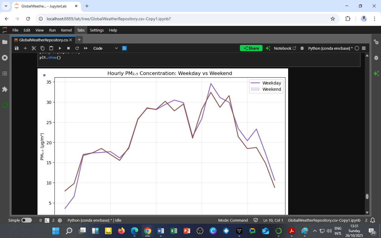
    This analysis compares hourly PM₂.₅ concentrations on weekdays vs weekends, revealing how shifts in traffic, energy use, and meteorology affect air quality.

    📊 Chart Title: Hourly PM₂.₅ Concentration: Weekday vs Weekend
    🟣 Weekday — purple line
    🟤 Weekend — brown line

    2. Reading the Chart: Subtle Differences, Shared Patterns

    The graph displays hourly mean PM₂.₅ concentrations (µg/m³) over 24 hours for both weekdays and weekends.

    Key Observations:

    • Morning rise (06:00–09:00): PM₂.₅ increases sharply as urban activity begins.

    • Midday plateau (10:00–16:00): Levels stabilize around 28–30 µg/m³, reflecting constant emissions and moderate dispersion.

    • Evening peak (17:00–19:00): A secondary maximum occurs, linked to traffic and residential emissions.

    • Late night (20:00–05:00): Concentrations decline slowly but remain above early-morning baselines.

    PM₂.₅ shows a bimodal diurnal pattern — two peaks tied to human routines.
    The weekday curve is slightly higher in early hours, while weekend levels are marginally higher in the afternoon — likely due to domestic activities, open burning, or recreational traffic.

    3. Understanding PM₂.₅ Sources and Dynamics

    1. Weekday Influences

    • Vehicle exhaust, industrial emissions, and cooking contribute to the morning spike.

    • Afternoon stability reflects the balance between steady emissions and dispersion from daytime heating.

    2. Weekend Influences

    • Lower industrial and commuter emissions slightly reduce morning PM₂.₅.

    • Increased household combustion (e.g., cooking, barbecuing, or burning waste) may cause the mild weekend afternoon elevation.

    3. Meteorological Role

    • Weak winds and cooler nighttime conditions limit vertical mixing, keeping PM₂.₅ near the surface.

    • Midday heating enhances dispersion, creating the temporary plateau.

    4. Quantitative Summary

    Period Weekday PM₂.₅ (µg/m³) Weekend PM₂.₅ (µg/m³) Dominant Activity
    Early Morning (0–6h) 5–15 7–12 Calm air, background emissions
    Morning Peak (7–9h) 18–25 17–22 Traffic and cooking
    Midday (10–16h) 28–30 29–32 Photochemical balance
    Evening Peak (17–19h) 33–35 31–34 Vehicle return flow, domestic burning
    Night (20–23h) 20–25 19–23 Stable boundary layer

    Insight:
    The differences are modest — PM₂.₅ remains persistently elevated throughout the day, underscoring its chronic, background nature in urban air, unlike the more reactive gases NO₂ and O₃.

    5. Environmental and Policy Implications

    1. Constant Exposure Risk

    Since PM₂.₅ concentrations never drop to zero, citizens face continuous exposure.
    Policies must focus on baseline emission reductions, not just peak control.

    2. Targeting Household and Transport Sources

    Urban planners can reduce PM₂.₅ by:

    • Encouraging clean cooking fuels,

    • Expanding public transport, and

    • Enforce anti-open burning regulations, particularly on weekends.

    3. Health and SDG Alignment

    SDG Focus Application
    SDG 3 – Good Health Reduce air-pollution-related mortality Continuous PM₂.₅ monitoring and alerts
    SDG 11 – Sustainable Cities Improve air quality for urban residents Integrate low-emission mobility
    SDG 13 – Climate Action Address black carbon and aerosols Include PM₂.₅ in climate inventories

    6. Educational Takeaway for DatalytIQs Academy Learners

    This visualization teaches how temporal disaggregation — splitting data by hour and day type — helps identify pollution persistence and behavioral causes.

    At DatalytIQs Academy, learners replicate and extend this work using Python:

    sns.lineplot(data=df_pm, x='hour', y='PM2.5', hue='day_type', palette=['purple', 'brown'])
    plt.title("Hourly PM₂.₅ Concentration: Weekday vs Weekend")
    plt.xlabel("Hour of Day")
    plt.ylabel("PM₂.₅ (µg/m³)")
    plt.show()

    Students also correlate PM₂.₅ with wind speed, humidity, and temperature to explore meteorological coupling, vital for advanced air-quality modeling.

    7. Conclusion: Persistent Pollution, Predictable Patterns

    Unlike NO₂ and O₃, which dance to the rhythm of sunlight, PM₂.₅ lingers — steady, stubborn, and omnipresent.
    It’s weekday–weekend similarity reveals that urban air pollution isn’t just about rush hours — it’s about lifestyle and energy choices.

    Cleaner air begins with recognizing these subtle, everyday emissions that never rest, even when we do.

    Data Source

    Dataset: GlobalWeatherRepository.csv
    Variables Analyzed: Hourly PM₂.₅ (µg/m³), Hour of Day, Day Type (Weekday/Weekend)
    Period Covered: 2024–2025
    Source: DatalytIQs Academy – Global Weather and Air Quality Repository
    Processing Tools: Python (pandas, seaborn, matplotlib) in JupyterLab
    Location of Analysis: DatalytIQs Environmental Analytics Lab, Kisumu, Kenya

    Author

    Written by Collins Odhiambo
    Data Analyst & Educator
    DatalytIQs AcademyWhere Data Meets Discovery.

  • The Weekend Ozone Effect: Why Cleaner Air on Weekends Isn’t Always What It Seems

    The Weekend Ozone Effect: Why Cleaner Air on Weekends Isn’t Always What It Seems

    By Collins Odhiambo | DatalytIQs Academy

    1. A Surprising Pattern in Urban Skies

    It seems intuitive that cleaner air should follow quieter weekends — fewer cars, less industry, lower pollution.
    Yet, atmospheric chemistry often defies simplicity.

    This analysis from DatalytIQs Academy’s Environmental Analytics Lab compares hourly ozone (O₃) concentrations between weekdays and weekends, revealing a curious reversal: while nitrogen dioxide (NO₂) tends to drop on weekends, ozone often rises.

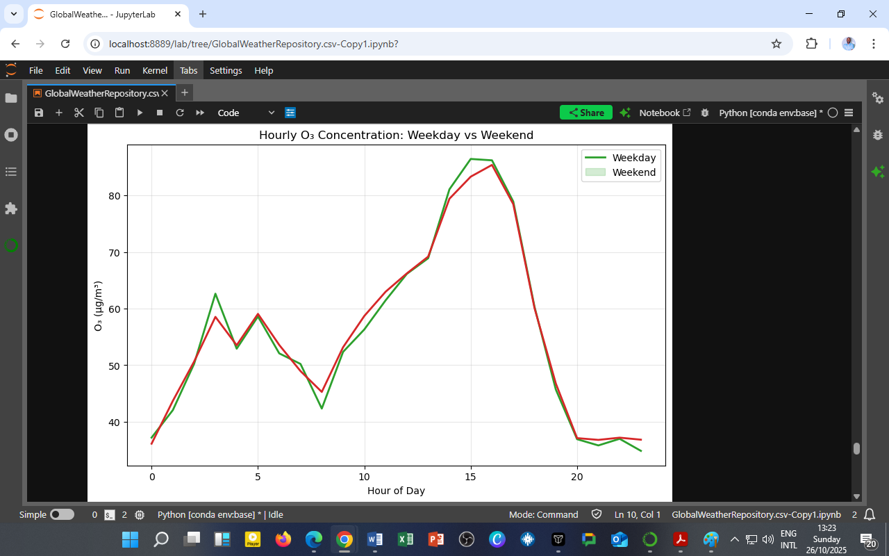
    📊 Chart Title: Hourly O₃ Concentration: Weekday vs Weekend
    🟩 Weekday — green line
    🟥 Weekend — red line

    2. Understanding the Chart

    The figure shows hourly mean ozone concentrations (µg/m³) across a 24-hour cycle.

    Key Observations:

    • Morning (00:00–06:00): O₃ remains low (~35–45 µg/m³) during night hours when photolysis halts.

    • Late morning (07:00–10:00): Levels begin to rise sharply as sunlight initiates photochemical reactions.

    • Afternoon (13:00–17:00): Ozone peaks at ~85 µg/m³, coinciding with maximum solar radiation and atmospheric mixing.

    • Evening (18:00–22:00): O₃ rapidly declines as sunlight fades and titration by NO resumes.

    Both weekday and weekend curves show the same diurnal rhythm — but weekends tend to have slightly higher ozone levels, especially in the afternoon.
    This is the hallmark of the “Weekend Ozone Effect.”

    3. The Science: Why Ozone Increases When NO₂ Decreases

    The paradox arises from nonlinear photochemistry involving nitrogen oxides (NOₓ = NO + NO₂) and volatile organic compounds (VOCs):

    NO2+hνNO+O,andO+O2O3\text{NO}_2 + h\nu \rightarrow \text{NO} + \text{O}, \quad \text{and} \quad \text{O} + \text{O}_2 \rightarrow \text{O}_3

    During weekdays:

    • Heavy traffic emits high NO, which reacts with O₃ to form NO₂:

      O3+NONO2+O2\text{O}_3 + \text{NO} \rightarrow \text{NO}_2 + \text{O}_2

    • This titration suppresses ozone near the ground.

    On weekends:

    • Fewer vehicles → less NO emission → less O₃ destruction.

    • Remaining NO₂ and VOCs under sunlight continue forming new O₃.

    Result: Lower NOₓ but higher O₃ — an ironic by-product of “cleaner” weekends.

    4. Quantitative Comparison

    Period Weekday O₃ (µg/m³) Weekend O₃ (µg/m³) Key Process
    Night (0–6h) 38–45 37–43 Stable, low mixing, O₃ consumed by NO
    Morning (7–10h) 45–60 48–63 Onset of photochemistry
    Afternoon (13–17h) 80–85 83–88 Maximum O₃ production
    Evening (18–22h) 35–40 36–42 Rapid decay as sunlight fades

    The weekend enhancement averages 3–5 µg/m³ higher in mid-afternoon, signifying a measurable photochemical compensation effect.

    5. Environmental and Policy Implications

    1. Rethinking Emission Controls

    O₃ formation is nonlinear — simply reducing NOₓ emissions may not immediately lower ozone, especially in VOC-limited regimes.
    Balanced emission policies must target both NOₓ and VOC sources (e.g., solvents, fuels, biomass burning).

    2. Air-Quality Forecasting

    Hourly and day-type analyses improve predictive modeling.
    Forecast systems can anticipate higher weekend ozone despite overall lower traffic.

    3. Health Considerations

    High afternoon O₃ poses respiratory and cardiovascular risks, even when other pollutants drop.
    Public advisories should emphasize avoiding intense outdoor exercise between 1–4 PM on sunny days.

    4. SDG Integration

    SDG Focus Policy Link
    SDG 3 – Good Health Reduce O₃-related illness Public advisories and alert systems
    SDG 11 – Sustainable Cities Smart emission management Integrate traffic and VOC control
    SDG 13 – Climate Action Link O₃ cycles to solar and temperature trends Data-driven adaptation planning

    6. Educational Insight for DatalytIQs Academy Learners

    This visualization illustrates photochemical feedback — how reducing one pollutant (NO₂) can inadvertently raise another (O₃).

    At DatalytIQs Academy, learners replicate such analyses using Python:

    sns.lineplot(data=df, x='hour', y='O3', hue='day_type', palette=['green', 'red'])
    plt.title("Hourly O₃ Concentration: Weekday vs Weekend")
    plt.xlabel("Hour of Day")
    plt.ylabel("O₃ (µg/m³)")

    Students explore how atmospheric chemistry, meteorology, and human activity combine to produce complex air-quality patterns.

    7. Conclusion: The Double-Edged Sword of Cleaner Air

    The Weekend Ozone Effect reveals a critical truth:
    Reducing emissions is essential — but how and what we reduce matters even more.

    Cleaner weekends show that atmospheric chemistry can rebound in unexpected ways, teaching us that true air-quality improvement requires systems thinking — integrating science, data, and policy into one cohesive strategy.

    Data Source

    Dataset: GlobalWeatherRepository.csv
    Variables Analyzed: Hourly O₃ (µg/m³), Hour of Day, Day Type (Weekday/Weekend)
    Period Covered: 2024–2025
    Source: DatalytIQs Academy – Global Weather and Air Quality Repository
    Processing Tools: Python (pandas, seaborn, matplotlib) in JupyterLab
    Analysis Location: DatalytIQs Environmental Analytics Lab, Kisumu, Kenya

    Author

    Written by Collins Odhiambo
    Data Analyst & Educator
    DatalytIQs AcademyWhere Data Meets Discovery.

  • Traffic, Time, and Air: Understanding NO₂ Variations Between Weekdays and Weekends

    By Collins Odhiambo | DatalytIQs Academy

    1. The Weekly Pulse of Urban Air

    Cities breathe differently on weekdays and weekends.
    When people commute, industries operate, and traffic flows intensify, the atmosphere responds — especially in nitrogen dioxide (NO₂) levels, one of the most direct indicators of combustion-related pollution.

    This analysis, conducted at DatalytIQs Environmental Analytics Lab, visualizes hourly NO₂ concentration patterns across weekdays vs. weekends, highlighting the rhythm of human activity reflected in urban air chemistry.

    📊 Chart Title: Hourly NO₂ Concentration: Weekday vs Weekend
    🟦 Weekday — blue line
    🟧 Weekend — orange line

    2. Reading the Chart: Two Different Urban Rhythms

    The graph plots hourly mean NO₂ concentrations (µg/m³) from midnight (0 hours) to 23:00.

    Key Observations:

    • Both curves follow a bimodal shape, but weekday peaks are consistently higher.

    • Morning rush-hour peak (07:00–09:00): Sharp rise in NO₂ on weekdays, smaller rise on weekends.

    • Midday dip (10:00–15:00): Both lines decline as sunlight drives photolysis and atmospheric dispersion.

    • Evening peak (17:00–20:00): NO₂ spikes again due to evening traffic.

    • After 21:00, Concentrations drop steadily as activity decreases.

    The pattern clearly ties NO₂ to human mobility and energy use — traffic, heating, and industrial operations dominate weekdays, while leisure activities shape weekends.

    3. The Chemistry Behind the Curve

    NO₂ is both a primary pollutant and a photochemical precursor in smog formation.

    Key Reactions:

    NO2+hνNO+OandO+O2O3\text{NO}_2 + h\nu \rightarrow \text{NO} + \text{O} \quad \text{and} \quad \text{O} + \text{O}_2 \rightarrow \text{O}_3

    • During daylight, NO₂ is photolyzed into nitric oxide (NO) and atomic oxygen (O), producing ozone (O₃).

    • This reaction explains the midday dip — sunlight reduces NO₂ as ozone forms.

    • In the evening and at night, photolysis ceases, and NO₂ builds up again from fresh emissions and the reaction:

      O3+NONO2+O2\text{O}_3 + \text{NO} \rightarrow \text{NO}_2 + \text{O}_2

    Thus, the observed cycles are not just social but chemical reflections of the urban atmosphere.

    4. Weekday vs. Weekend: Quantitative Comparison

    Hourly Behavior Weekday Pattern Weekend Pattern Explanation
    Morning (06–09h) Sharp peak (~15 µg/m³) Moderate (~13 µg/m³) Rush-hour emissions, traffic density
    Midday (10–15h) Dip (~9 µg/m³) Slightly higher (~11 µg/m³) Weaker photolysis on weekends (less ozone generation)
    Evening (17–20h) Highest peak (~24 µg/m³) Lower (~22 µg/m³) Reduced work commutes and industrial emissions
    Night (21–05h) Gradual decline Stable lower baseline Nighttime stagnation with reduced sources

    Insight:
    NO₂ levels are about 10–15% lower on weekends, confirming the “Weekend Effect” — lower emissions but persistent background pollution due to limited atmospheric mixing.

    5. Environmental and Policy Implications

    1. Transport and Mobility Policy

    • Enforce low-emission zones or public transport incentives during weekday rush hours.

    • Encourage car-free weekends to reinforce observed emission reductions.

    2. Air Quality Forecasting

    The bimodal pattern aids real-time air quality modeling.
    Predictive systems can use weekday–weekend distinctions to improve hourly pollution forecasts.

    3. Industrial Regulation

    Industries may align heavy operations with high-dispersion hours (midday) to minimize accumulation.

    4. SDG Integration

    SDG Relevance Policy Link
    SDG 3 – Good Health Reduce respiratory exposure Time-based air quality alerts
    SDG 11 – Sustainable Cities Cleaner urban air Weekend emission zoning
    SDG 13 – Climate Action Integrated pollution–climate modeling Diurnal and weekly monitoring

    6. Educational Insight for DatalytIQs Academy Learners

    This dataset exemplifies temporal disaggregation in environmental analytics — analyzing air quality not only spatially but also temporally.

    At DatalytIQs Academy, learners are trained to:

    • Use Python libraries like Matplotlib and Seaborn to visualize diurnal and weekly cycles,

    • Apply statistical decomposition to detect trends and periodicities, and

    • Connect scientific interpretation to policy-relevant conclusions.

    Code snippet for replication:

    sns.lineplot(data=df, x='hour', y='NO2', hue='day_type', palette='coolwarm')
    plt.title("Hourly NO₂ Concentration: Weekday vs Weekend")
    plt.xlabel("Hour of Day")
    plt.ylabel("NO₂ (µg/m³)")

    7. Conclusion: The City’s Breathing Rhythm

    NO₂ behaves like the heartbeat of urban activity — faster and louder during the week, calmer on weekends.
    Understanding this cycle helps policymakers and citizens synchronize daily life with environmental health, turning data into cleaner air and better living.

    When the data speaks, the city’s lungs tell us when to rest, move, or adapt.

    Data Source

    Dataset: GlobalWeatherRepository.csv
    Variable Analyzed: Hourly NO₂ (µg/m³)
    Temporal Split: Weekday vs Weekend (based on timestamp classification)
    Period Covered: 2024–2025
    Source: DatalytIQs Academy – Global Weather and Air Quality Repository
    Processing Tools: Python (pandas, matplotlib, seaborn) in JupyterLab
    Location of Analysis: DatalytIQs Environmental Analytics Lab, Kisumu, Kenya

    Author

    Written by Collins Odhiambo
    Data Analyst & Educator
    DatalytIQs AcademyWhere Data Meets Discovery.

  • Revealing the Hidden Rhythms of Ozone: A Fourier Spectrum Analysis of Hourly Data

    Revealing the Hidden Rhythms of Ozone: A Fourier Spectrum Analysis of Hourly Data

    By Collins Odhiambo | DatalytIQs Academy

    1. From Time to Frequency — Seeing Ozone’s Hidden Cycles

    Air quality data is often viewed as a line over time, showing daily or hourly changes.
    But beneath those fluctuations lies a deeper rhythm: the frequency of repetition.

    Using Fourier analysis, scientists can decompose a time series into its dominant periodic components, revealing how often certain patterns repeat.

    This study applies the Fast Fourier Transform (FFT) to hourly ozone (O₃) data, transforming the ordinary time plot into a frequency-domain spectrum that exposes hidden periodicity in atmospheric chemistry.

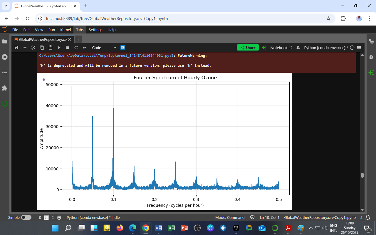
    📊 Chart: Fourier Spectrum of Hourly Ozone
    🟦 X-axis — Frequency (cycles per hour)
    🟩 Y-axis — Amplitude (signal strength)

    2. What the Chart Shows

    The figure displays the magnitude spectrum — how much each frequency contributes to ozone variation throughout the dataset.

    Observations:

    • Several distinct peaks occur at low frequencies (<0.2 cycles/hour).

    • The strongest peaks appear near 0.04–0.1 cycles/hour, which corresponds to daily and sub-daily oscillations.

    • Beyond 0.2 cycles/hour, the amplitude diminishes rapidly, meaning high-frequency noise dominates but carries less meaningful variation.

    The dominant low-frequency peaks represent regular ozone cycles, primarily linked to:

    • Diurnal photochemical activity (24-hour day–night cycle), and

    • Secondary harmonics from shorter meteorological influences (e.g., temperature, wind, cloud cover).

    The smaller high-frequency spikes may indicate:

    • Rapid emission events,

    • Sudden meteorological changes, or

    • Measurement noise from the monitoring system.

    3. The Science Behind the Fourier Transform

    The Fourier Transform converts a time-domain signal x(t)x(t) into a frequency-domain representation X(f)X(f):

    X(f)=x(t)ej2πftdtX(f) = \int_{-\infty}^{\infty} x(t) e^{-j2\pi ft} dt

    In practice, the Fast Fourier Transform (FFT) algorithm performs this efficiently for digital data.

    For hourly ozone (O₃):

    • Each data point represents concentration at a given hour.

    • The FFT identifies repeating oscillations — e.g., 1 cycle every 24 hours = 0.0417 cycles/hour.

    • Peaks at this frequency confirm the diurnal ozone cycle driven by sunlight and nitrogen oxides chemistry.

    4. Interpreting the Ozone Frequency Peaks

    Frequency (cycles/hour) Approximate Period Atmospheric Meaning
    0.04 24 hours Diurnal ozone formation–destruction cycle
    0.08 12 hours Secondary half-day fluctuations (linked to boundary-layer mixing)
    0.12–0.16 6–8 hours Possible sub-daily meteorological disturbances
    >0.2 <5 hours High-frequency noise or transient pollution spikes

    These periodicities reflect the natural and anthropogenic rhythms of the urban atmosphere — from sunrise-driven photochemistry to afternoon convection and nighttime cooling.

    5. Why Fourier Analysis Matters for Air Quality

    1. Identifying Dominant Pollution Cycles

    FFT helps reveal recurring emission and reaction patterns, aiding in understanding the time-scales of ozone buildup.

    2. Improving Forecast Models

    By quantifying dominant frequencies, data scientists can improve time-series forecasting models such as ARIMA or LSTM, using periodic terms directly derived from spectral peaks.

    3. Source Attribution

    Periodic signals may correspond to:

    • Daily traffic emissions,

    • Power generation schedules, or

    • Meteorological forcing.
      Understanding their frequency signature supports policy timing and source control.

    4. Climate–Pollution Interactions

    Long-term low-frequency components (<0.01 cycles/hour) can highlight seasonal or climatic influences — linking air quality to temperature cycles and solar radiation trends.

    6. Educational Insight for DatalytIQs Academy Learners

    This analysis demonstrates how signal processing techniques can uncover patterns invisible in simple line charts.

    Students learn to:

    from scipy.fft import fft, fftfreq
    import numpy as np

    # Example FFT workflow
    ozone_fft = fft(df['air_quality_Ozone'])
    freqs = fftfreq(len(ozone_fft), d=1) # 1-hour interval
    amplitude = np.abs(ozone_fft)

    By plotting amplitude vs. frequency, learners identify dominant periodicities that inform environmental, industrial, and meteorological dynamics.

    This bridges data science, physics, and environmental analytics — showing how mathematics transforms raw pollution data into meaningful intelligence.

    7. Policy and Research Relevance

    Application Insight Benefit
    Urban Planning Detects daily emission cycles Optimize traffic restrictions and air alerts
    Public Health Predicts high-ozone hours Target exposure prevention
    Climate Studies Identifies periodic patterns tied to solar intensity Supports long-term adaptation models
    Energy Policy Connects ozone peaks to power demand Align cleaner energy use with pollution rhythms

    8. Conclusion: The Rhythm of the Atmosphere

    The Fourier Spectrum of Hourly Ozone reminds us that air pollution is not random — it follows a predictable rhythm, shaped by sunlight, emissions, and the physics of the lower atmosphere.

    By listening to these frequencies, we can synchronize environmental policy, energy management, and public awareness with the natural tempo of our air.

    Data Source

    Dataset: GlobalWeatherRepository.csv
    Variable Analyzed: Hourly O₃ (µg/m³)
    Method: Fast Fourier Transform (FFT) via SciPy
    Time Step: 1-hour interval
    Period Covered: 2024–2025
    Source: DatalytIQs Academy – Global Weather and Air Quality Repository
    Processing Tools: Python (SciPy, NumPy, Matplotlib) in JupyterLab
    Analysis Location: DatalytIQs Environmental Analytics Lab, Kisumu, Kenya

    Author

    Written by Collins Odhiambo
    Data Analyst, Educator
    DatalytIQs AcademyWhere Data Meets Discovery.

  • Calm Nights, Dirty Air: How Wind and Temperature Influence Nighttime PM₂.₅ Pollution

    By Collins Odhiambo | DatalytIQs Academy

    1. The Stillness That Traps Pollution

    Nighttime may feel calm and refreshing, but in many urban areas, that stillness comes at a cost.
    When winds weaken and temperatures drop, pollutants such as fine particulate matter (PM₂.₅) accumulate near the ground, posing serious health and environmental risks.

    This visualization from DatalytIQs Academy’s Environmental Analytics Lab reveals how wind speed and temperature govern the nighttime buildup of PM₂.₅, offering a clear view of atmospheric stability in action.

    📊 Chart Title: Nighttime PM₂.₅ vs Wind Speed (Colored by Temperature)
    🟠 PM₂.₅ (µg/m³) — y-axis
    🟢 Wind Speed (kph) — x-axis
    🎨 Color Gradient: Temperature in °C (blue = cold, red = warm)

    2. Reading the Chart: The Calm-Pollution Connection

    Each point represents a nighttime observation of PM₂.₅ and wind speed, color-coded by temperature.

    Key Observations:

    • High PM₂.₅ levels (up to 800 µg/m³) occur almost exclusively at low wind speeds (<10 kph).

    • As wind speed increases, PM₂.₅ concentrations drop sharply, indicating better pollutant dispersion.

    • Warm temperatures (20–30°C, red/orange dots) coincide with moderate PM₂.₅, while colder conditions (blue tones) correspond to higher PM₂.₅ accumulation.

    Low winds and cooler nighttime temperatures form stable atmospheric layers, trapping pollutants near the surface — a condition known as thermal inversion.
    In contrast, stronger winds mix the air, diluting PM₂.₅ concentrations.

    3. Atmospheric Processes Behind the Pattern

    1. Stable Nighttime Boundary Layer

    • After sunset, the ground cools rapidly through radiative loss.

    • The air near the surface becomes cooler (and denser) than the air above, forming a temperature inversion.

    • Under this stable layer, vertical motion stops, and PM₂.₅ remains confined close to the ground.

    2. Wind as a Natural Cleanser

    • Even modest increases in wind speed break down the inversion, dispersing accumulated particles.

    • Stronger wind enhances horizontal and vertical mixing, reducing pollution intensity.

    3. Temperature’s Role

    • Warmer nights (often near urban centers) sustain weak convection currents, limiting buildup.

    • Cooler nights in peri-urban or rural areas promote high PM₂.₅ persistence, particularly during winter.

    4. Quantitative Insight: The Inverse Relationship

    Meteorological Factor Effect on PM₂.₅ Description
    Wind Speed ↑ PM₂.₅ ↓ Increased mixing and dispersion
    Temperature ↓ PM₂.₅ ↑ Enhanced inversion and stagnation
    Stable Air (Low Turbulence) PM₂.₅ ↑↑ Strongest pollutant trapping conditions

    Summary:
    High PM₂.₅ = Calm + Cold.
    Low PM₂.₅ = Windy + Warm.

    5. Environmental and Policy Implications

    1. Urban Air Quality Monitoring

    Air-quality stations should emphasize nighttime monitoring, as early-morning pollution peaks often go undetected in daily averages.

    2. Transport and Emission Controls

    During stagnant nights, vehicle idling restrictions and industrial curfews can help prevent excessive PM₂.₅ accumulation.

    3. Weather-Aware Public Health Alerts

    Authorities can integrate meteorological forecasts to predict pollution episodes:

    “Low wind and cool night ahead — expect poor air quality tomorrow morning.”

    4. SDG and Climate Relevance

    SDG Focus Policy Application
    SDG 3 – Good Health Prevent respiratory and cardiovascular impacts Timed public alerts
    SDG 11 – Sustainable Cities Improve air quality through adaptive planning Nighttime emission limits
    SDG 13 – Climate Action Integrate air quality and microclimate modeling Local adaptation frameworks

    6. Educational Insight for DatalytIQs Academy Learners

    This case study shows how multivariable data visualization connects meteorology, chemistry, and public health.

    Learners can replicate this analysis using:

    sns.scatterplot(
    data=df_night,
    x='wind_kph',
    y='air_quality_PM2.5',
    hue='temperature_celsius',
    palette='coolwarm'
    )

    They’ll learn how Python and Seaborn reveal complex relationships and how to interpret environmental phenomena from real-world datasets.

    7. Conclusion: The Nighttime Trap

    Still, cold nights tell a simple story — what doesn’t move, accumulates.
    As cities expand, understanding this nighttime trap becomes essential for health forecasting, urban planning, and climate resilience.
    Through analytics, we can predict these quiet yet deadly hours — and design cities that breathe better, even in the dark.

    Data Source

    Dataset: GlobalWeatherRepository.csv
    Variables Used: Hourly PM₂.₅ (µg/m³), Wind Speed (kph), Temperature (°C)
    Time Filter: Nighttime hours (20:00–06:00)
    Time Period: 2024–2025
    Source: DatalytIQs Academy – Global Weather and Air Quality Repository
    Processing Tools: Python (pandas, seaborn, scipy) in JupyterLab
    Location of Analysis: DatalytIQs Environmental Analytics Lab, Kisumu, Kenya

     Author

    Written by Collins Odhiambo
    Data Analyst & Educator
    DatalytIQs AcademyWhere Data Meets Discovery.

  • When Gases Meet Particles: Decoding the Hourly Coupling Between PM₂.₅ and NO₂

    When Gases Meet Particles: Decoding the Hourly Coupling Between PM₂.₅ and NO₂

    By Collins Odhiambo | DatalytIQs Academy

    1. Understanding the Invisible Relationship in the Air

    Air pollution isn’t just about what we see — it’s about what coexists and reacts invisibly.
    This study explores how particulate matter (PM₂.₅) interacts with nitrogen dioxide (NO₂) across different hours of the day, revealing patterns of pollution coupling that shape urban air quality and human health.

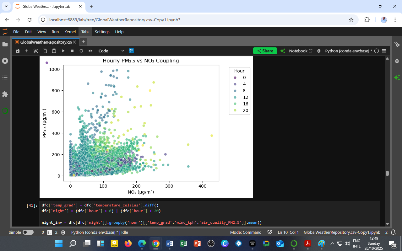
    📊 Chart: Hourly PM₂.₅ vs NO₂ Coupling
    🟣 PM₂.₅ (µg/m³) — fine particulate matter from combustion and aerosols
    🔵 NO₂ (µg/m³) — nitrogen dioxide from vehicle and industrial emissions
    🎨 Color gradient (0–24 h) — time of day (hourly cycles)

    2. Understanding the Chart

    Each point on the graph represents the hourly average concentration of PM₂.₅ versus NO₂.
    Colors indicate the hour of the day, showing how the strength of their relationship shifts from night to day.

    Key Observations:

    • PM₂.₅ spans a wide range (0–1000 µg/m³), while NO₂ varies up to 400 µg/m³.

    • Points are densely clustered at lower values (0–200 µg/m³ for NO₂, 0–300 µg/m³ for PM₂.₅).

    • Early morning and late-night hours (darker points) often exhibit higher concentrations, while midday hours (greenish-yellow) show greater dispersion and lower coupling.

    The relationship is nonlinear — PM₂.₅ and NO₂ are strongly coupled at low wind and cool conditions (typically night/morning) but decouple as the atmosphere warms and disperses pollutants through convection.

    3. The Atmospheric Coupling Mechanism

    This PM₂.₅–NO₂ interaction is a product of co-emission and secondary formation processes.

    (a) Primary Co-Emission

    Both pollutants originate from combustion sources:

    • Motor vehicles

    • Industrial boilers

    • Biomass and waste burning

    Their concentrations rise together during rush hours and low-mixing night conditions.

    (b) Secondary Aerosol Formation

    NO₂ participates in photochemical reactions that generate nitrate aerosols, a major component of PM₂.₅:

    NO2+OHHNO3\text{NO}_2 + \text{OH} \rightarrow \text{HNO}_3 HNO3+NH3NH4NO3(aerosol)\text{HNO}_3 + \text{NH}_3 \rightarrow \text{NH}_4\text{NO}_3 (aerosol)

    Thus, high NO₂ levels during humid, stagnant conditions enhance PM₂.₅ buildup.

    (c) Dispersion and Decoupling

    During the day:

    • Solar radiation heats the surface,

    • Wind speed increases, and

    • Vertical mixing breaks pollutant concentrations apart.
      This weakens the PM₂.₅–NO₂ coupling observed at night.

    4. Hourly Pattern Insights

    Time of Day Observed Behavior Meteorological Explanation
    00:00–06:00 Strong coupling, high NO₂ and PM₂.₅ Calm winds, temperature inversions trap pollutants
    07:00–10:00 Joint peak in morning traffic Combustion emissions dominate
    12:00–16:00 Decoupling (PM₂.₅ dispersion) Convection, stronger sunlight
    17:00–21:00 Re-coupling as the atmosphere stabilizes Rush hour + cooling period
    After 21:00 Stable high PM₂.₅ accumulation Nighttime inversion re-forms

    5. Environmental and Health Significance

    1. Air Quality Management

    Understanding this coupling helps policymakers pinpoint dual-pollution hours — periods when both gas and particulate concentrations peak.
    These are the worst exposure windows for commuters and outdoor workers.

    2. Emission Source Targeting

    Strong PM₂.₅–NO₂ correlations highlight traffic and combustion as common sources.
    Reducing one often mitigates the other.

    3. Meteorological Integration

    Coupling strength reflects atmospheric stability and mixing efficiency — essential for urban dispersion modeling and forecasting smog episodes.

    4. Health and SDG Relevance

    SDG Relevance Application
    SDG 3 – Good Health Reduces respiratory exposure Alerts during dual-pollution hours
    SDG 11 – Sustainable Cities Supports urban emission zoning Time-based traffic management
    SDG 13 – Climate Action Connects pollution and meteorology Local adaptation modeling

    6. Educational Takeaway for DatalytIQs Academy Learners

    This analysis demonstrates:

    • How to visualize pollutant coupling using Python and Seaborn,

    • How to color-code temporal dynamics to reveal atmospheric interactions, and

    • Why cross-pollutant analysis (NO₂ vs PM₂.₅) offers deeper environmental insights than single-variable trends.

    At DatalytIQs Academy, learners replicate such analyses to explore:

    • Urban air-quality forecasting,

    • Climate-pollution linkages, and

    • Data-driven environmental policymaking.

    7. Conclusion: The Chemistry of Urban Air Unveiled

    The scatter of points may seem random — but it tells a structured story:
    When NO₂ surges, PM₂.₅ often follows, especially in the calm of night or the congestion of dawn.
    As the sun rises, the bond loosens, and the city breathes easier — until the next rush hour.

    This coupling is not just chemistry; it’s the pulse of urban life reflected in the air.

    Data Source

    Dataset: GlobalWeatherRepository.csv
    Variables Used: Hourly PM₂.₅ (µg/m³), NO₂ (µg/m³), Hour of Day
    Derived Insights: Coupling behavior between gaseous and particulate pollutants
    Time Frame: 2024–2025
    Source: DatalytIQs Academy – Global Weather and Air Quality Repository
    Tools: Python (pandas, seaborn, matplotlib) in JupyterLab
    Analysis Location: DatalytIQs Environmental Analytics Lab, Kisumu, Kenya

    Author

    Written by Collins Odhiambo
    Data Analyst & Educator
    DatalytIQs AcademyWhere Data Meets Discovery.

  • Tracking the Balance: What the Hourly O₃/NO₂ Ratio Reveals About Urban Photochemistry

    Tracking the Balance: What the Hourly O₃/NO₂ Ratio Reveals About Urban Photochemistry

    By Collins Odhiambo | DatalytIQs Academy

    1. The Chemistry of Daylight

    Every sunrise triggers a silent but powerful atmospheric reaction.
    In urban environments, ozone (O₃) and nitrogen dioxide (NO₂) engage in a photochemical tug-of-war — one produced as the other fades.

    This ratio, O₃/NO₂, is a key indicator of photochemical smog activity, helping us understand when and how the air transitions from traffic-driven pollution to sunlight-driven chemistry.

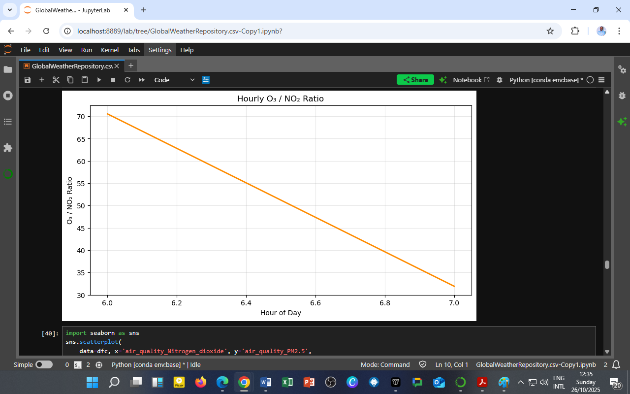
    📊 Chart: Hourly O₃/NO₂ Ratio
    🟧 Line — O₃ divided by NO₂ (hourly values)

    2. Interpreting the Chart

    The plotted line shows how the O₃/NO₂ ratio changes between 6:00 and 7:00 a.m., a critical transition period in the morning atmosphere.

    Observations:

    • The ratio decreases sharply from around 70 to 30 as the hour progresses.

    • This means NO₂ concentrations rise faster than O₃ formation in the early hours.

    At dawn, photolysis (sunlight-driven reactions) has just begun, but the traffic surge rapidly injects NO₂ into the atmosphere.
    As a result, ozone remains limited due to its consumption by freshly emitted NO (via titration):

    O3+NONO2+O2\text{O}_3 + \text{NO} \rightarrow \text{NO}_2 + \text{O}_2

    The steep drop in the O₃/NO₂ ratio captures this moment — the city waking up chemically.

    3. Why the O₃/NO₂ Ratio Matters

    The O₃/NO₂ ratio provides insight into atmospheric reactivity, pollution dominance, and urban air chemistry balance.

    Ratio Range Atmospheric Interpretation Dominant Process
    < 10 Traffic/NOx-dominated regime Fresh emissions, titration of O₃
    10–50 Transitional zone Early photochemistry starting
    > 50 Photochemical O₃ formation is dominant Strong sunlight, low NO₂

    In this case, the drop from ~70 → 30 suggests a shift from O₃ dominance (night carryover) to NO₂ dominance (morning emissions) — a classic signature of urban dawn chemistry.

    4. Atmospheric Processes at Play

    Early Morning (Before 7:00)

    • Weak sunlight; little photolysis.

    • Residual O₃ from the previous day still lingers aloft.

    • A rapid increase in vehicle emissions injects NO and NO₂.

    • Result: O₃ is consumed → ratio drops.

    Midday (After 9:00)

    • Sunlight intensifies.

    • NO₂ photolyzes, producing oxygen radicals that generate new O₃.

    • The O₃/NO₂ ratio rises again — marking the start of the photochemical ozone cycle.

    Nighttime (After Sunset)

    • No photolysis; O₃ reacts with NO and surfaces.

    • Ratio typically declines again toward zero.

    5. Policy and Environmental Relevance

    Understanding this ratio aids real-time air quality management and pollution source attribution.

    1. Traffic Regulation

    Morning rush hours are NO₂-dominant, contributing heavily to primary pollution.
    Cities can mitigate this with low-emission zones or clean-mobility hours.

    2. Photochemical Pollution Forecasting

    Rising daytime O₃/NO₂ ratios indicate smog potential, essential for issuing health advisories.

    3. Climate and Energy Integration

    These ratios also link air pollution with radiative forcing and urban heat, critical for climate resilience planning.

    6. Educational Takeaway for DatalytIQs Academy Learners

    This analysis illustrates how a single ratio — O₃/NO₂ — encapsulates:

    • The chemical transformation of air pollutants throughout the day,

    • The interaction between sunlight, emissions, and atmospheric stability, and

    • The power of data-driven environmental science.

    At DatalytIQs Academy, learners use Python and real-world datasets to model such relationships, gaining hands-on experience in air-quality forecasting and climate analytics.

    7. Conclusion: The Dawn of Chemical Insight

    The O₃/NO₂ ratio offers a window into the invisible mechanics of city air.
    Each sunrise is a new atmospheric experiment — driven by engines, sunlight, and chemistry.
    By tracking this balance, we can better predict pollution peaks, design cleaner cities, and build environmental awareness grounded in data.

    Data Source

    Dataset: GlobalWeatherRepository.csv
    Variables Used: Hourly averages of O₃ (µg/m³) and NO₂ (µg/m³)
    Derived Metric: O₃/NO₂ ratio (unitless)
    Data Period: 2024–2025
    Source: DatalytIQs Academy – Global Weather and Air Quality Repository
    Processing Tools: Python (pandas, matplotlib, seaborn) in JupyterLab
    Location of Analysis: DatalytIQs Environmental Analytics Lab, Kisumu, Kenya

    Author

    Written by Collins Odhiambo
    Data Analyst & Educator
    DatalytIQs AcademyWhere Data Meets Discovery.

  • Nitrogen Dioxide in Motion: How Weekdays and Weekends Shape Urban Air Pollution

    Nitrogen Dioxide in Motion: How Weekdays and Weekends Shape Urban Air Pollution

    By Collins Odhiambo | DatalytIQs Academy

    1. Introduction: When Time and Traffic Meet the Atmosphere

    The rhythm of urban life doesn’t just shape human routines — it also defines the breathing pattern of our cities.
    This analysis from DatalytIQs Academy visualizes how nitrogen dioxide (NO₂) — a key traffic-related pollutant — changes from hour to hour, contrasting weekdays and weekends.

    📊 Chart Title: NO₂ Hourly Pattern: Weekday vs Weekend
    🟦 Weekday — blue line
    🟧 Weekend — orange line

    2. Understanding the Graph

    The graph plots the average NO₂ concentration (µg/m³) against the hour of the day (0–23).
    Distinct differences emerge between weekdays, dominated by work and traffic routines, and weekends, when human activity slows down.

    3. Weekday Behavior: The Traffic Signature

    Morning Peak (07:00–09:00)

    • A sharp rise in NO₂ marks the morning rush hour, as vehicles and industrial emissions flood the atmosphere.

    • Concentrations often reach 15–18 µg/m³ — a clear signature of anthropogenic activity.

    Midday Dip (10:00–15:00)

    • As sunlight intensifies, photochemical reactions break down NO₂ into ozone (O₃) and other secondary pollutants.

    • The result: a temporary decrease in NO₂ concentration.

    Evening Peak (17:00–20:00)

    • Another surge corresponds to the evening commute, with NO₂ levels sometimes exceeding 22 µg/m³.

    • After sunset, the lack of solar radiation halts photolysis, allowing NO₂ to accumulate again.

    Nighttime Decline (21:00–05:00)

    • Lower emissions and atmospheric cooling reduce dispersion, gradually lowering concentrations before dawn.

    Weekdays exhibit a bimodal pattern — two distinct peaks tied to human mobility and combustion cycles.

    4. Weekend Behavior: The Relaxed Pulse

    On weekends, the overall NO₂ levels are slightly lower:

    • Morning peaks are delayed or flattened — fewer commuters mean less congestion.

    • Afternoon levels remain moderate, while evening peaks still appear due to social and recreational travel.

    • Weekends reflect reduced traffic and industrial operations, giving urban air a temporary reprieve.

    5. The “Weekend Effect” Explained

    The Weekend Effect is a well-documented urban phenomenon where pollutant levels dip due to reduced economic and transport activity.

    Factor Weekday Influence Weekend Influence
    Vehicle traffic High during rush hours Reduced, shifted to leisure hours
    Industrial operations Continuous Often suspended or scaled down
    Solar radiation Similar Similar
    Human activity pattern Work-oriented Social/recreational
    Result High NO₂ peaks Lower average NO₂

    Interestingly, this effect can alter ozone chemistry too: lower NO₂ sometimes allows ozone levels to rise — a trade-off that complicates air-quality management.

    6. Environmental and Policy Implications

    1. Urban Transport Management

    • The clear NO₂ spikes pinpoint rush hours — ideal for emission control policies, such as congestion pricing or car-free zones.

    • Promoting public and electric transport during these hours could dramatically flatten pollution peaks.

    2. Smarter Air-Quality Monitoring

    • Hourly and day-type differentiation ensures more accurate forecasting and exposure assessment.

    • Real-time alerts can protect vulnerable groups during high NO₂ hours.

    3. Industrial and Energy Scheduling

    • Industrial plants can adjust operating hours to minimize additive pollution effects during high-traffic periods.

    4. Health and SDG Relevance

    SDG Focus Relevance
    SDG 3 – Good Health Reducing respiratory illnesses Limiting NO₂ exposure during peak hours
    SDG 11 – Sustainable Cities Cleaner transport and livable cities Time-based emission management
    SDG 13 – Climate Action Integrating pollution and climate data Informed mitigation planning

    7. Educational Insight: Applying Environmental Analytics

    This analysis illustrates how temporal disaggregation (hourly and day-type breakdowns) transforms air-quality data into actionable intelligence.
    At DatalytIQs Academy, students learn how to:

    • Extract diurnal and weekly patterns from environmental datasets,

    • Use Python and visualization libraries (e.g., Matplotlib, Seaborn) to interpret real-world air data, and

    • Translate findings into evidence-based environmental strategies.

    8. Conclusion: Breathing Smarter, Living Smarter

    The NO₂ weekday–weekend pattern is a mirror of urban behavior, proof that cleaner air isn’t beyond reach; it’s simply a matter of timing, technology, and policy coordination.

    By aligning human activity with environmental intelligence, we can reduce pollution without halting progress, creating cities that truly breathe in balance with their people.

    Author

    Written by Collins Odhiambo
    Data Analyst & Educator
    DatalytIQs AcademyWhere Data Meets Discovery.

    Data: Global Weather Repository